
5 Smart Strategies For App Store Screenshots
October 7th, 2015
Tagged: App-Marketing, Screenshots, Tips, User-Acquisition
By David Bell
CEO at Gummicube, Inc.
Without looking, do you know which element of an app listing makes up 75% of the view in the app store search results? Here is what Apple’s app store search results look like on my iPhone 6: 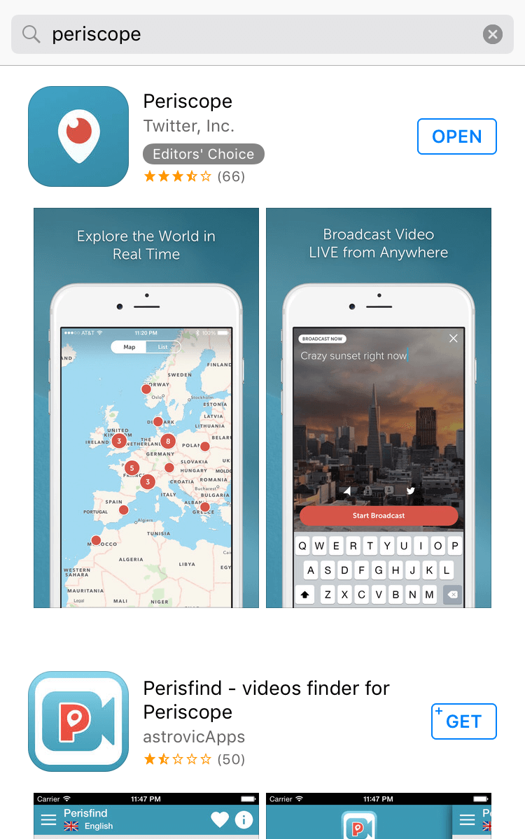 The first result is Twitter’s Periscope. While the listing includes the app name, publisher, icon and even ratings, the first two screenshots take center stage. Optimizing an app listing for visibility in search results consumes a lot of what’s talked about in ASO, but converting viewers is how we actually acquire users. And since the screenshots are such a big part of the view a potential user sees when navigating the app store - we need to make sure our screenshots are optimized for conversion.
Features First
If you have read some of our other posts on app store optimization for Apple and Google Play, you know we are big on highlighting features. Features and brands are how users search the app stores. With your market research using an app store intelligence platform, you know which features of your mobile app are most important or differentiating. When focusing on your app’s features, make sure the first two clearly show what your app is for and what it does. Visiting the Periscope listing again - they have obviously decided to position the app in two ways:
- explore the world (for those consuming videos on Periscope)
- broadcast live from anywhere (for those making videos)
Even if you had never heard of Periscope and you saw the listing in results from a search for
“live video” or some other related search, the first two screenshots tell two different types of potential users exactly what the app is and does. Screenshots 3, 4 and 5 go into additional features including discovery and the social features, but screenshots 1 and 2 show off Periscope’s most unique, important and differentiating features. 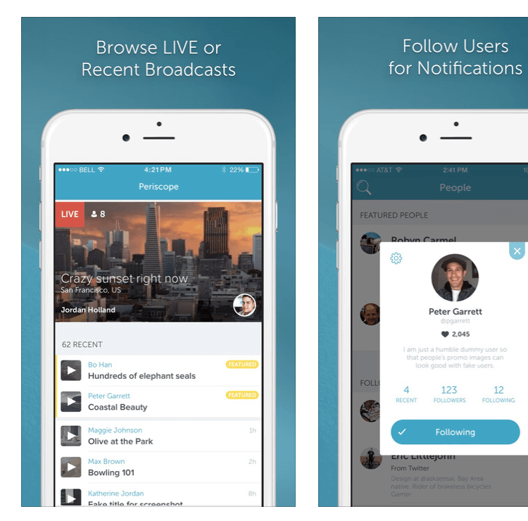
Focus Group Tested
Identifying your app’s most important features is one thing, designing screenshots that are understandable and encourage action is quite another. From the graphics used to the call to action or copy, and of course even color and font choices impact how potential users react to your screenshot design. Testing a variety of screenshot designs with a focus group made up of your target audience can provide actionable feedback that is hard to get anywhere else.
Two benefits of working with a focus group on app screenshots designs are:
testing a wider variety of design directions and calls to action
A completely different design direction that flops won’t impact actual conversion rates and installs like live-testing would.
qualitative and quantitative feedback. Most A/B testing on live traffic is data driven
“Screenshot Design A” converted at a 15% higher rate than “Screenshot Design B” so let’s go with “A”. With focus groups, we can get written feedback as to why a user liked one design over another, what was confusing, what they liked etc…
Increasing conversions in app store views from 25% to 30% (a 20% increase) can mean thousands of new users each month.
Order Testing
Maybe your app has 2 or 3 features that really set it apart, and you are not sure which to lead with? As we have discovered, the first 2 screenshots are visible in search results - so experimenting with order can have a real impact on conversion rates. Bamboo Apps shared they saw an increase of 50% in installs from rearranging screenshots.
A/B Testing
Multivariate testing (or A/B testing when there are only 2 variations) is virtually impossible on Apple’s app store, but Google Play recently announced support for testing of all sorts of app listing elements. Called “Experiments”, Google Play helps publishers test different icons, names, descriptions, and screenshots by country - and on whichever percent of live traffic we choose. Since these experiments are being run on live traffic, tests should be limited to smaller variations in screenshot designs, copy and order - and limited to one test at time for the best results.
Screenshot Localization
Depending on where your current traffic is coming from, screenshot localization can provide an easy improvement in conversions. Because screenshots are limited in scope, changing out text and graphics is much more simple than localizing an entire app. How screenshots are localized really depends on who the app is for and what it does, but the call to action copy is generally a pretty reasonable project for those new to app localization. A recommendation - don’t rely on Google Translate as we discussed in a previous post on app localization.
Optimization is an ongoing process of improvement where changes and gains add up. The optimization of an app's screenshots for conversion represents "low hanging fruit" for many app marketers and publishers. By implementing the above strategies for app store screenshots, your app will be positioned to achieve solid gains from small efforts.
More blog-posts like this:
How to Write an Apple App Store Description
Learn how to approach App Store descriptions the right way so you can effectively engage and convert users.
App Store Preview Video: Best Practices for ASO
Learn how to grab your audience's attention through effective and engaging app store preview videos.

App Store News - Gambling Ads Nixed, New NFT & Crypto App Regulation
Welcome to this week’s ASO Weekly - The App Store halts gambling ads amidst outcry and the Apple takes a bite out of NFT app sales.
