Analyzing Zillow's App Store Optimization: How It Stacks Up in the Real Estate Market
November 1st, 2024
 Tagged: App Metadata, App Ranking, App Screenshots, App Promotion, Aso Strategy
By Anh Nguyen
COO & Co-Founder at Gummicube, Inc
ZILLOW AT A GLANCE
Zillow Real Estate and Rentals is one of the most popular apps in the real estate market, helping users find homes, rentals, and comprehensive market insights with ease. As homeownership remains a cornerstone of many people's financial goals, apps like Zillow continue to see widespread usage. This is especially true given the rising trend of digital property searches, where consumers rely on mobile platforms for real estate browsing, renting, and purchasing decisions.
Zillow’s impact is evident in its app ranking. As of Oct 24, 2024, Zillow is ranked #4 in the Lifestyle category on the Apple App Store, reflecting its strong user base and brand recognition. However, even as a top-performing app, there are opportunities for improvement in its app store optimization (ASO) strategy, especially when it comes to keyword use and creative assets. This could unlock even greater visibility and conversions, ensuring Zillow remains a leader in an increasingly competitive space.
SEARCH RESULTS: EXAMINING ZILLOW’S KEYWORD STRATEGY AND VISIBILITY
When users search for real estate apps, Zillow is one of the first names that come up, particularly for high-volume keywords like “real estate app.” This is an important position to hold, given the intense competition in the property search market.
Currently, Zillow’s title is “Zillow Real Estate & Rentals - Buy & Sell Homes & Apartments,” which does a decent job of covering core aspects of the app. However, there is room to include additional high-volume keywords that could drive more targeted traffic.
The subtitle, “Buy & Sell Homes & Apartments,” provides a basic description, but it could provide clearer details about the app's functionality by utilizing target key terms. By refining its title and subtitle with these kinds of keywords, Zillow could enhance its visibility and attract more users.
Zillow’s icon is visually recognizable, creating immediate brand trust. However, there’s a notable absence of a preview video on its iOS listing. A preview video could be a game changer, providing potential users with a dynamic overview of Zillow’s key features. Videos often engage users more effectively, increasing the likelihood of a download, so incorporating this could significantly improve conversion rates.
ZILLOW’S METADATA: WHAT’S WORKING AND WHAT NEEDS OPTIMIZATION
Zillow’s metadata, which includes its title, subtitle, and description, plays a key role in how well the app ranks in search results. While the current metadata does a reasonable job, there are areas where optimization could lead to improved performance.
- Title: Zillow Real Estate & Rentals
- Subtitle: Buy & Sell Homes & Apartments
The title includes relevant terms like "real estate" and "rentals," which are essential for attracting users in the property search market. However, it could benefit from adding more varied, high-volume keywords that cover other key features, such as "house buying" or "property search." These additions could help Zillow capture users who may be searching with more specific intentions, rather than general real estate browsing.
The subtitle, while straightforward, could provide a clearer picture of Zillow's functionality. It could behoove Zillow to further their A/B testing in the future to see what additional key terms they could incorporate the subtitle to better target their niche audience.
Currently, Zillow’s metadata leans toward branding rather than functional descriptions. While brand recognition is crucial, Zillow could benefit from shifting the balance to focus more on keywords that directly describe its features. By doing so, it can attract users who are specifically searching for detailed real estate services, boosting the app’s discoverability in search results.

CREATIVE ELEMENTS: ARE ZILLOW’S VISUALS CAPTIVATING ENOUGH?
Creative assets, including screenshots and visual elements, are vital for turning app store visitors into actual users. For Zillow, these assets provide users with an overview of the app’s functionality and benefits. However, there is potential to enhance these elements to better engage users and increase conversion rates.
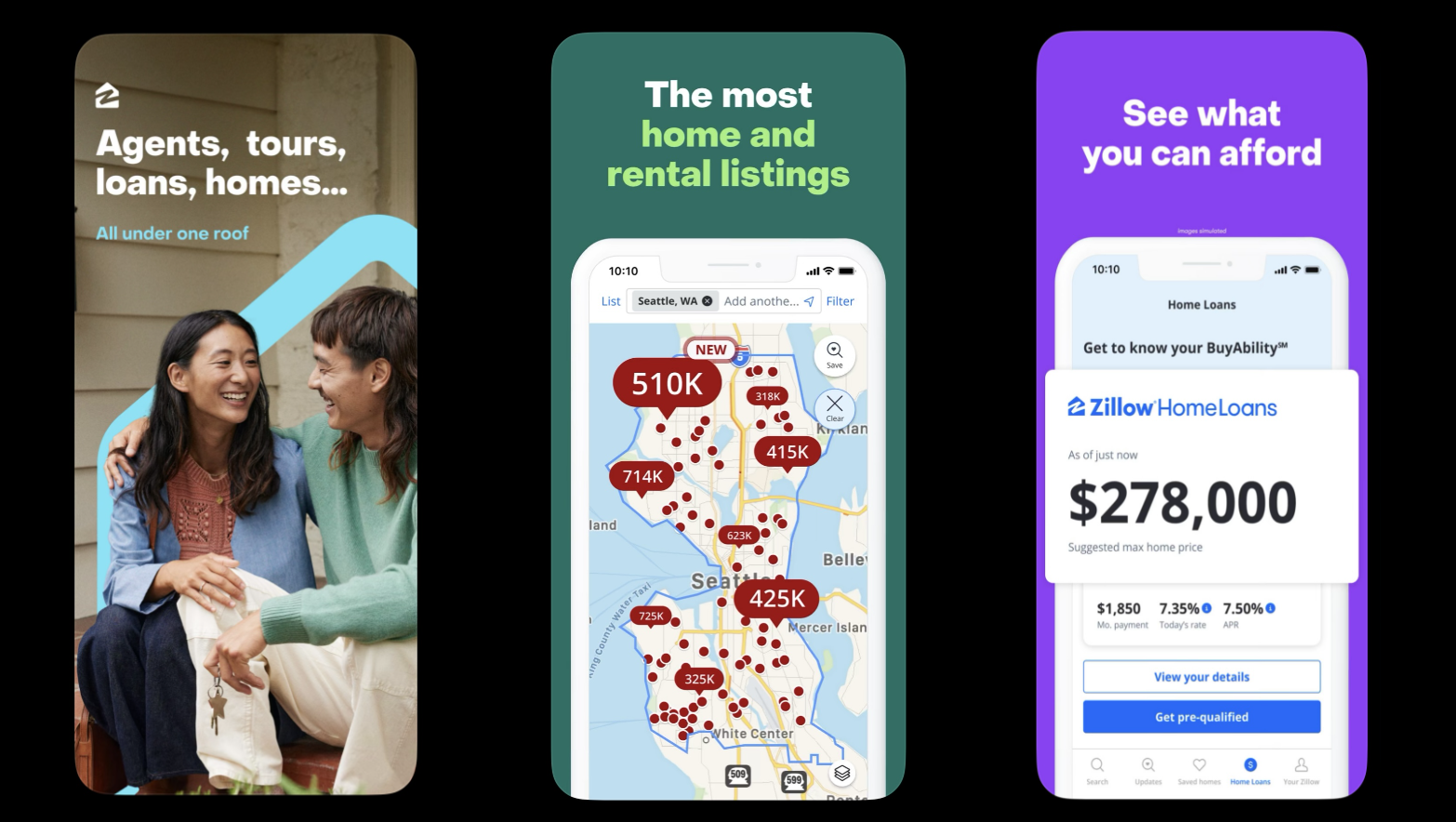
Research shows that the first three screenshots are crucial for driving conversions. With this in mind, Zillow’s media must be engaging and showcase its key features earlier in the screenshots. When you search the app, Zillow’s screenshots present a clear view of the app’s core functionalities, starting with the first screenshot that states, 'Agents, tours, loans, homes… All under one roof.' However, even with the inclusion of target keywords, this opening screenshot leaves room for further explanation. The following screenshots mention 'The most home and rental listings' and 'See what you can afford.' As mentioned earlier, A/B testing different aspects of these screenshots—such as color schemes, text variations, and imagery—would help Zillow discover what resonates best with users and leads to higher conversion rates.
Adding brief and bold captions that incorporate high-volume keywords could make the screenshots even more compelling. For example, captions like “Find Your Dream Home” or “Search Thousands of Rentals” could directly appeal to users’ search intent and help draw the connection between their needs and the app’s features.
One of the biggest missed opportunities for Zillow is the absence of a preview video. Videos can be a powerful tool to demonstrate the app’s value quickly and effectively. A short, engaging video could showcase Zillow’s ease of use, diverse property listings, and seamless user interface, providing potential users with a clear reason to download. Considering the app’s competition and market size, a video could be a significant factor in improving its conversion rate.
REDFIN VS. ZILLOW: WHAT’S WORKING AND WHERE ZILLOW LEADS THE WAY
What’s Working For Redfin and Where Zillow Leads the Pack
When comparing Zillow to its competitor Redfin, it’s clear that both apps bring unique strengths to their app store presence. Redfin currently ranks #27 in the Lifestyle category, far behind Zillow’s #3 ranking, which speaks to the power of Zillow’s brand and its ability to attract a larger audience. However, Redfin offers some noteworthy ASO strategies that Zillow could take into consideration—particularly in terms of keyword usage and how their features are showcased visually.
Keyword Strategy
Redfin’s use of keywords in its title and subtitle demonstrates a clear, user-focused approach:
- Title: Redfin - Homes for Sale & Rent
- Subtitle: Real Estate & Apartment Finder
These elements highlight high-volume search terms like “homes for sale” and “rent,” ensuring that Redfin appears in a broad range of relevant searches. This focus on search-driven keywords is an area where Redfin excels—its metadata is tightly aligned with what users are searching for when looking for real estate solutions.
Zillow, on the other hand, emphasizes branding more than search-specific optimization in its metadata. While Zillow’s brand recognition works in its favor, incorporating more or different functional keywords into its title and subtitle could help it capture even more organic traffic that leads to increased conversion rates.

CREATIVE STRATEGY: VISUAL IMPACT AND USER ENGAGEMENT
Both Zillow and Redfin utilize vibrant, eye-catching colors in their screenshots, which is a crucial strategy for grabbing user attention in a crowded app store. However, when it comes to visual execution, Zillow has an edge in several key areas:
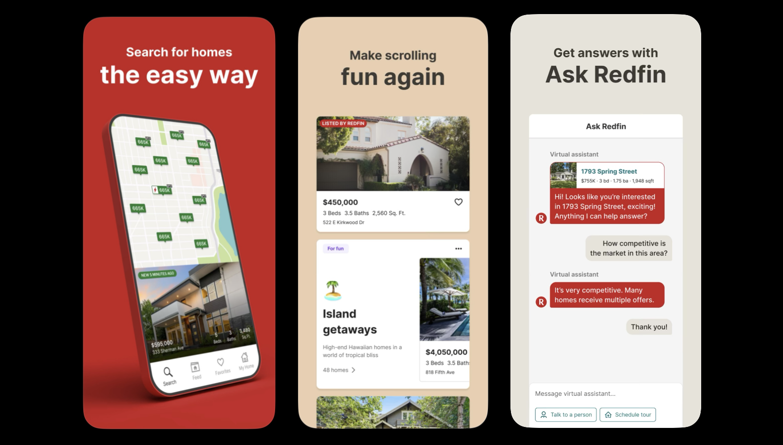
iOS Search Results Comparison: When comparing the iOS search results of both Zillow and Redfin, key differences in their presentation and engagement strategies become evident. Zillow opens its screenshots with bolder text, relatable imagery, and attention-grabbing screenshots. Redfin’s screenshots maintain a clean and professional aesthetic, but its reliance on uniform text and a more subdued design in comparison. This may explain why Zillow ranks higher in search results and attracts a broader audience. Zillow’s ability to better engage potential users directly from the search result view could give it an advantage, helping it convert more searchers into app downloads.
Text Presentation: Redfin's screenshots feature consistent bold, black text overlaid on its designs, creating a professional and clean aesthetic. This approach ensures readability but lacks visual diversity. The uniformity of the black text across all screenshots makes the presentation somewhat static, reducing the emotional or visual engagement that could otherwise compel users to download the app.
Dynamic Approach: In contrast, Zillow incorporates varying text colors and bold lettering in its screenshots, using contrast and design variations to enhance each image's impact. A particularly effective choice is the use of a real-life couple in Zillow's opening screenshot, which helps create an emotional connection with potential users. This relatable imagery conveys a sense of real-life engagement, making viewers feel like they are stepping into the journey of finding a home—something many can identify with. By portraying real people in real situations, Zillow fosters a sense of community and trust, encouraging users to download and explore the app further.
Graphics and Readability: Zillow's graphics are larger and easier to read than many competitors', allowing for a more straightforward user experience. Larger visuals paired with clear, concise text ensure that users can quickly grasp the app's offerings without straining their eyes. This accessibility is particularly important in the fast-paced mobile environment, where users often make snap judgments about whether to download an app based on its visuals.
By ensuring that all graphic elements are both eye-catching and easy to understand, Zillow successfully positions itself as a user-friendly option in the competitive real estate app market. Zillow's strategic approach to keyword usage and creative presentation sets it apart in this crowded marketplace.
Prioritizing emotional engagement through relatable visuals and ensuring its metadata is aligned with user searches, Zillow not only attracts a larger audience but also creates a more compelling user experience.
Implementing A/B testing for various app elements could provide valuable insights into user preferences, helping Zillow discover areas for improvement and optimization. As the app continues to evolve, it can take cues from Redfin's strengths while enhancing its own strategies for even greater visibility and user conversion.
CONCLUSION: ELEVATING ZILLOW'S ASO STRATEGY FOR CONTINUED SUCCESS
While Zillow holds a prominent position as the #3 ranked app in the Lifestyle category, there are still opportunities for it to enhance its app store optimization strategy. By refining its metadata to incorporate more high-volume keywords and leveraging dynamic creative assets, Zillow can significantly improve its visibility and conversion rates. Additionally, learning from competitors like Redfin can provide valuable insights into effective keyword usage and user engagement tactics.
As the digital landscape continues to evolve, focusing on these areas will ensure Zillow not only maintains its leadership in the real estate app market but also expands its user base and fosters deeper connections with potential homebuyers and renters. With thoughtful enhancements to its ASO strategy, Zillow can continue to be a trusted companion in the home search journey, guiding users to their next dream property with ease and efficiency.
LET’S CHAT!
For those looking to sharpen their app store strategies, Gummicube is here to help. From A/B testing visuals to refining keyword selection, our team can guide you in optimizing your app’s presence for maximum visibility and engagement. Ready to elevate your app? Let’s connect and make it happen.
More blog-posts like this:

Timeleft: Finding Friends, But Is It Finding App Store Visibility?
A/B testing alternative subtitle structures, and experimenting with screenshot designs could set Timeleft apart from its competition. Read more!

Checking In on Booking.com's ASO Strategy
Success in the App Store is driven by a combination of discoverability and conversion. Apps that excel in both areas consistently outperform the competition.

Mark Your Calendar: Howbout's ASO Audit
By introducing dynamic design elements & leveraging ASO tools such as App Store video and A/B testing, Howbout can significantly enhance its App Store listing.
