How to Write an Apple App Store Description
Posted on July 17th, 2024
Learn how to approach App Store descriptions the right way so you can effectively engage and convert users.
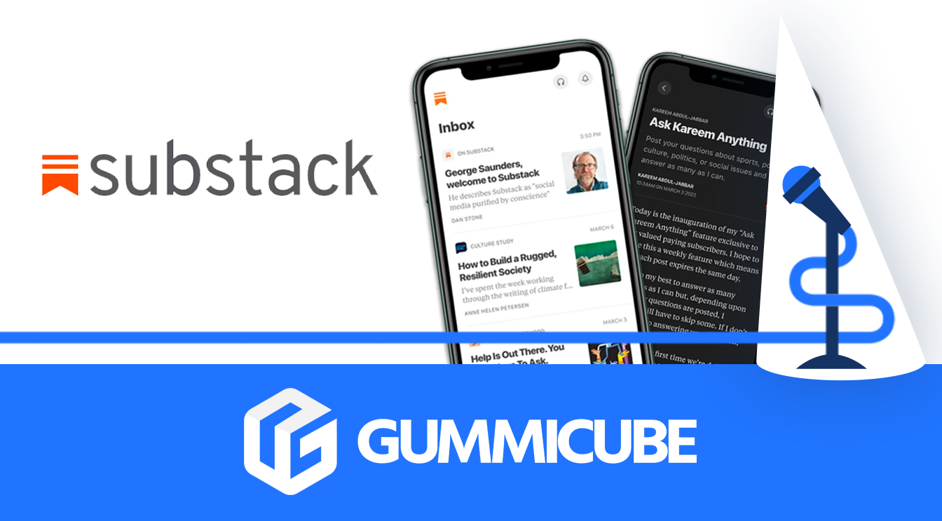
Readers and writers come together on a unique social media meets reader app, Substack Reader. In this unique fusion of an app, users can discover their new favorite writers in an industry that’s largely difficult to penetrate.
Our world is becoming more digitized, and App Store Optimization (ASO) ranking factors play a large role in how new and existing users interact with your app. Our apps are the extensions of our business and are largely different from other modes of marketing. Substack is a web-first platform, but how can it see larger success on the app store organically?
ASO marketing can be defined as metadata, creative and paid mobile user acquisition optimization. It’s a process that helps developers and mobile marketers organically gain traction on the app stores.
Mobile app promotion, whether in or out of the app stores, relies on a synergistic combination of optimized screenshots and keyword phrases. There are three vital fields for each app store platform each developer has to use to their full potential.
For the Apple App Store they are:
The iOS App subtitle, app titles and keyword banks are all fields where iOS keywords get indexed. Substack’s current subtitle is:
“The home for great writing”
While this is a great way to continue with branding from the app name, subtitles are often forgotten places to increase visibility on the app store. The iOS metadata fields are indexed non–sequentially; this means that all keywords are compiled and then strung together to make ranking phrases.
With the title and subtitle, Substack has limited visibility capabilities in these fields. Including the word “app” in the title alone would make a large difference in indexation opportunities. When users search for a particular query on the App Store, it’s vital to see what exactly they search for and what word associations they have with your app. ASO technology like DATACUBE can help.
An app creative set is directly responsible for converting your users on the app store. Whether they’re screenshots, feature videos, or your app store icon. Screenshots are an integral part of the ASO process. It’s the step where your creative sets are optimized to convert users. So, they should be as informing as they are captivating for new and existing audiences! Currently, Substack Reader uses some ASO best practices for screenshots like use of handset and branded colors.
These elements help drive users toward a download. However, use of handset is typically accompanied by visual copy. Visual copy helps users understand what the screenshot is about, and supplies them with any possible feature expectations. Our ASO company has found that without visual copy, users are led to come to their own conclusions and this may even dissuade them from downloading the app.
We have a reader and a writer in all of us, and Substack makes it easier than ever to connect with that side of ourselves. To be more visible on the app store, it’s crucial to have ASO best practices that help you drive better discoverability on the App Store. This way, Substack can attract a new wave of eager readers and aspiring writers!
Want to learn more about App Store Optimization? Contact Gummicube and we’ll help get your strategy started.

Learn how to approach App Store descriptions the right way so you can effectively engage and convert users.
Learn how to grab your audience's attention through effective and engaging app store preview videos.

Welcome to this week’s ASO Weekly - The App Store halts gambling ads amidst outcry and the Apple takes a bite out of NFT app sales.