5 Best Practices for Apple Search Ads
Posted on July 3rd, 2024
Are you leveraging Apple Search Ads the right way? Take a look at these recommendations to optimize your paid campaigns and target the right users.

Apple Search Ads can help an app appear at the top of search results for terms they target. Since this is important for visibility and App Store Optimization, it’s common for developers to target terms they already rank #1 for as a defensive strategy to protect their strongest keywords and brand name. When this happens, it may feel redundant for the same app to appear twice in a row. A recent update to Apple Search Ads has addressed this by changing how the creative sets are displayed.
When an app appears in Apple Search Ads, its creatives are displayed with the ad, the same as any other app. In 2018, Apple also added Creative Sets to Search Ads, which developers can customize to better align with targeted keywords and audiences.
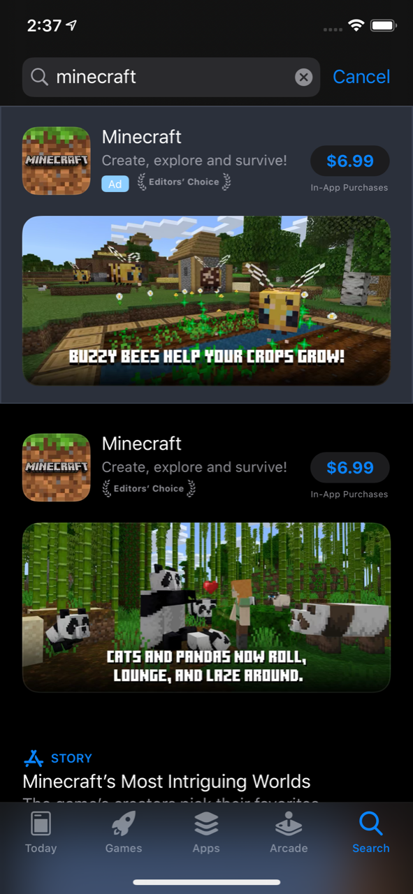
Following this recent change, if an app has a Search Ad in the same search results that it already ranks #1 for, the creatives it displays on the organic search result will be different. This will display more screenshots in a single search result.
In the case of apps using landscape-oriented creatives, the Search Ads will display the first video or screenshot in the App Store listing. The app’s organic listing in the #1 spot will then display the second video or screenshot.

For App Store listings using portrait-mode creatives, the Search Ads result will display the first three. The organic listing will then show the second three, for a total of six creative elements displayed in one search result.

When an app appears in search results, the creative set provides an important early impression. Typically, the first one to three (based on whether they’re landscape or portrait mode screenshots) have the biggest impact. Many developers neglect the screenshots past three, while some don’t even use six. It is now more important that they fully utilize more of their screenshots, not just the first three.
With this change, the remaining screenshots can have an important impact on first impressions. Mobile ads have less than a second to make a first impression, and a similar concept applies to App Store screenshots. The screenshots must be engaging and make an impact on the users the instant they appear.
Each of an App Store listing’s screenshots should be tested and designed to drive conversions. This is especially true now for apps running Search Ads campaigns. Being able to include multiple screenshots in the same search result can provide more information about the app to users, helping improve the odds of gaining new installs.
Want more information regarding App Store Optimization? Contact Gummicube and we’ll help get your strategy started.

Are you leveraging Apple Search Ads the right way? Take a look at these recommendations to optimize your paid campaigns and target the right users.

Ghostly happenings are among us... and in your app listing too? If you aren't leveraging the power of app seasonality to make relevant tweaks to your store listing you're leaving precious engagement and conversions on the table.

Developers on the iOS App Store should plan in advance of the upcoming Holiday Schedule to allow enough time for apps to get approved during the busy holidays.