5 Best Practices for Apple Search Ads
Posted on July 3rd, 2024
Are you leveraging Apple Search Ads the right way? Take a look at these recommendations to optimize your paid campaigns and target the right users.

While WWDC 2019 was filled with many major announcements, one important piece of news was a new App Store designed for watchOS. While previously, users would have to purchase apps from the iOS App Store to access the watchOS versions, this new wrist-mounted storefront will allow users to download apps directly to their Apple Watch even when their phones are elsewhere. Since users are going to start searching for Apple Watch apps directly from their watches, it’s important to think ahead and contemplate App Store Optimization strategies for watchOS apps.
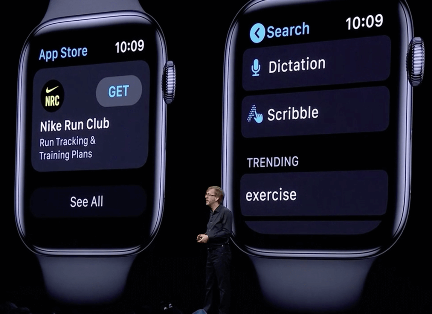
While we won’t know everything about the watchOS App Store until its release with watchOS 6, we were shown several preview images at WWDC. One important feature is that users search for terms by dictating them to the watch or writing them by hand with the “scribble” function.
How this will impact user searches will be made clear in time as users begin searching on the store. It is entirely possible that users will search for different lengths of words or phrases when they dictate searches compared to when they scribble them, or just search for shorter terms in general.

An app’s star ratings will be one of the few aspects visible directly from search results. This will impact conversions, as users will get a good idea of how well an app is received as soon as they see it. Reputation management is important for apps on any store, although it may be particularly essential on watchOS, where ratings are prominently displayed.
When creating apps with watchOS capabilities, developers already have to create screenshots that show how the app will look on an Apple Watch screen. Screenshots must be 312 x 390 pixels for Series 3 watches, or 368 x 448 for Series 4.
Previously, these screenshots had to be designed to be viewed on iPhone screens while reflecting how they’d look on Apple Watches.
As shown during Apple’s demonstration apps on the watchOS App Store will be displayed similarly to how they are on the iOS App Store. Along with the app’s title, subtitle, icon and rating, users will see the first two screenshots. These two images should catch users’ attention and display the top features of the app. Given the Apple Watch has a dark background, brighter colors may stand out more, while darker shades will blend in with the rest of the screen.
While viewing the app within the watch, users can scroll through each of the ten screenshots. As with any app creatives, these should be engaging and demonstrate the app’s functions. Apple Watch screenshots do not typically include callout text or extra design features, but this is currently an option. The screenshots need to stand out at a glance, so callout text should not prevent users from seeing the full screenshot on the small watchOS screen. How this will change with the watchOS App Store has yet to be seen, but the creative sets need to be visually engaging and informative.

The watchOS App Store will include an app’s descriptions, just as the iOS App Store does. One key aspect of ASO for iOS apps is that the descriptions are kept short and sweet so users can glance over them while scrolling through the listing. The Apple Watch screen is even smaller, so descriptions should be kept shorter too.
App descriptions are likely to still need to include keywords related to the app while remaining short. While it may be a difficult balance to strike, it may be essential for conversions.
For instance, while a TV streaming app on the iOS App Store could say “Stream your favorite shows and watch them on the go anytime, anywhere,” a watchOS app description may want to shorten it to “Stream TV on the go.” This is easy to read from the watch screen while scrolling, yet still connects to potential keyword searches and provides relevant information. It could then utilize bullet points to list the shows available, so users can quickly scroll through and see what the options are.
While the watchOS App Store is still on the horizon, it’s important to prepare now. Apple has revealed how the search will work and how apps are displayed, which provides valuable insights into how developers should optimize their apps.
What has yet to be seen is how the new search functions will impact how users search for apps and the keywords they look for.
When users begin searching on the watchOS App Store, apps will need to be optimized for visibility and conversions. This is especially important for apps available only on the Apple Watch, which Apple will be enabling with the new watchOS. Those apps will not be able to benefit from their visibility on the iOS App Store or any optimization there, so they must be optimized for the store they’re on.
No matter where an app is available, App Store Optimization is necessary to reach the widest audience possible.
Want more information regarding App Store Optimization? Contact Gummicube and we’ll help get your strategy started.

Are you leveraging Apple Search Ads the right way? Take a look at these recommendations to optimize your paid campaigns and target the right users.

Ghostly happenings are among us... and in your app listing too? If you aren't leveraging the power of app seasonality to make relevant tweaks to your store listing you're leaving precious engagement and conversions on the table.

Developers on the iOS App Store should plan in advance of the upcoming Holiday Schedule to allow enough time for apps to get approved during the busy holidays.