Leveraging ASO Tools to Boost App Conversion Rates
Posted on April 2nd, 2026
Developers who rely on data-driven insights gain a significant advantage, enabling them to optimize their App Store presence with precision and confidence.

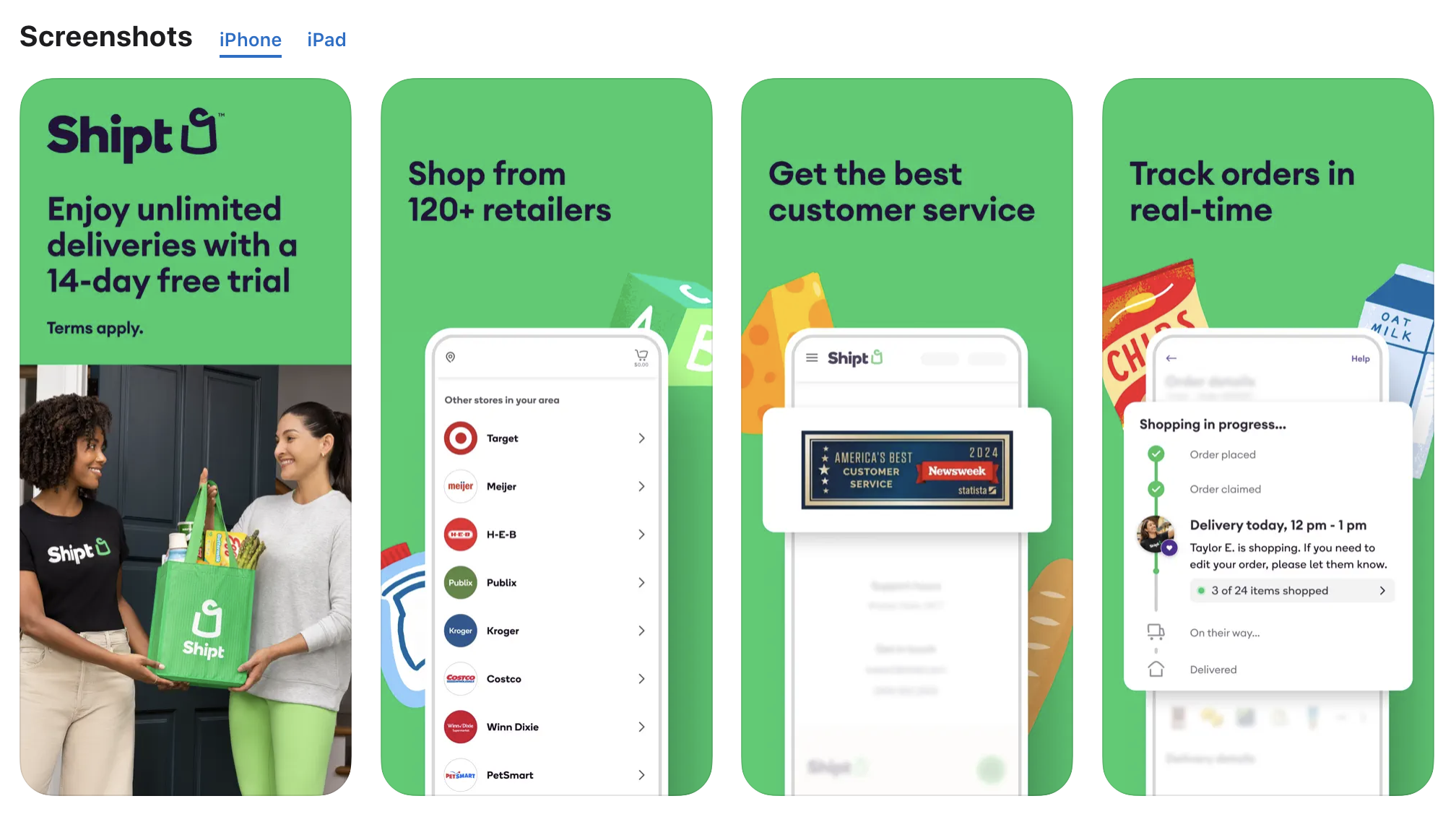
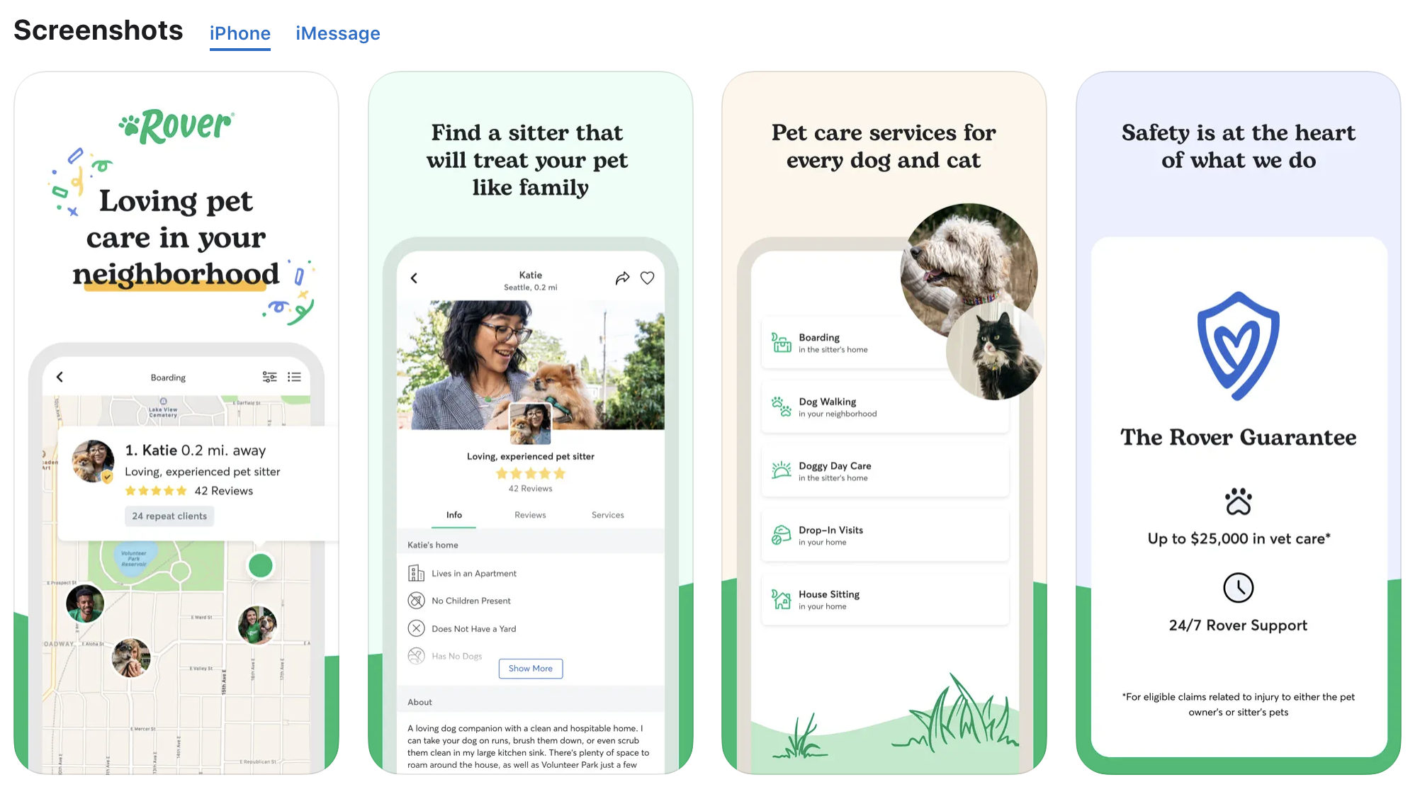
Screenshots are not just visual add-ons—they're essential to an app's presence in both the App Store and Google Play. As the first thing users see after your app’s icon, screenshots serve as a powerful introduction to what your app offers. With millions of apps available, these visuals must be optimized to immediately grab attention, showcase functionality, and drive conversions. But are screenshots really that critical to app store success? Absolutely.
Research shows that a significant portion of users—about 70% on the App Store—download apps directly from search results. That means users often make their decision based on just a quick glance at your app’s listing, especially the icon and the first few screenshots. This makes the initial first look even more critical, as those first images need to communicate value immediately. If the visuals don’t capture their attention or convey what your app does, users are likely to scroll past to another app.
By the time users arrive at your app's listing, they’re already evaluating whether it's worth downloading. This is where well-crafted screenshots come into play. More than just eye candy, these visuals act as a bridge between curiosity and action, showing users what to expect from your app in a way that text alone can't convey.

When a potential user stumbles upon your app, first looks are everything. Think about the last time you browsed for an app—what caught your eye first? For most users, the app's screenshots take center stage. These images provide an immediate sense of the app’s design and capabilities.
Screenshots are crucial because they serve multiple functions:
The power of standing out against competition cannot be overstated. Screenshots essentially tell a visual story about your app’s value proposition, showing users what makes your app unique while evoking an emotional response. Whether it's demonstrating smooth navigation or illustrating an intuitive interface, screenshots must deliver a compelling argument for why users should hit the “Download” button.
Now that we’ve established why screenshots are important, let’s dig deeper into the key benefits they provide. These images do more than just beautify your listing—they communicate vital information quickly and effectively.
Here’s how screenshots benefit your app store strategy:
Accurate and representative screenshots can also help reduce user churn. When users know exactly what they’re getting from the images, they are less likely to be disappointed after downloading, leading to higher retention rates. The clarity you provide through your screenshots sets expectations and helps your app stand out from the competition, making a strong case for your app in just a few images.

While effective screenshots are essential for attracting users, their role doesn’t stop at downloads. High-quality visuals can also play a significant part in user retention, influencing how users perceive and engage with your app long after they’ve downloaded it.
Screenshots are not just for attracting downloads—they play a vital role in setting user expectations from the moment they land on your app listing. These images do more than display your app’s design; they establish what users should expect when they open your app for the first time. By providing a visual preview of your app's core features and functionality, screenshots help smooth the transition from curiosity to action.
When users download your app, they’re already making decisions based on the expectations set by your app store listing. The onboarding process should reaffirm those expectations, ensuring users recognize the features that initially drew them in.
Consistency between your screenshots and the in-app experience builds trust, reduces user frustration, and reinforces the value proposition that encouraged them to download your app in the first place.
Consider these strategies for maximizing the impact of screenshots during onboarding:
Using your app store screenshots to bridge the gap between initial interest and long-term engagement can significantly enhance the onboarding process. By consistently re-emphasizing key features, you can reinforce your app’s value, making users more confident in their decision to download and more likely to continue using it.
Another aspect of user retention is fostering a sense of community among your users. Screenshots can facilitate this by showcasing user-generated content or testimonials within your app:
By leveraging user-generated visuals, you can cultivate a community that feels connected to your app, leading to increased user loyalty and satisfaction.
Once you understand the importance and benefits of screenshots, the next step is to optimize them for maximum impact. But what does that look like in practice? Screenshots should be treated as a marketing tool rather than placeholders in your app’s listing. Every image should be intentional, and designed to inform and engage potential users.
Here are some best practices to keep in mind:
By following these practices, you can create a visually compelling narrative that draws users in, showing them exactly what your app can do. This level of transparency helps build trust and increases the likelihood of conversion, especially when users can quickly understand the app’s value through its screenshots.
Prioritizing Clarity in Screenshot Design
When optimizing your app’s screenshots, clarity is a key factor that’s often overlooked. While stunning visuals are essential for capturing user attention, ensuring that these visuals are easy to understand for all users should be a top priority. Screenshots that are clear and easily digestible not only improve the user experience but also broaden your app’s appeal to a wider audience.
Rather than focusing solely on aesthetics, consider the following when designing clear and user-friendly screenshots:
By prioritizing clarity in your screenshot design, you’re not just improving the visuals—you’re enhancing the overall user experience. Clear and easy-to-understand screenshots allow your app to be instantly appreciated by a broader audience, ensuring that your product makes a strong first impression on potential users.
Even with best practices in place, there’s always room for improvement. This is where ASO technology like A/B testing comes in, allowing you to test different screenshot designs and identify which visuals drive the most engagement. Not all users respond the same way to specific images, so continuous testing is essential to optimizing your visual assets.
Why should you test your screenshots? A/B testing gives you insight into what resonates best with your audience:
By making data-driven decisions, A/B testing empowers you to continuously refine your visuals. Even small tweaks can lead to significant improvements in user engagement and conversion rates.
When crafting your screenshots, it is imperative to recognize and avoid common pitfalls that can significantly impact user perception and download rates.
Here are some pitfalls to watch out for:
Deviating from user expectations with misleading visuals can lead to negative reviews and uninstalls. Transparency in your screenshot design is non-negotiable—it fosters trust and credibility among potential users.
Being mindful of these mistakes will help you maintain a polished and professional app listing, while also avoiding negative user experiences that could harm your app’s reputation.
Screenshots aren’t just an optional add-on for your app listing—they’re a crucial part of your app’s success on the App Store or Google Play. In today’s competitive app market, having a well-optimized set of screenshots can be the difference between a user downloading your app or scrolling past it.
By carefully selecting and optimizing your screenshots, you can provide potential users with a clear, engaging visual story about your app. Whether it’s demonstrating core features, showing off the design, or simply giving a glimpse into the user experience, screenshots help bridge the gap between what your app does and what the user expects.
For developers and marketers alike, investing time and effort into creating high-quality, relevant screenshots is essential. Not only do these visuals attract attention, but they also build trust and excitement about your app’s capabilities.
As the competition for app downloads continues to grow, those who use visual assets effectively will have a significant advantage. So, whether you’re preparing to launch a new app or updating an existing one, make sure your screenshots reflect your app’s best qualities—and don’t forget to follow platform guidelines for the best results.
Ready to enhance your app store strategy? Take a moment to evaluate your screenshots today. If you need assistance or want to dive deeper into app store optimization, reach out to Gummicube for tailored solutions to boost your app’s success.

Developers who rely on data-driven insights gain a significant advantage, enabling them to optimize their App Store presence with precision and confidence.

A successful feature graphic combines strong design, clear messaging, strategic keyword use, & alignment with your entire ASO strategy. Read more to learn more!

Winning ASO marketing strategies start by taking a comprehensive, data-driven approach, that can lead to unlocking the full potential of your app. Read more!