App Store Screenshot Dimensions & Guidelines
Posted on August 1st, 2024
Make sure your app stays compliant with the latest App Store Screenshot Dimensions & Guidelines here

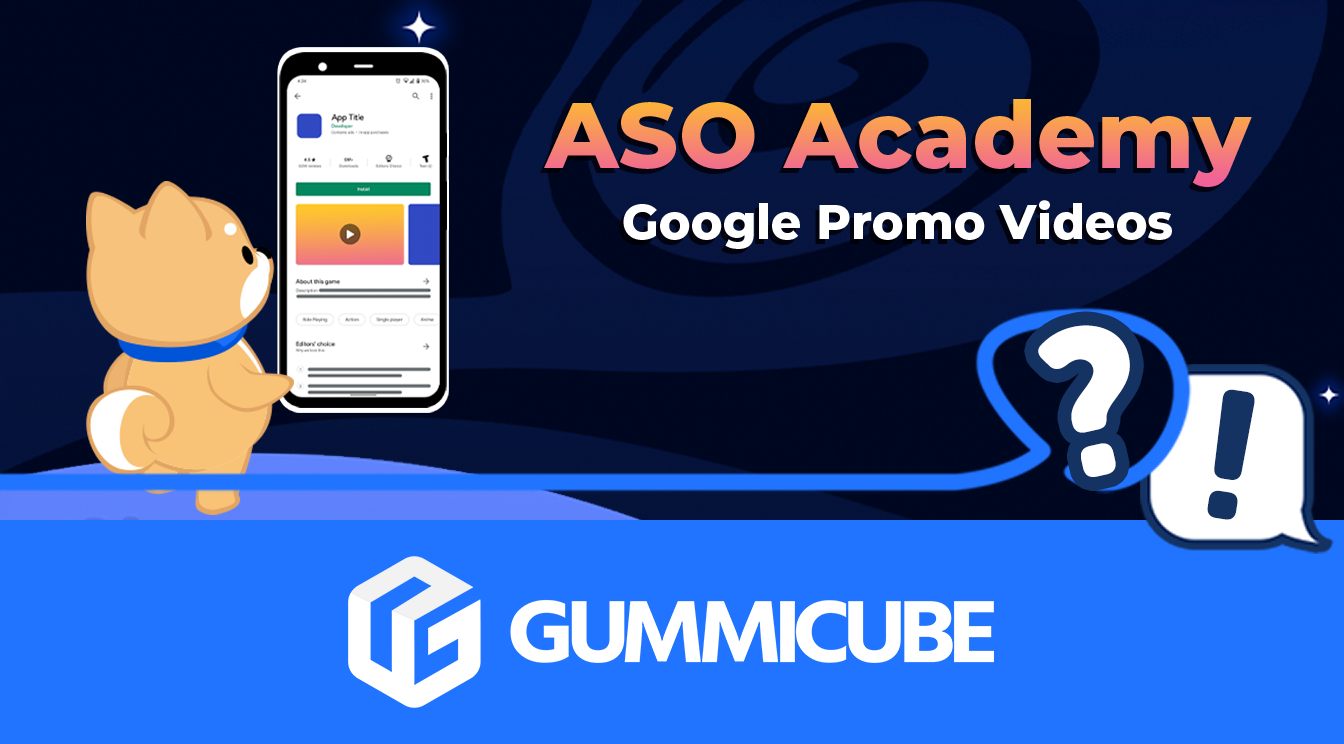
Google Play Store Videos provide developers with a dynamic, engaging way to let potential users know what their Play Store app is all about. Similar to Apple App Previews, these are optional creatives that, when enabled, are placed at the forefront of your Store Listing.
However, unlike Apple App Previews, Google Play Store Videos do not have a laundry list of strict guidelines in place. While this might seem like an opportunity to try out all sorts of different treatments, fewer policy guidelines open up the possibility of using a video that isn’t optimally structured to convert potential users.
Read on to learn what guidelines Google does have in place, what recommendations it provides, and some best practices to have a better chance at converting more visitors into acquisitions.
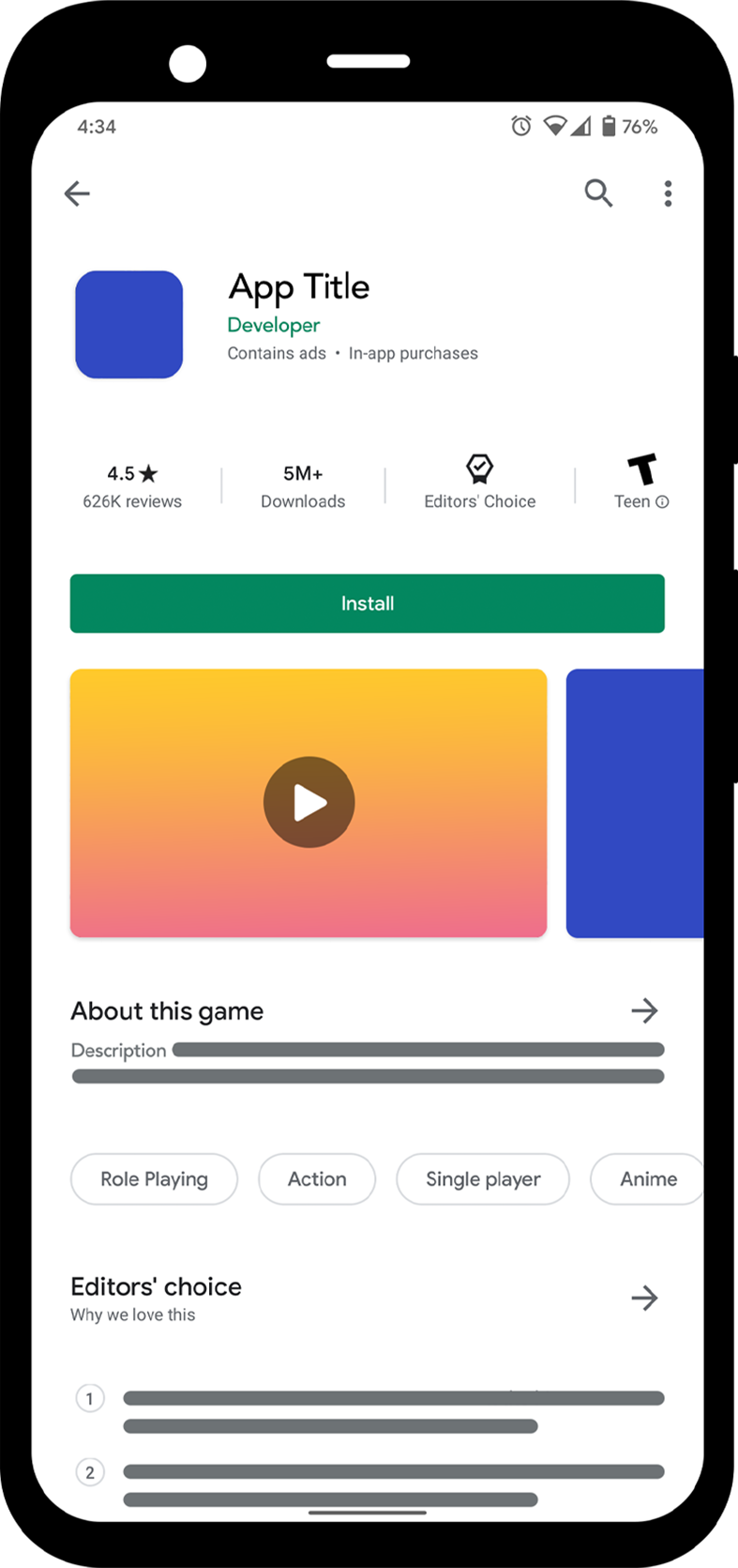
Play Store Videos occupy the first slot of your Product Page Gallery view, making them potentially the most important creative element on the page. Depending on a user’s device, settings, connection, or screen surface area, Play Store Videos can autoplay upon viewing the Product Page. If they don’t autoplay, the static Feature Graphic image will be displayed until the user manually taps to play the video.
Preview Videos are, very simply put, YouTube URLs entered into the Developer Console that then get displayed on the Product Page. As a publisher, you might think that simply linking a YouTube URL to any video you upload is enough, but that’s not the case.
It’s important to know the requirements and recommendations set out by Google. This includes being aware of the dimensions, restrictions, and content suggestions established by Google.
Below you can find Play Store guidelines to help you create a preview video that is sure to get approved and contribute to app store growth.
The first step in making a great Play Store Video is ensuring it follows Google’s guidelines in terms of what is accepted. Considering the video, if used, can be your most prominent creative, following the Play Store’s requirements will be critical in getting approved and not delaying your publication process. Edits on a preview video can take much longer than on static screenshots, so getting it right the first time can avoid lengthy setbacks.
As mentioned before, Google does not have as many strict guidelines compared to Apple. That being said, they still have rules to follow:
Along with their guidelines, Google has some “highly recommended” suggestions to follow. These include uploading your Play Store Video in landscape mode, as the video player will display them in this format. Consider all the possible placements your Preview Video may appear in other than your product page, such as the home page, search page, or app recommendations, as well as how it plays.
Uploading a video that gets shrunk down or has black bars on the sides in certain displays will likely not convert as well as one that utilizes the maximum screen area available.
Your Preview Video only autoplays the first 30 seconds, so deciding what goes into those initial moments will determine how your video is initially – potentially entirely – received by users. Placing your hook in the opening seconds of the video is a good way of attracting viewers right away.
When it comes to what is allowed within your Preview Video there is content and terminology that is acceptable according to Google. According to Google Play Developer Guidelines, Preview Videos are recommended to not include words like “best”, “#1”, or similar terms that can “suggest Play Store performance”.
While value propositions and accolades are important conversion drivers, you shouldn’t make claims regarding app ranking in your Preview Video. Developers should also avoid certain promotional words or calls to action, such as “free”, “discount”, or “download now” per Google’s suggestions. While these suggestions may pass Play Store review, they may make the app ineligible for promotion or featuring on the Play Store.
Similar to Apple’s strict guidelines, Google discourages the inclusion of handsets in the video, unless the main app experience is off the device. Footage of users interacting with a device can be included (unlike on the App Store) but should be limited in comparison to a display of in-app functionality. As per Google’s recommendations, developers should aim to have at least 80% of their video accurately display the user experience. Showing in-app or in-game footage is your best bet at staying eligible for promotion by Google and also keeping users engaged with your video’s content.

Consider how and where your Preview Video appears. By doing so, you know exactly how to structure your content and the initial moments of your video.
Google Play Preview Videos are a great way to attract potential users, provide a glimpse into your app experience, and convert those interested enough. Following Google's guidelines is a starting point in a developer’s journey to success. In addition, there are ASO best practices that should be applied to increase your chances of having users download.
Without a hard time limit like Apple has, it may be tempting to explain every single detail of your app. However, avoid filling your video with fluff and stick to the core mechanics that make your app different from the competition – you’re not trying to hit the 10-minute mark on this YouTube video.
Highlighting unique value propositions from the start allows you to maximize the time given during a video’s autoplay period while communicating the most important aspects of your app when a user is likely paying the most attention.
It’s recommended you follow the advice Google gives when it comes to creating video ads and apply it to your Preview Videos by keeping them under 3 minutes long. According to Google, Preview Videos below this time frame usually perform better than those over 3 minutes.
Keep in mind that while this is a YouTube URL, your Google Play Preview Video is not being watched on YouTube, it’s being viewed on the Play Store Product page. User viewing habits will be much briefer. Give them the information they need as soon as possible to get them to convert to an install.
You might have a great video, but what if a user doesn’t see it? This is where your Feature Graphic comes in handy. Your Feature Graphic is a still image that acts as a thumbnail for your Preview Video. It is the paused state of your Play Store video before it plays so having a standout image can be a powerful engagement driver for your video.
Creating an image that effectively communicates your app core features and standout proposition is a great way to attract a user to the rest of your creative sets, whether that be playing the video or viewing the rest of the screenshots. Consider using the “safe area” of your Feature Graphic to include popular imagery that can prompt users to click the video or ideally, download.
Unlike the iOS App Store’s Poster Frame, which must be a still image timestamped from the video itself, the Feature Graphic is its own independent 1024x500 image. This allows Play Store developers to create a specific graphic for its purpose without needing to find a way to squeeze it into the video.
With most users viewing Preview Videos with the sound off, having relevant supporting text is essential to your content. By including emphasized text elements and visible copy you can provide context to what users are viewing while their audio is off. Prioritize copy just as you would other elements of your video so that both pieces of content work in synergy to provide useful information about your app.
As with any marketing strategy, conducting continuous market research is what will allow you to understand what is currently working among Preview Videos and what needs improvement. Take a look at your competitors to see how their videos are possibly contributing to current performance and how you can improve upon their approach.
Leverage powerful ASO tools and technology to help you make better decisions as to which variations of Preview Videos convert better. Through A/B tests you can evaluate different creative options that can help narrow down your strategy and optimize each creative asset of your listing, including Preview Videos.
Developing a Google Play Store Video may seem “easier” than an App Store Preview Video due to guideline differences, but creating a quality video that converts requires a solid understanding of Google’s guidelines and ASO best practices. As with any creative asset, developers should research the market to see how they can stand out among competitors, A/B test different treatments that keep compliance guidelines in consideration and build upon what works best.
Creating a compelling Preview Video can be a great avenue for enhancing an App Store Optimization plan. Take advantage of the power of video in today’s content and marketing landscape to attract even more users and potentially increase your app downloads.
Want more information regarding App Store Optimization? Contact Gummicube and we’ll help get your strategy started.

Make sure your app stays compliant with the latest App Store Screenshot Dimensions & Guidelines here

Soon developers will be able to extend their customer lifetime value with a handy new way of providing subscription offers directly through Apple. Contingent Pricing looks to act as a revolutionary new system for leveraging new upsell & cross-sell opportunities all within Apple’s ecosystem.

Have you ever A/B tested your Google Play listing? If not, you're probably navigating the Play Store marketing blind, and leaving valuable installs on the table.