The Children's Place App: Shopping for ASO Insights
Posted on March 20th, 2026
Read more to see how The Children’s Place can implement winning ASO marketing strategies that could improve both app visibility & conversion rates.

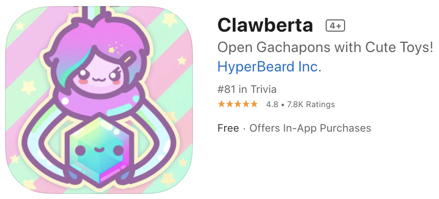
In this week’s App Store Spotlight, we look at Clawberta, a quirky and cute game featured in Apple’s “Keep It Weird” collection.
Clawberta follows the adventures of the titular character, a kawaii anthropomorphic claw machine, as she collects gachapon toys and coins across five unique worlds. You must help Clawberta collect 100 toys in each world to unlock the next, and once you complete your collection there is a special prize in store.
Clawberta is fun and funky, with bright colors and cute toys begging to be collected. But are the right ASO elements in place to grasp new users once its App Store feature is over?
The Title and Subtitle on the iOS App Store are important areas for keyword indexation. With a maximum 30 characters allowed for each field, these areas should represent what the app is all about so users can understand what to expect, and Apple’s algorithm can understand how to index it in search results.

Clawberta’s App Store listing only uses 9 of the 30 characters allowed, only displaying the name with no additional terms. Relevant, high-volume keywords like “gacha” and “claw machine” could be added to describe the app and target additional keywords.
Clawberta’s subtitle, “Open Gachapons with Cute Toys” is doing a bit better by using most of the space provided, at 29 of 30. However, there is room for improvement by replacing low-volume terms that do not build additional long-tail phrases to further refine how many overall keywords can be targeted. For both the Title and Subtitle fields, terms can be adjusted not just for keyword targeting, but to see how they impact conversion rates.
Clawberta’s description is definitely “on-brand” with its whimsical tone and amusingly exaggerated language. It does a decent job of describing the app to users, but where the branding tone of voice definitely stands out, the features of the app could be highlighted more with quick bulleted lists that are easy for users to read.
While descriptions on the App Store are not indexed for organic search results, they are indexed for Apple Search Ads. Clawberta’s short description - coming in at around 640 of the 4000 maximum allowed - could use more of this space to target important terms for ASA.
An organized list of features after the kawaii intro could allow Clawberta’s quirkiness to shine, let users easily scan and glean details that they may not have otherwise read, and give Apple’s algorithm more information on terms to serve it for in discovery campaigns.
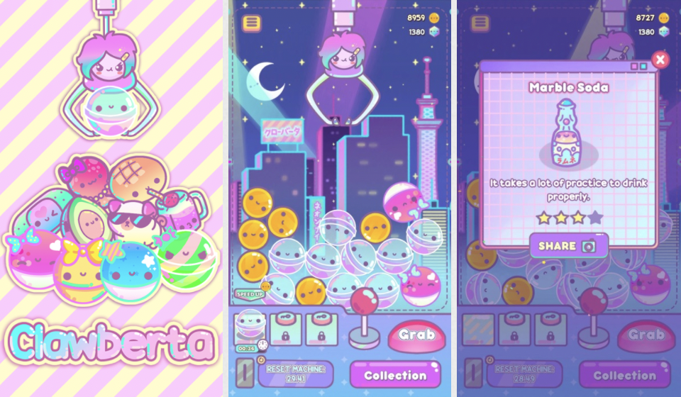
Clawberta’s screenshots are colorful and cute, and they definitely reflect the style of the game. While the user interface is easy to see in the screenshots, the gameplay features aren’t so readily discernible. There are a few best practices for screenshots that Clawberta could incorporate to better communicate details about the game.

The most apparent issue with Clawberta’s screenshots is the lack of text callouts. Users may forego reading the description, or simply decide to download a game based on what they see in search results, instead downloading based on what they gather from the screenshots. Clear, readily visible text callouts in the cute and creative branded font can help get more information across faster to users quickly scanning through search results and product pages.
Another element that can be tested is framing the screenshot in a device frame with added background and foreground elements, rather than a full-screen in-app image. So long as the gameplay holds true-to-life per Apple’s guidelines, this treatment could allow the gameplay of Clawberta to come through while further highlighting its cute characters and environments.
Clawberta definitely has a vibe and style all its own, deserving of its spot in Apple’s “Keep It Weird” collection. Its claw-waii characters and whimsical gameplay are sure to attract gachapon fans of all ages.
While Clawberta can currently be discovered via a Today Tab collection feature, its search discoverability potential is limited by its lack of keyword use, and it may be difficult keep clawing in new users without testing changes to screenshot design treatments outside of direct in-app images.
Want to learn more about App Store Optimization? Contact Gummicube, and we’ll help get your strategy started.

Read more to see how The Children’s Place can implement winning ASO marketing strategies that could improve both app visibility & conversion rates.

Apps that evolve alongside their audience can maintain visibility in its app category through regular A/B testing, and iterations based on real user behavior.

By evaluating SeedTime's app title, subtitle, icon, screenshots, we can identify what the app is doing well & where ASO opportunities exist. Read more!