ASO Spring Cleaning with Sweepy
Posted on March 27th, 2026
In this week’s App Store Spotlight, we are taking a closer look at Sweepy: Home Cleaning Schedule. Read more to see how the app can improve its ASO strategy.

This month marks Mickey Mouse's 90th anniversary, so the Disney apps are celebrating. As such, it’s the perfect time to take a look at the App Store Optimization for one of their apps. For this week’s App Store Spotlight, we visit the “Disney Magic Kingdoms” app and see if its ASO has enough magic to fly.
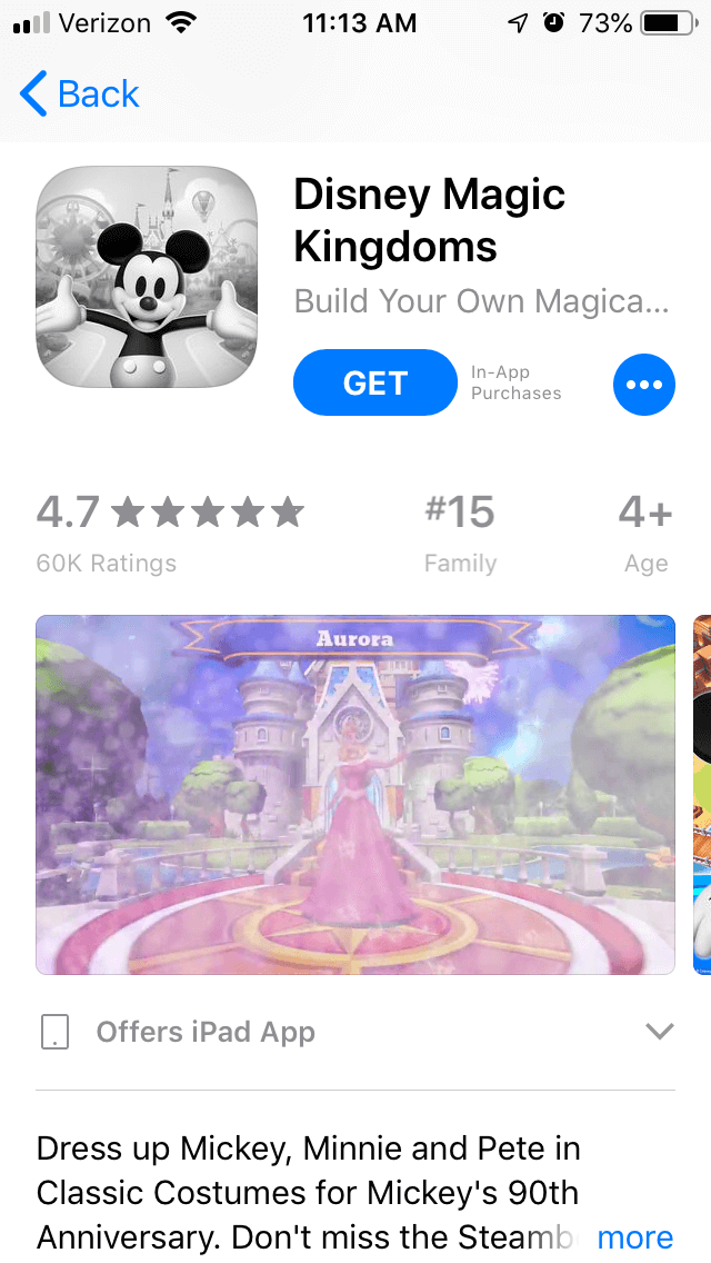
On the Apple App Store, “Disney Magic Kingdoms” is the #15th top app in the Family section. In searches, it’s the top app for “Disney games,” including variations like “Disney games for free,” as well as for “magic kingdom” and its variations. It also ranks highly for terms related to Disneyland, as the third-highest for “Disneyland explorer” and “Disneyland maps free,” and the 4th highest for “Disney park.” Interestingly, while it ranks highly for terms relating to Disney games and parks, it’s the 110th app for “Disney” itself. Terms related to the mechanics rank a little lower, such as its 72nd placement for “simulation games,” while it does not rank at all for any “collect” terms or “building games.” Creatives: The app begins with a video showcasing what the app has to offer, such as collecting Disney characters and building the park. It’s accompanied by cheery music and text that tells users exactly what they’ll get out of the app.  The following screenshots show different aspects of the app, accompanied by callout text and a recognizable Disney character. However, it only uses five out of the ten allowed screenshots. While the five it uses are effective at showing off how the app looks and what it has to offer, it has room to show even more features, such as the quests and special events. Every screenshot helps provide more information about the app and helps appeal to users, so each one should be put to use.
Even images that aren’t immediately visible are important, as they’re useful for targeted Search Ads campaigns. Of course, it is equally important that the first screenshots visible are effective and appealing, as they’re the ones users will see while browsing the App Store and when first viewing the app page. Title & Subtitle: The app’s title, “Disney Magic Kingdoms,” and subtitle, “Build Your Own Magical Park,” both contain important keywords, such as “build,” “park,” and of course, “Disney.” At 21 and 27 characters respectively, the title could fit in nine more characters worth of keywords, but the subtitle doesn’t have much room for adding more in the 30 characters the app is allowed. The subtitle also makes it clear what the app lets users do, so it’s effective both for providing a quick overview and utilizing keywords. Description: The app’s description starts off by talking about the new “Classic Costumes” for the characters, as per the 90th anniversary celebrations. Following that, the rest is a blurb that gives a very quick overview of what the app has to offer before it goes into the feature sets. There is room to expand here, as it could talk more about the various characters that users can collect, the park attractions they can build and the types of quests they can go on. While the description is properly short for the Apple App Store, it can still provide more information in a few short lines. It uses a few short lists of feature sets, with a header and bullet points delving into the app’s features. This is a good way to format app descriptions, as it’s easy to read and provides information about everything it has to offer in a way that users can quickly absorb. It also integrates the keywords throughout the description, which is helpful for Search Ads campaigns.
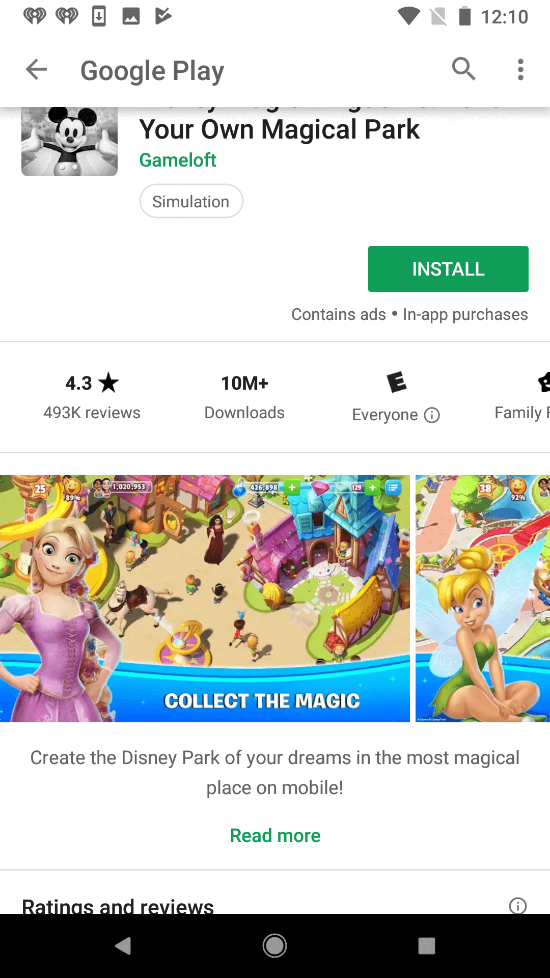
On Google Play, “Disney Magic Kingdoms” is the top-ranked app under “Disney game,” as well as variations like “free Disney games” and “kids games Disney.” It also ranks as the top app for “magic kingdom” and “magic kingdoms,” while maintaining high rankings for similar terms, such as “kingdom hearts” (#9) and “shop Disney parks” (#5). Unlike its iOS counterpart, its rankings for “Disneyland” terms are not quite as high, as it’s the 21st ranked app for “Disneyland lines” and “Disneyland California.” It’s also the 23rd app under “build,” and 156th under “collect,” although it does rank better for longer-tail terms like “collect cartoon characters” (#10). Also noteworthy is that while the iOS version ranked in the 100’s for “Disney,” the app is the 9th highest app for that term on Google Play. Creatives: The video and first five screenshots on Google Play are identical to those on the iOS version. It does include a sixth screenshot, but it is presented without callout text or context and simply shows several buildings within the app. As such, it is unclear what feature it is supposed to highlight or what users can get out of it, so including a line like “Build Disney Park Attractions” could improve its effectiveness.  As with the iOS creatives, they’re all visually engaging and highlight the app’s features, but there is room for more of them. Including additional screenshots can tell users more about the app and everything they can do on it. Description & Metadata: The description for “Disney Magic Kingdoms” is short, just a few lines telling users to embrace their inner child and build the park. It does not delve into the features of the app or what it can offer, leaving that up to the feature sets. Like on iOS, it lists each of the features with a header and bullet list, which is good for ASO and readability. On Google Play, descriptions should start each line and sentence with relevant keywords. The “Disney Magic Kingdoms” app does occasionally, but typically integrates the keywords in the middle of the sentences, such as where it says, “Features attractions from Disneyland Park” or “Share special moments with Mickey Mouse.” As a result, it doesn’t rank for the “Mickey Mouse” keyword, aside from being the ninth highest app for “mickey mouse clubhouse.” Although the features set is useful, the description should still take its time to sell the app to the users before that. If the description were to delve more into what users can do, such as “collect characters” and “build a park,” it could improve its rankings for those keywords while appealing to users looking for an app with those features.
The “Disney Magic Kingdoms” app has good App Store Optimization for the most part, but there are places where it can improve. It succeeds in terms of iOS keyword usage in the title and subtitle, the appeal of its video and screenshots, and the descriptions being formatted in an easy to read manner. There are simply areas in each of those where it still has room to improve. While the screenshots it has are effective on both stores, it has room for more that it’s leaving unused. Similarly, although the bullet lists work well for the description features, it could utilize the description introductions to provide more information about the app and better appeal to users. Whishing upon a star is great for many things, but if you want to give life to a mobile app and let it soar, App Store Optimization is more important than a fairy’s magic or pixie dust.

In this week’s App Store Spotlight, we are taking a closer look at Sweepy: Home Cleaning Schedule. Read more to see how the app can improve its ASO strategy.

Read more to see how The Children’s Place can implement winning ASO marketing strategies that could improve both app visibility & conversion rates.

Apps that evolve alongside their audience can maintain visibility in its app category through regular A/B testing, and iterations based on real user behavior.