CBS Sports: Analyzing its ASO Bracket
Posted on March 13th, 2026
Apps that evolve alongside their audience can maintain visibility in its app category through regular A/B testing, and iterations based on real user behavior.
App Store Screenshots provide a first look at the UI, features and core values of an app. In the case of Ecosia, a web browser designed to raise money for planting trees and helping the planet, its screenshots should convey its goal while showcasing its functionality. If the screenshots can do this, users will gain a more thorough understanding of the app and are more likely to convert. As today is Earth Day and Ecosia is one of Apple’s top featured apps for the day, our App Store Spotlight will take a look at its App Store Screenshots on the App Store and Play Store.
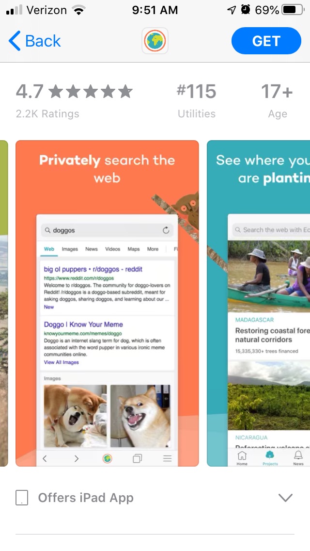
On the iOS App Store, Ecosia begins its creative set with an image split across two screenshots. This extends a single shot of a device showing the Ecosia launch screen into multiple images, giving it a wider shot of the handset and background. As the screenshots are in portrait mode, these two images will appear beside each other when the app appears in search results, along with a third screenshot.
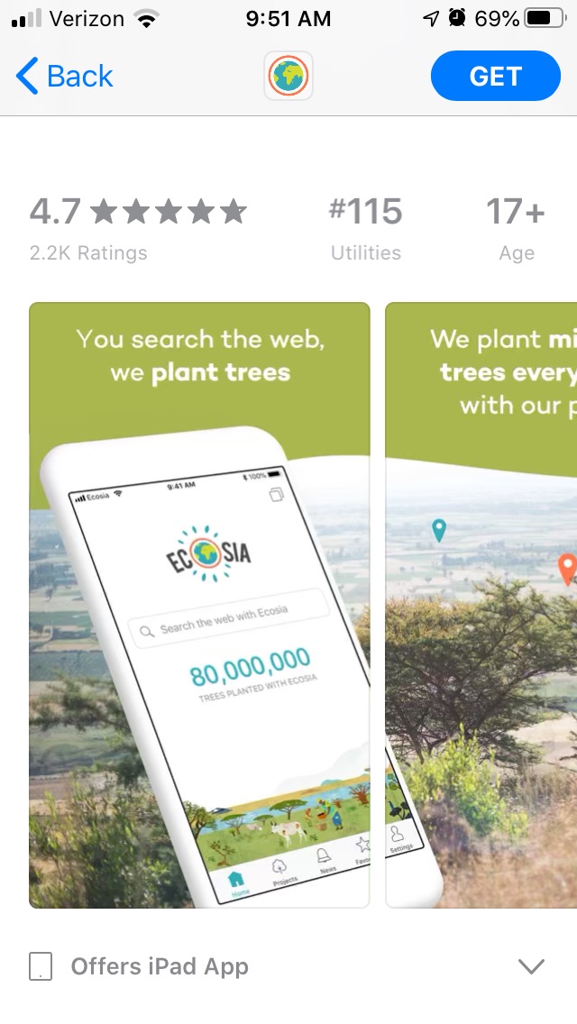
The following five screenshots are less connected, each showing a distinct image and color scheme. They show various search results and articles from Ecosia’s interface to demonstrate the UI, but the majority of content also ties into the company’s environmental message.
While each screenshot uses a different color, the images are still linked through cartoon animals in the background. This creates a sense of continuity between each screenshot.
The screenshots all feature callout text at the top of the screen that highlight the features and value propositions. They begin by explaining how any profits Ecosia gains goes towards planting trees, then delves into the web search features.
The text runs on the long side for callout text, with statements like “See where your searches are planting trees” and “Track our fully transparent finances” but uses bold text to highlight the key terms. Users should be able to glance at the image and understand the value proposition from the callout text. Longer text makes this more difficult, but bolded words can help by drawing attention to the keywords.
While the screenshots include several different searches and images, the callout text is primarily focused on the ecological benefits, such as how the company uses renewable energy. This reinforces the environmental message, although it does not provide much information about the functionality or features. The only feature-based callout text is searching the web; it could elaborate on the privacy features, user interface and so forth to provide additional information.
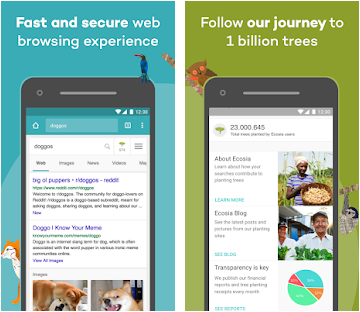
The screenshots on Google Play are very different than on iOS, although several design elements are similar. Like the App Store Screenshots, the Google Play creatives begin with a double image describing how the app donates trees whenever users search the web through the app. Both the handset, screen shown on the device and the background are different, but the features and purpose are stated in a similar way.
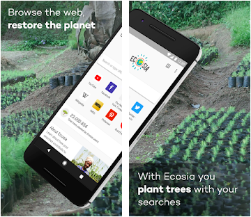
The following three screenshots also feature single images of the device on a colorful background, accompanied by cartoon animals to create continuity between each image. The images used and the associated callout text are focused more on the functionality of the app, including “fast and secure web browsing experience” and “no pesky ads.”
Google Play and the iOS App Store have different guidelines for screenshots. They’re designed for devices with different screen sizes, allow for a different number of screenshots and have separate rules for what’s allowed. Additionally, Google Play enables experiments for A/B testing screenshots, so it is possible to test different designs live on the Play Store.
While Ecosia uses similar designs for its App Store Screenshots on iOS and Google Play, the content they highlight are noticeably different. While the iOS screenshots focus primarily on the environmental benefits, the Google Play ones are more focused on the search functionality.
Using different screenshots on different stores can be beneficial, since each store allows a different number of screenshots. However, with seven App Store Screenshots and five on Google Play, it has room for up to three more screenshots for either store. The question Ecosia must ask, then, is: which message appeals more to users?
Ecosia can determine which designs and messaging convert more users by A/B testing variants. This can run two sets of creatives against each other to see what performs better on the store, so developers can test two different designs or messages.
Helping the environment is a noble cause, whether on Earth Day or every day of the year. Apps like Ecosia, which are designed to give back to the world, can appeal to users concerned about their environmental impact or looking to help the planet. Effective App Store Screenshots can help them gain notice and conversions on the stores.
Want more information regarding App Store Optimization? Contact Gummicube and we’ll help get your strategy started.

Apps that evolve alongside their audience can maintain visibility in its app category through regular A/B testing, and iterations based on real user behavior.

By evaluating SeedTime's app title, subtitle, icon, screenshots, we can identify what the app is doing well & where ASO opportunities exist. Read more!

Even apps supported by healthcare providers must compete in search. The App Store is is an evolving marketplace shaped by user behavior, seasons, & algorithmic shifts.