ASO Tips and Tricks for Feature Graphics
Posted on March 27th, 2026
A successful feature graphic combines strong design, clear messaging, strategic keyword use, & alignment with your entire ASO strategy. Read more to learn more!

In today’s highly competitive app marketplace, the first impression an app makes can significantly impact its success. When users first encounter an app—whether it’s through search results, a featured spot, or editorial recommendations—those few seconds determine whether they’ll continue exploring or move on.
Understanding how first impressions work on iOS and Google Play and knowing what specific features each store prioritizes are essential to improving visibility and conversion rates. This deep dive covers the main ways apps can be discovered on these platforms, highlighting what makes each unique and why it matters for app success.
Organic search remains one of the top ways users discover apps, whether in the Apple Store or Google Play. When users search with keywords, the search results display key elements: app title, icon, rating, screenshots, and sometimes videos. Each element offers developers a chance to capture user interest and make a compelling case for downloading. In Google Play, titles and descriptions are highly impactful, as they are among the primary search metadata elements indexed.
Clear, keyword-rich titles are essential for visibility in both iOS and Google Play's organic search. Titles should be concise and packed with relevant keywords to convey the app's purpose instantly. On iOS, keywords in the title and subtitle contribute to search ranking, while the subtitle, screenshots, and videos help create a compelling first impression. For Google Play, similar rules apply, with a focus on delivering immediate clarity on the app’s core value right from the title. By optimizing these core elements, apps can improve discoverability and engage users at first glance.
The initial view in search results differs slightly between iOS and Google Play. iOS gives prominence to videos, pushing screenshots lower, which adds a dynamic element that helps convey the app’s features quickly. Conversely, Google Play will only show the icon and app title and will not show the screenshots for a general keyword’s search results. Google Play will only display creative for branded searches, prioritizing screenshots if no video is available, emphasizing the importance of eye-catching visuals in converting users.
Incorporating a mix of vibrant, clear screenshots and videos is recommended for both platforms, as each has a unique impact on search result engagement and download rates.
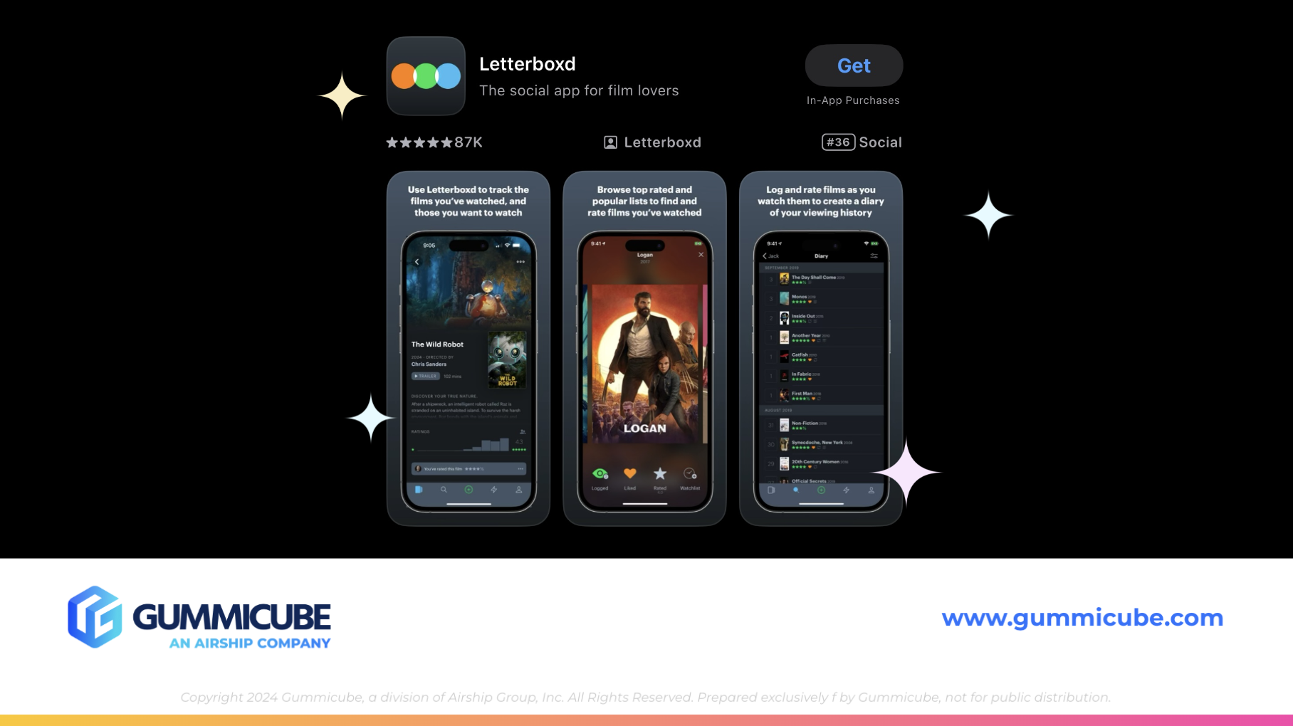
Visual assets—screenshots, videos, and even icons—are some of the most powerful tools for app store conversion. Both iOS and Google Play rely on visual media to showcase an app’s primary features and user benefits, but they handle these elements differently. On iOS, videos take precedence in search results and on the app’s product page, often pushing screenshots further down. Google Play, in contrast, highlights icons first unless the user has searched with a non-brand term. All visuals should be clear, appealing, and focus on the app’s core functions. Consider A/B testing screenshots to determine what resonates best with users. Testing various formats—such as showing real-world use cases versus highlighting unique app features—can provide insights into what visuals lead to more conversions.
For both platforms, a well-thought-out sequence of screenshots is crucial. Aim for an engaging flow, starting with your most compelling feature and leading users through the app’s key functionalities. Adding brief, descriptive text overlays can improve understanding, though they should be used sparingly to avoid clutter. By delivering a cohesive and visually captivating presentation, you help users envision the app’s benefits right from the start, increasing the likelihood of a download.

Feature pages are an incredibly effective way for apps to gain exposure, but they differ significantly in approach between Google Play and the iOS App Store. Google Play’s feature pages provide editorially selected placements with concise visuals, while Apple’s Today Tab offers a unique, immersive experience that enhances an app's visibility. However, it’s important to note that while developers can submit assets, the final presentation and messaging are entirely determined by the app store’s editorial teams.
Google Play Feature Pages: Google Play’s editorial team curates lists based on app quality, relevance, and recent updates. These feature pages emphasize brief but impactful visuals and descriptions to communicate value quickly, focusing on essential information that will resonate with users. Although developers can supply promotional images and descriptions, the selection and overall layout are controlled by the Google Play team.
iOS Today Tab: Apple’s Today Tab provides a unique, immersive showcase of featured apps and games. Positioned as the first tab in the iOS App Store, it’s what users encounter upon opening the store, offering an immediate, visually rich experience. The Today Tab goes beyond app descriptions, as Apple’s editorial team creates stories that highlight an app’s backstory, developer journey, or unique features. Developers should aim for a feature on the Today Tab, as it offers unmatched visibility and credibility.
The iOS Today Tab and Google Play feature pages both provide high-value exposure that can dramatically impact downloads and brand reputation. However, developers should remember that while they can supply assets, the presentation remains in the hands of each app store’s editorial team, who have full control over what users ultimately see. This editorial-driven approach adds credibility but requires developers to provide their best assets to increase their chances of being showcased. Next, we’ll explore how organic search and media elements play essential roles in app discovery and user engagement.
The differences between Google Play and the iOS App Store in terms of discoverability and visual emphasis present unique opportunities and challenges. By understanding how each platform displays search results, featured content, and media assets, developers can tailor their approach to make the strongest possible impression. Every element—from the app title and subtitle to screenshots and videos—plays a role in how users perceive the app and, ultimately, whether they choose to download it.
Clear, compelling visuals paired with optimized metadata can significantly impact conversion rates, bringing more users to the app and increasing engagement. For those looking to refine their strategy further, Gummicube offers advanced ASO solutions that provide the insights necessary to maximize visibility and drive conversions in both Google Play and iOS. With Gummicube’s support, your app can stand out and thrive in today’s competitive marketplace.

A successful feature graphic combines strong design, clear messaging, strategic keyword use, & alignment with your entire ASO strategy. Read more to learn more!

Winning ASO marketing strategies start by taking a comprehensive, data-driven approach, that can lead to unlocking the full potential of your app. Read more!

The most successful apps regularly test, analyze, and improve their screenshots based on real user behavior. As a result, their listings can convert more users!