hoopla Digital App Store Spotlight
April 5th, 2021
 Tagged: Reader Apps, Readers, Books, Library, Hoopla Digital, Hoopla, App Store Spotlight
By David Quinn
VP of Strategy & Partnerships at Gummicube, Inc.
hoopla Digital connects you with an expansive library of eBooks, audiobooks, movies and more all for free. When we take a dive into the pages of hoopla to analyze the app’s ASO efforts, will we like what we see or will the app meet a less than fairytale ending?
hoopla Digital has been around for just under a decade, launching in 2013 by parent company Midwest Tape. hoopla partners with your local public libraries to give a digital alternative to the old school library experience. Now library patrons don’t have to wait for missing physical books to be mailed to their library or worry about returning books in time to avoid fees. And with personal health being at the front of everyone’s mind lately, it’s a safer alternative, too.
Keep reading below to see what all the hoopla is all about, and how they can improve their App Store Optimization efforts, in today’s App Store Spotlight.
Metadata
Title and Subtitle
From a keyword reach perspective, hoopla has a lot of room for improvement in their title and subtitle. “hoopla Digital'' uses only 16 of an available 30 characters, and the 30 character maximum subtitle is not being used at all. This means hoopla is missing out on not on the opportunity to target additional keywords, but to tell users what their app does for those unfamiliar with the brand.
Nowhere in the title or subtitle is the core audience of library users mentioned, nor are their key offerings of eBooks, audiobooks or movies. This also severely limits the number of phrases their metadata can build with connecting terms like “read” and “reader” noticeably missing. Maybe hoopla should take another read of their title and subtitle.
hoopla may benefit from moving some of these terms to its visible metadata fields, to both target the terms as keywords and let users know what the app is about. Users searching for these terms would be able to see them in the visible title, connecting their search query to the app, and potentially click through- which over time can increase ranking. Some of these terms that are doing OK, but could improve, include:
“audio books” - ranked #13
“audiobooks” - ranked #13
“audio book” - ranked #13
“books” - ranked #36
“free movies” - ranked #37
Description
With only 669 of a usable 4000 characters, hoopla’s description is missing some, well, description. While the description does help make up for the lack of explanation of features found in the title and subtitle, the majority of users who discover the app in search results and decide whether or not to download without viewing the product page will not even see the description.
This being said, like any good short novel, it is still important to have a description that outlines all the app features and value propositions in a thorough and captivating way for the users that will read it. However, for those that never make it to this part of the product page, they will rely on the title and subtitle to convey what the app is all about. Without a clear understanding of what the app does at a glance, users will pass to the next available app.
Creative
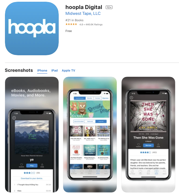
While you can have up to 10 screenshots in the App Store and up to 3 videos, hoopla is only utilizing 3 screenshots and no videos. With the only text reading “eBooks, Audiobooks, Movies, and More,” hoopla is missing out not only explaining who their core demographic is, but how you can access these books in the first place- through their partnership with public libraries. Also missing is their clear value proposition - hoopla lets you access these books and other media for free!

Other than the demographic and features once again being less than clear, a few design elements also add to a visual clarity issue. Blurry, patterned background clash with the content on the handsets, distracting from the important in-app screenshots. Copy on the first screenshot is small and could be improved by increasing the font size, adding a banner or using a solid background.
CTR plays a big role in improving keyword rankings that are already ranking highly (top 10 and higher). The following keyword rankings could be improved by using these, or similar version of these, in the copy of the screenshots:
- “library” - ranked #3
- “books for teens” - ranked #4
- “free comic books” - ranked #5
- “free library” - ranked #7
- “read book” - ranked #9
- “digital books” - ranked #8
Overall
hoopla Digital has a stream of amazing features that can help communities of all ages learn and entertain themselves. But without the proper keyword targeting, description and creatives, the app limits the audience who can take advantage of their program. With a few quick changes to their title, subtitle, description and screenshots, the app can go from passable to the next app you’ll want to bookmark.
Want to learn more about App Store Optimization? Contact Gummicube and we’ll help get your strategy started.
More blog-posts like this:

Timeleft: Finding Friends, But Is It Finding App Store Visibility?
A/B testing alternative subtitle structures, and experimenting with screenshot designs could set Timeleft apart from its competition. Read more!

Checking In on Booking.com's ASO Strategy
Success in the App Store is driven by a combination of discoverability and conversion. Apps that excel in both areas consistently outperform the competition.

Mark Your Calendar: Howbout's ASO Audit
By introducing dynamic design elements & leveraging ASO tools such as App Store video and A/B testing, Howbout can significantly enhance its App Store listing.
