App Ratings and Reviews
Posted on March 25th, 2025
Boost app rankings with better ratings! Learn how to manage reviews, improve user experience, and use ASO tools to increase conversions and engagement.

The What’s New copy available to developers grew in attention over the past few years as major brands such as Slack decided to take a more unconventional approach. Users began to notice and talk about what was once a seemingly forgotten field on the product page — now beginning discourse on Linkedin and other major platforms regarding the humor and creativity apps were integrating into their What’s New copy.
While it won’t actually impact your App Store Optimization efforts, nor your keyword rankings, it can impact your levels of engagement — as was made clearly apparent via Linkedin.
Appearing at the top of the product page for existing and returning users, the What’s New field will be the first (and only) snippet of text a user will read before your preview video and screenshot set. In other words, it’s highly visible and a viable resource to leverage in encouraging current and lapsed users to update, redownload, or simply hop into the app.


For most apps currently available in the iOS App Store, the What’s New copy is vastly underutilized. Whether that means they’re simply providing the bare minimum in character count, or providing highly redundant copy recycled with each successive release, most developers aren’t using this space to their advantage. Let’s break down what we would recommend here.
To begin, it’s mandatory. So regardless of if you’re feeling creative — you have to plug copy into this field for your build release to see the light of the day. But greater than that (and as mentioned before) it’s highly visible for existing and returning users.
The What’s New copy is available with the intention of communicating to users what’s changed in your app tied to your latest release, with developers being granted a grand total of 4,000 characters for this field (although we have yet to see someone come close to that count). Here, developers should work to provide users with a clear understanding of “what’s new” in-app, in a manner that aligns with the brand voice and provides users with a strong call-to-action to interact with said change.
Slack may have been the catalyst, but regardless of who led the movement, the awareness of this field grew notably in more recent history. Whether a user is looking to update the apps they already have downloaded, or a new user is scrolling through your product page deciding whether or not to download, the What’s New copy is a visible field with low stakes and ample potential.
As mentioned previously, and as recommended by Apple, the What’s New field is a section of the product page devoted to educating users on changes in the app experience and interface. It’s ultimately an opportunity to get users amped about the latest and greatest going on in your app.
We would recommend approaching this space in a similar manner as you would the iOS Promotional Text. Both fields are ultimately not indexed through Apple’s algorithm (i.e. you can prioritize branded language over keyword targeting) and are more-so tools for conversion or engagement. Look to provide users with a strong representation of your brand voice, in an easy-to-read manner that allows for quick and easy comprehension, and potentially incentivizes users with a form of a call-to-action.
Let’s consider some current examples of how the What’s New copy is being used in the App Store.
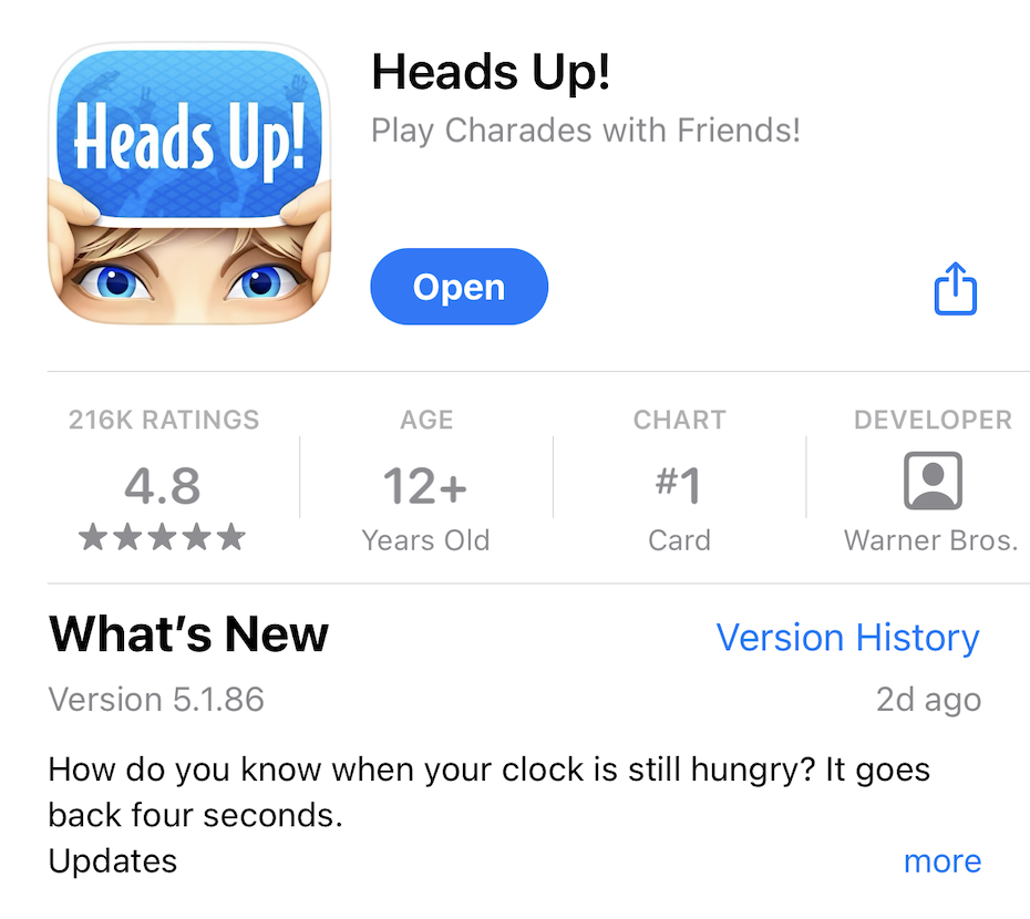
Most commonly, we’ve witnessed games make a bit of a more notable effort to leverage this space, including strong examples such as Heads Up or eFootball 2024.


Both apps aim to provide a unique update with each release on “what’s new” in their app, regardless of the scope of changes made.
With eFootball, while the updates may be a little less entertaining per say, it provides users with a clear understanding of what exactly was altered within each of their monthly releases, beyond the simple “bug fixes and improvements” message most developers plug in.
Heads Up also works to provide an overview of the exact feature updates applied with each release, paired alongside a bit of the branding itself. With each What’s New update, the app works to incorporate a joke or pun — mirroring the lightheartedness and fun provided by the game itself. Are the jokes the best things we’ve ever heard? Maybe not, but the intent is appreciated and provides users with a better grasp of the app’s tone.
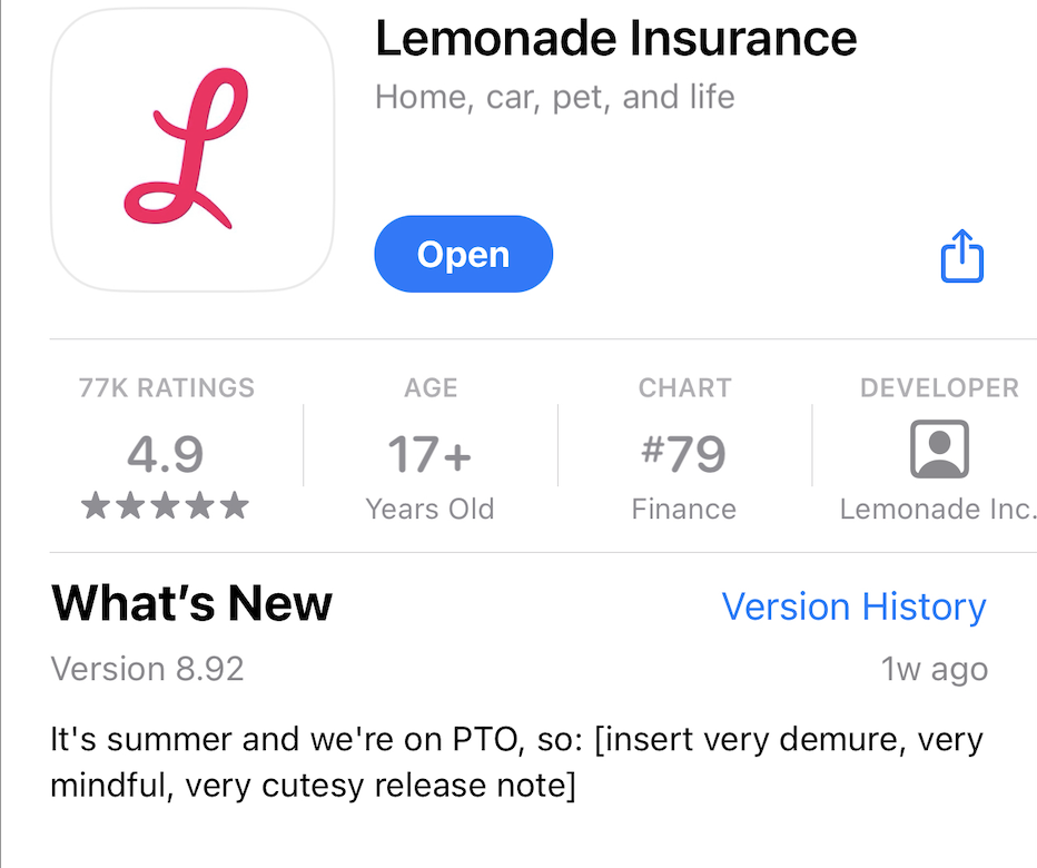
Some apps such as Lemonade Insurance or Slack also display a clear effort in utilizing this space, with both apps leaning a bit more heavily into the banter tactic.


While the updates don’t necessarily provide as clear of an understanding on what has been changed with the latest release rollout, it does adequately work to engage users through fun or mindful messaging. Both apps could potentially serve to benefit through a more straight-forward read on the alterations made. Regardless, the attempt to provide a unique, user-geared message with each new app version is a positive step in maximizing product page potential and user sentiment.
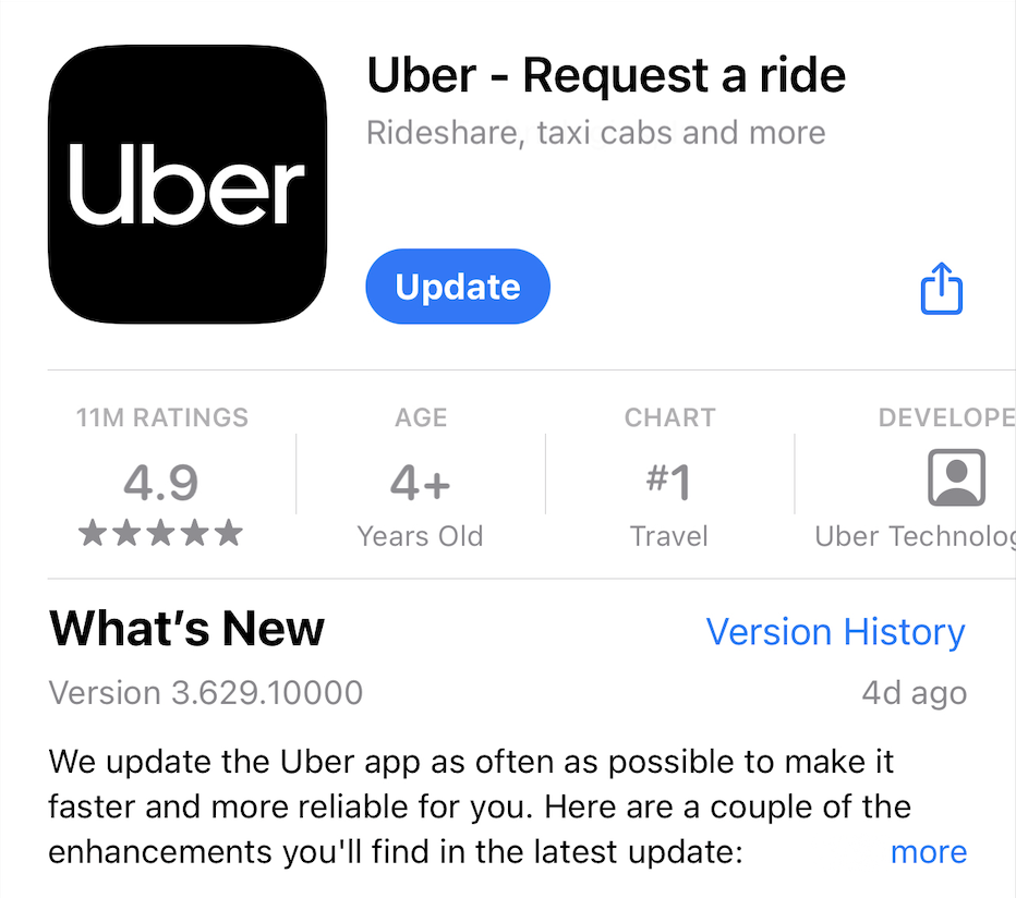
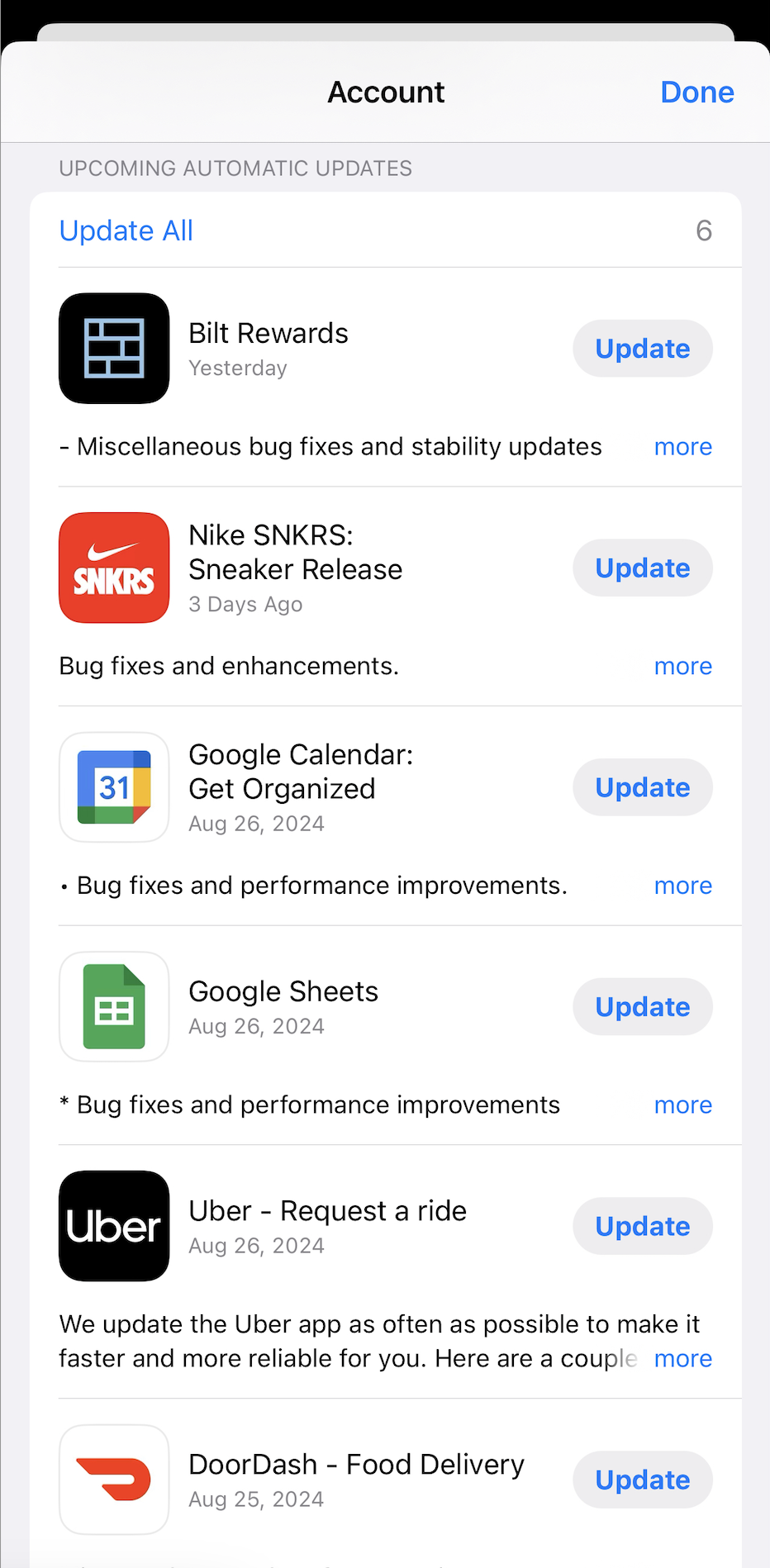
Apps such as Duolingo or depop could benefit from following suit. With redundant What’s New updates, recycled with each new release, the app provides little motive for an existing or returning user to engage with the app. No matter the true scale of the update made, there is always opportunity to lean into the brand itself when explicit content flags may be lacking.
At the end of the day, the What’s New copy is a mandatory field that you — as a developer or marketer — are required to use. So why not make the most of it? Take advantage of this low-risk space as an additional engagement tool in the App Store and give new, existing and returning users the added incentive to interact with the latest version of your app. Although it may not be the most important field when considering app store performance, maximizing usage of all you are allocated is only to your benefit.

Boost app rankings with better ratings! Learn how to manage reviews, improve user experience, and use ASO tools to increase conversions and engagement.

Every business needs an app to stay competitive. See how ASO drives visibility, increases downloads, and fuels long-term success in the app marketplace.

Learn how to leverage Apple’s Today Tab ads to boost app visibility with effective App Store Optimization, custom product pages, and key campaign strategies.