
ASO Checkup on Walgreens' App Listing
Posted on April 2nd, 2026
By combining data-driven insights with thoughtful design, developers can create listings that not only attract users but also convert them effectively.

App Store Screenshots can mean the difference between a user tapping on your app to download or passing you up for a competitor. Compelling, informative visuals that are relevant to users’ searches can make or break success. In today's App Store Spotlight, we look at Icy Ropes, a casual game featured in Apple's "Tap Til You Win" Today Tab collection, to see if their screenshots are as tap-inducing as Apple's collection name implies.
Icy Ropes is a casual mobile game set in icy mountains, featuring a wide variety of characters to unlock. Control two climbers tied together by a rope, tap to jump from cliff to cliff, try not to fall, collect coins, and avoid obstacles like ice and snakes. But do their screenshots communicate this in an effective, compelling way?
App Store Screenshots should convey the core gameplay of the app, along with unique functionality that sets it apart. In the case of Icy Ropes, the first screenshot is of one character in motion, jumping to another cliff, setting up the main game mechanic. The next image shows over 30 unlockable characters, followed by three more in-action jumps in the game, one of which is falling, all with different characters.
While these screenshots give a general idea of the game, they are direct in-app screenshots that have no additional elements to immediately communicate what is happening to the user. This is a stark contrast from the App Preview video, which has brief transition slides between scenes containing explanatory text.
While the gameplay is simple by design and the text cuts are brief, these small changes can more quickly and effectively convey what the app is all about to the user. Fast communication through images is critical in getting users to convert when they are quickly scrolling through search results.
Adding stylized text to the screenshots can also clear up how the gameplay unfolds. At a glance, it looks like various images in a game where you move from platform to platform. However, Icy Ropes requires skill to avoid obstacles along the way- something that is hard to see at a brief glance. It may be beneficial to further emphasize these features in the screenshots, via both the in-app imagery and supplementary callout text to highlight the challenging, skill-based aspect of the app outside of its casual tapping mechanics.
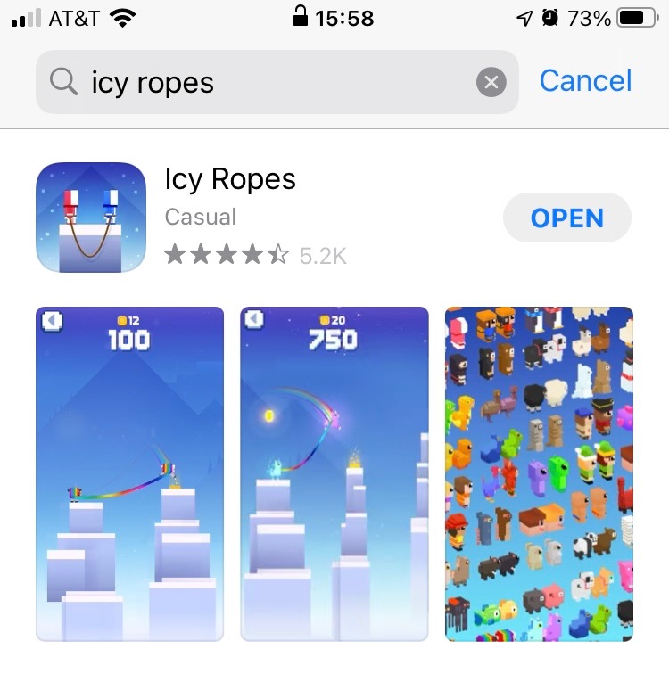
Icy Ropes uses five screenshots in the Apple App Store. This is below the maximum, so it has room to include more screenshots to tell users more information. The extra space could be used to focus on the obstacles within the game, more characters to choose from, and/or include the distance meter on the top.
The screenshots share a similar design across each image. The images are directly from the game, with the ombre blue to white in the background, designed to invoke a feeling of cold/winter. This connects the game to its title and setting. A screenshot showing the variety of unlockable skins breaks this pattern.
A notable design choice is the gameplay shots. The images show a character jumping from one cliff to another, or a character falling. This allows the audience to see and get a feel for the advancement of gameplay, and helps with their understanding of game mechanics.
These screenshots don’t include any copy. This is a recommended strategy to test for App Store Optimization, as it quickly tells potential users more about what the app can do.
ASO best practices suggest short, concise text that utilizes keywords. The text copy in the video for Icy Ropes is short, with phrases such as “Climb the Mountain Together”, “100+ Characters”, and “Don’t Fall!” Though the text could be more directly keyword-focused, it is a great way to enhance a user’s understanding of the app.
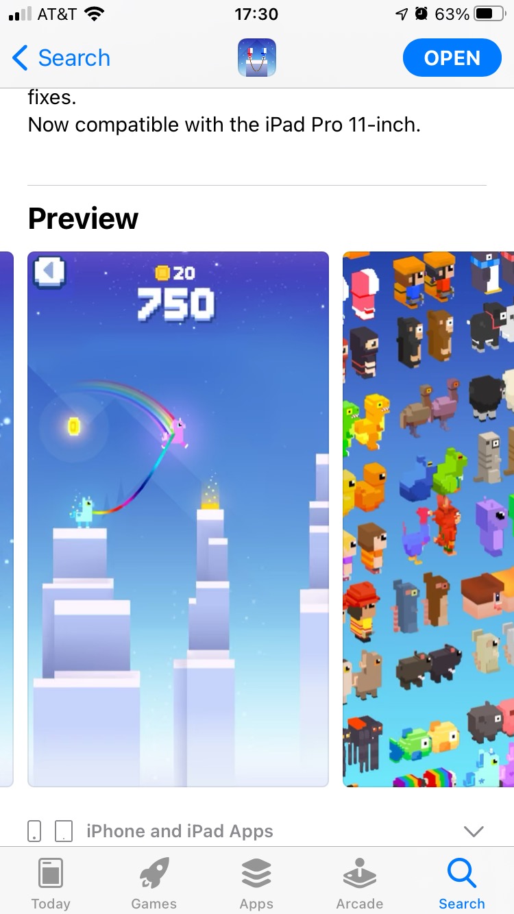
By analyzing Icy Rope’s competitors, we can see how their App Store Screenshots and video vary, and how it compares to other apps in its space.
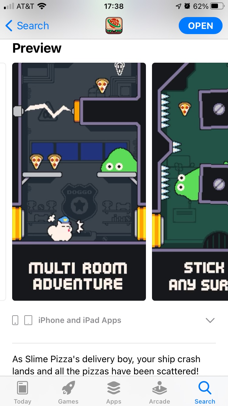
Like Icy Ropes, Slime pizza is a casual game where you lead the character through each level, avoiding obstacles along the way. Rather than jumping cliffs, this game focuses on flinging the slime.
The screenshots for Slime Pizza are similar to Icy Ropes in that they are directly from the game itself, using five images. However, Slime Pizza reinforces the gameplay it shows with brief text to supplement each image.
Similar to Icy Ropes, this casual game uses 5 screenshots with mainly direct in-app imagery. Since the core gameplay itself is so similar, they show different color and tower theme options to break up the imagery. This shows the variety of skins and themes available in the screenshots without needing to directly call it out- though they have additional screenshot space to do so.
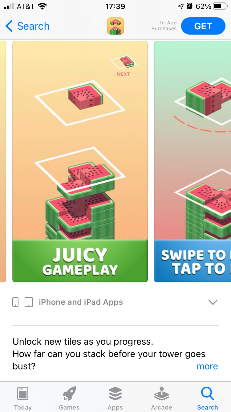
Like Slime Pizza, Juicy stack incorporates text in its screenshots to reinforce the gameplay being shown. The text is large, displayed on a colorful banner and doesn’t take away from the in-game composition. This can help users more quickly understand how the game works and how it is relevant to what they were searching for.
Users looking for hyper-casual games want something they can pick up quickly and play in an instant. Similarly, App Store Screenshots should be something a user can quickly scan, comprehend and want to download right away. Incorporating compelling in-game imagery and showing the variety of features is the first step; having the creatives be quick and easy to understand could be the difference between getting a user to make the first tap in their ‘Tap Til You Win’ experience.

By combining data-driven insights with thoughtful design, developers can create listings that not only attract users but also convert them effectively.

In this week’s App Store Spotlight, we are taking a closer look at Sweepy: Home Cleaning Schedule. Read more to see how the app can improve its ASO strategy.

Read more to see how The Children’s Place can implement winning ASO marketing strategies that could improve both app visibility & conversion rates.