Invitation Maker by Hobnob - App Store Spotlight
December 27th, 2022
 Tagged: App Marketing, Mobile App Optimization, Aso, App Store Spotlight
By David Quinn
VP of Strategy & Partnerships at Gummicube, Inc.
With holiday festivities right around the corner, preparing a guest list and sending out those last-minute party invitations has never been more urgent. Designing cards, picking the right message, and sending invites out can seem daunting. Luckily, Invitation Maker by Hobnob can do all that and more, giving users more time to prepare for the occasion.
The makers of this party planner have curated an App Store listing that has contributed to an app position among the top of search results for several relevant terms. Are they doing all they can to maximize their App Store Optimization efforts?
App Metadata Best Practices
Invitation Maker by Hobnob implements a number of recommended ASO strategies in its app listing, helping it rank among the top 10 for terms such as “invitation”, “invites”, and “rsvp”. Below you can find what app marketing best practices they’re adopting in their metadata fields that have played a part in this growth.
App Title
Being the first text field users come across when navigating search results, your app title is key to building relevance as soon as someone lays their eyes on it. Including keywords within your app title is always a recommended strategy as it is one of the fields the algorithm crawls for terms during indexation.
We can refer to these keywords as title tags – short, relevant phrases that relate your app feature set to a possible search query. Below you can find two top competitors that effectively implement title tags in their app listing.
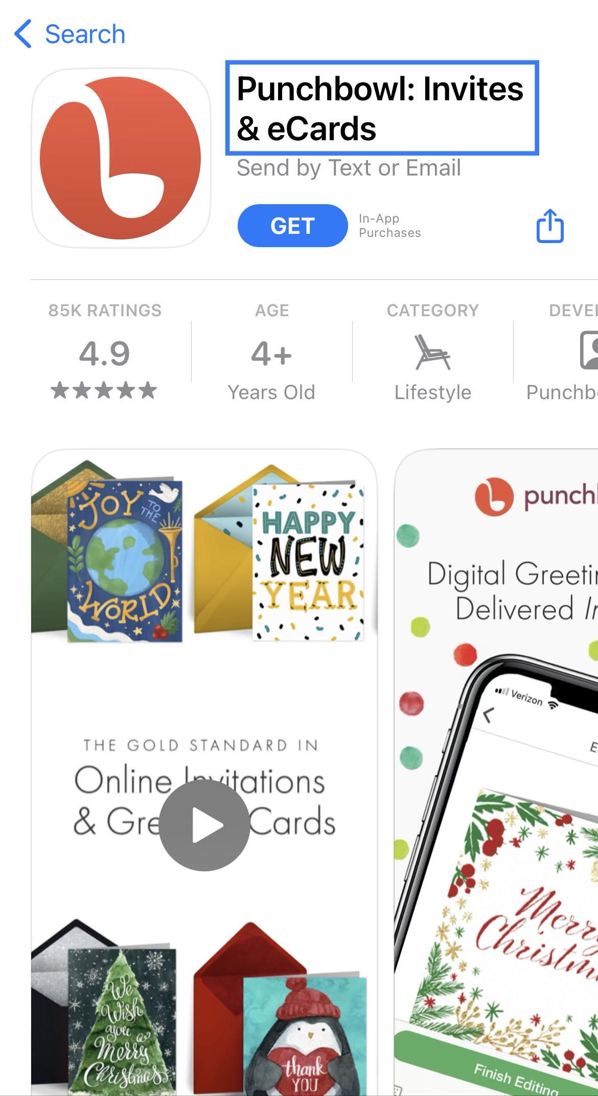
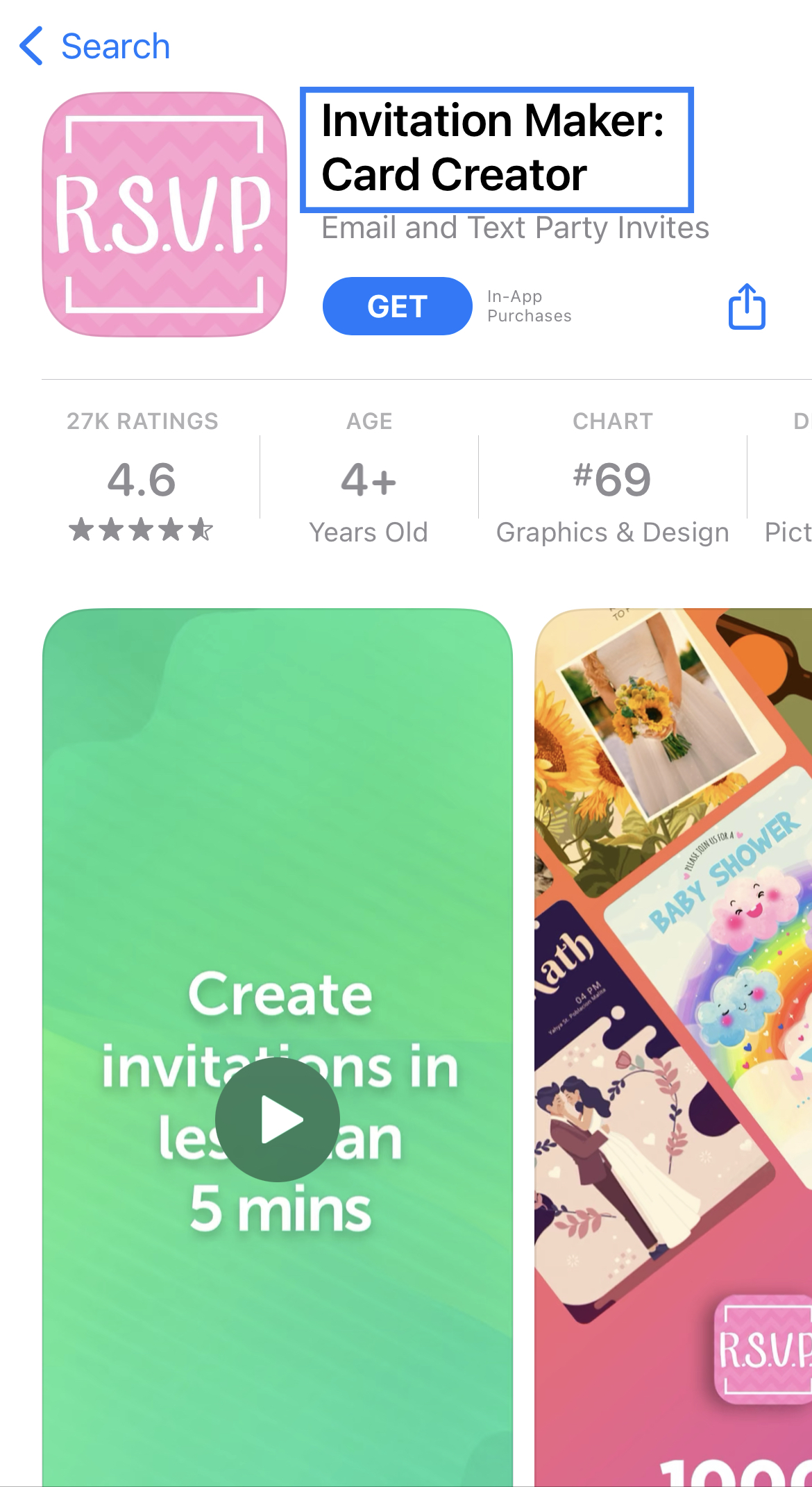
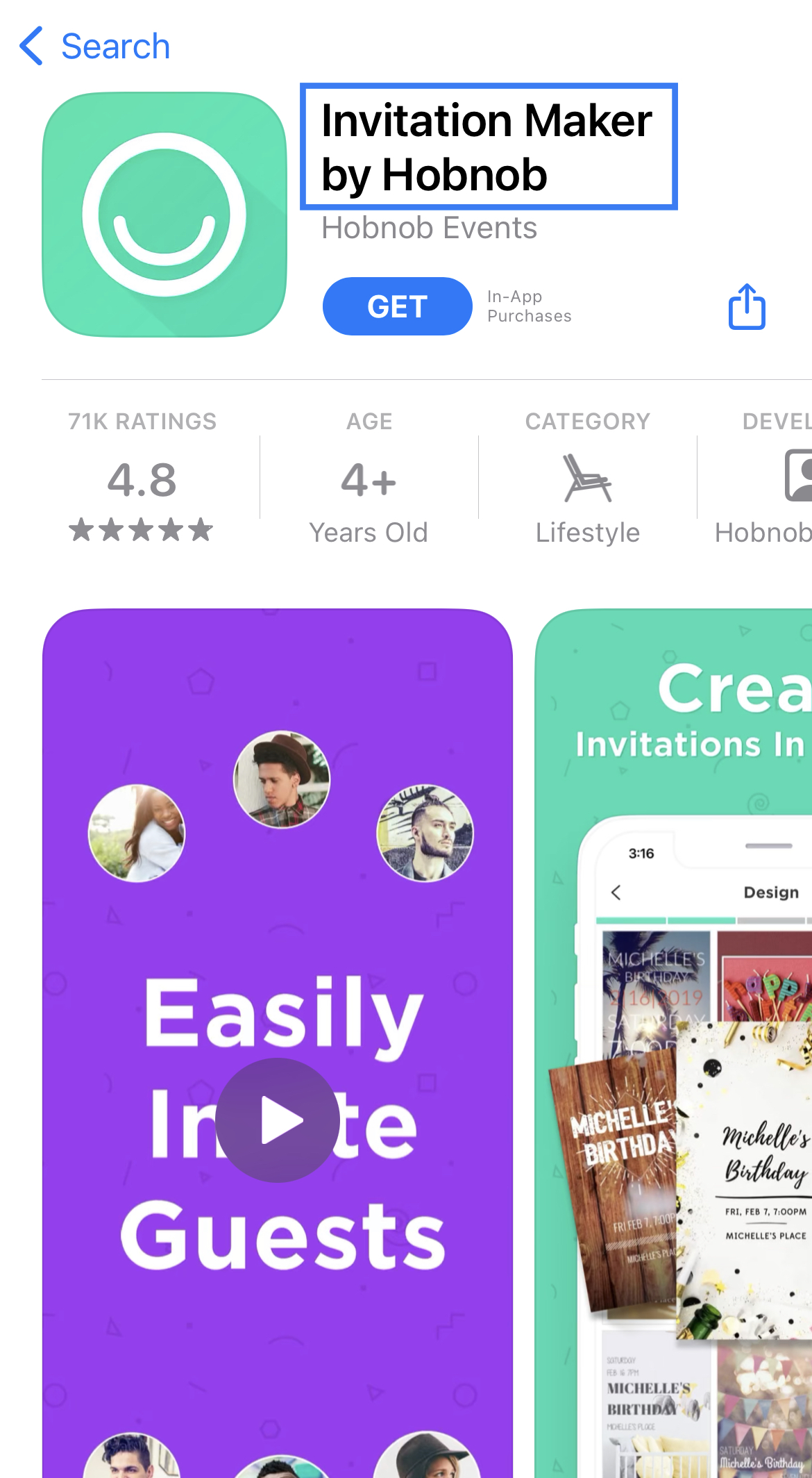
Invitation Maker’s developers make good use of the core functionality of the app itself by using it as the primary app name. This can contribute to improved positioning, but developers should also consider differentiating the app title with a term other than “Hobnob”. Unless immediately recognizable by a large number of users, then opting to include a title tag with a hyper-relevant keyword is the better option.
App Subtitle
Invitation Maker’s current subtitle effectively targets the different types of events the app can be used to make invites for. It also targets the term “invites” which can be effective at building phrases with the individual event keywords positioned before it.
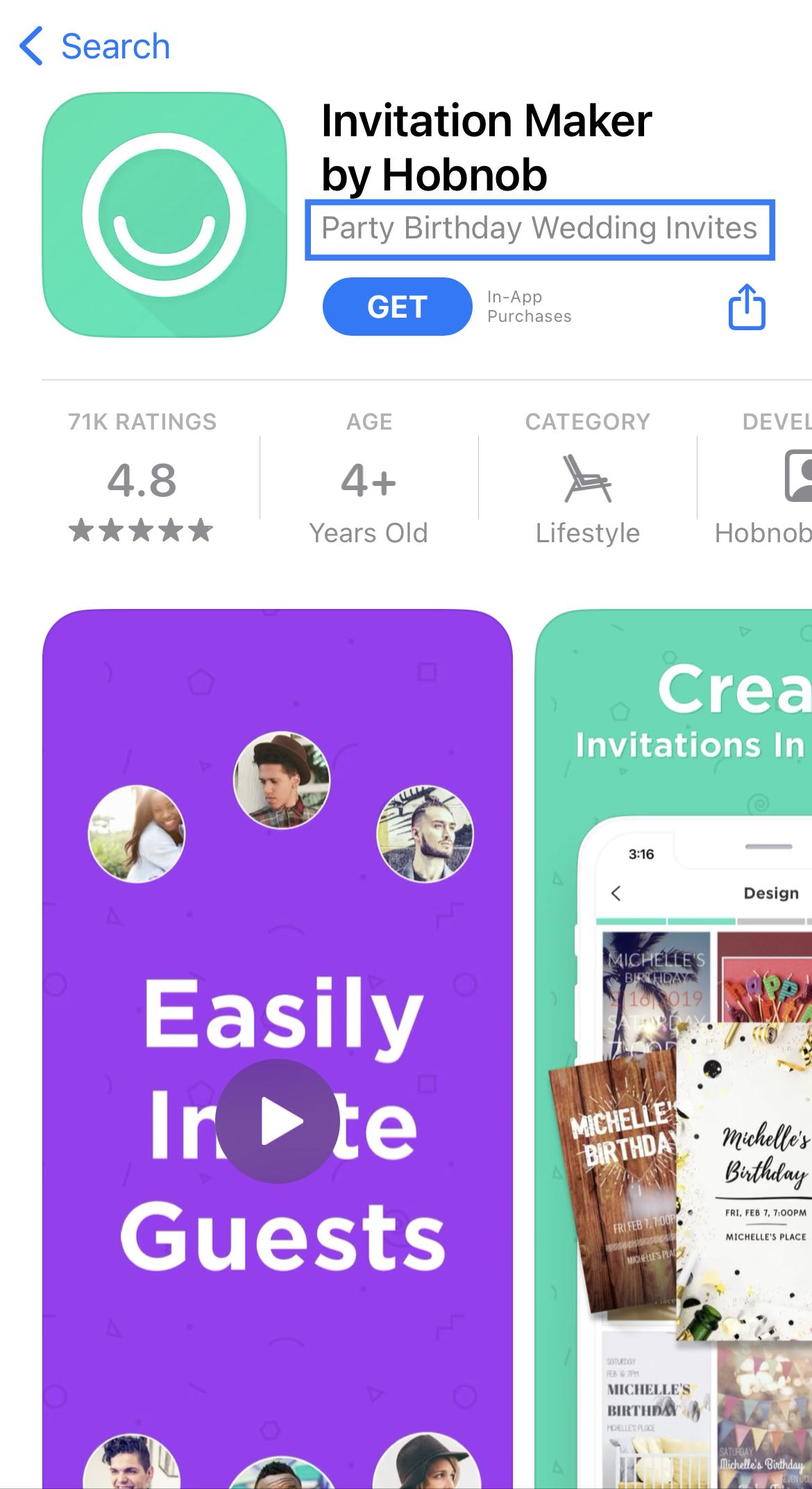
With the right ASO tools and technology, you can implement this strategy as well by understanding each term’s estimated search volume. You can then build relevance for phrases that pertain to core features of your app that are also being searched for by a considerable amount of users.
App Description
Your App Store description is a great place to showcase the app features, value propositions, and functionalities that make your user experience unique. The developers at Invitation Maker by Hobnob effectively organize the different features of their app in a way that highlights each one individually while maintaining readability.
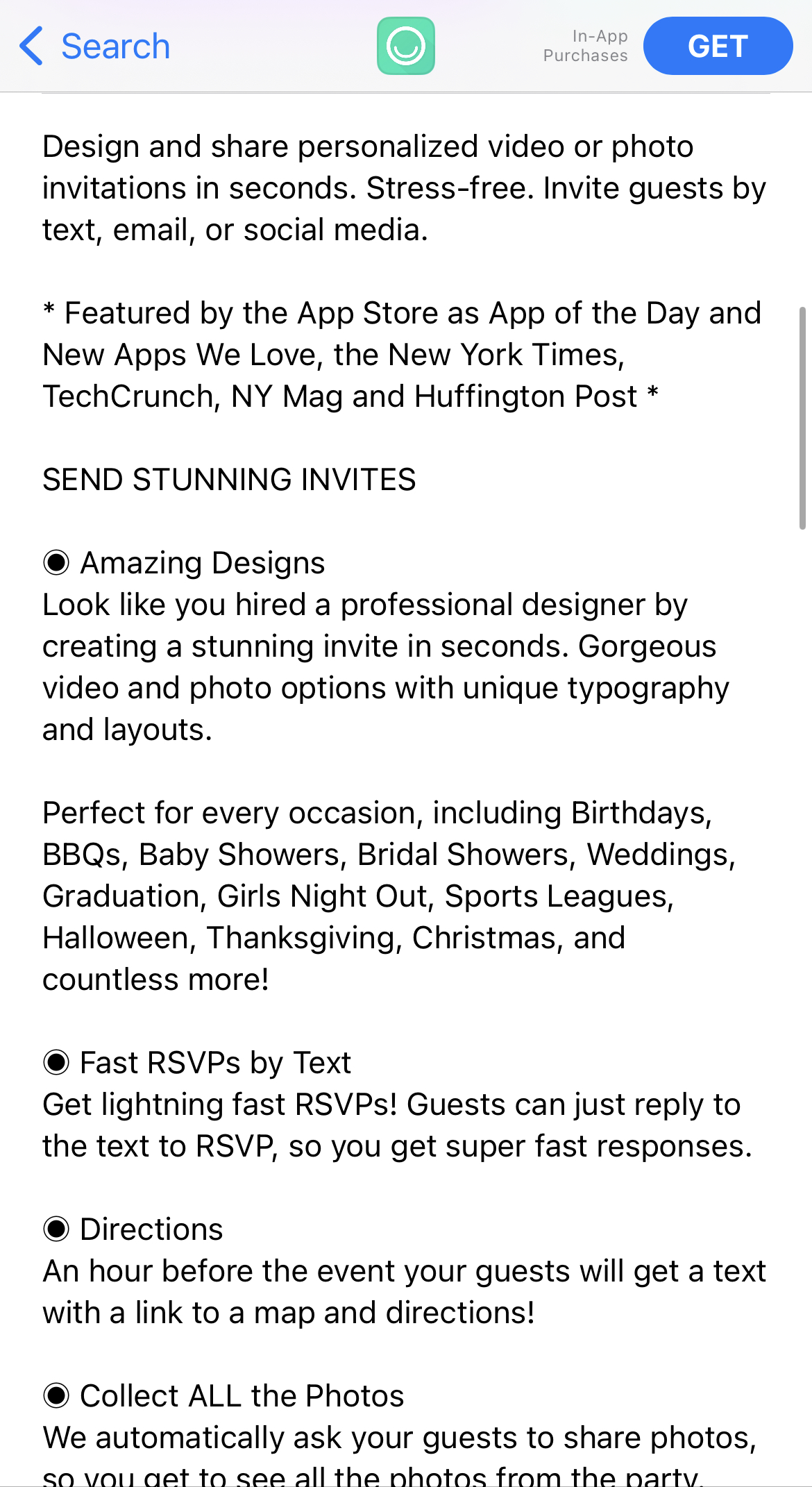
The method of dividing app features into separate sections with supporting copy that explains each one in-depth is an ASO best practice that can be observed not only in this app, but in other top performers competing with Invitation Maker as well.
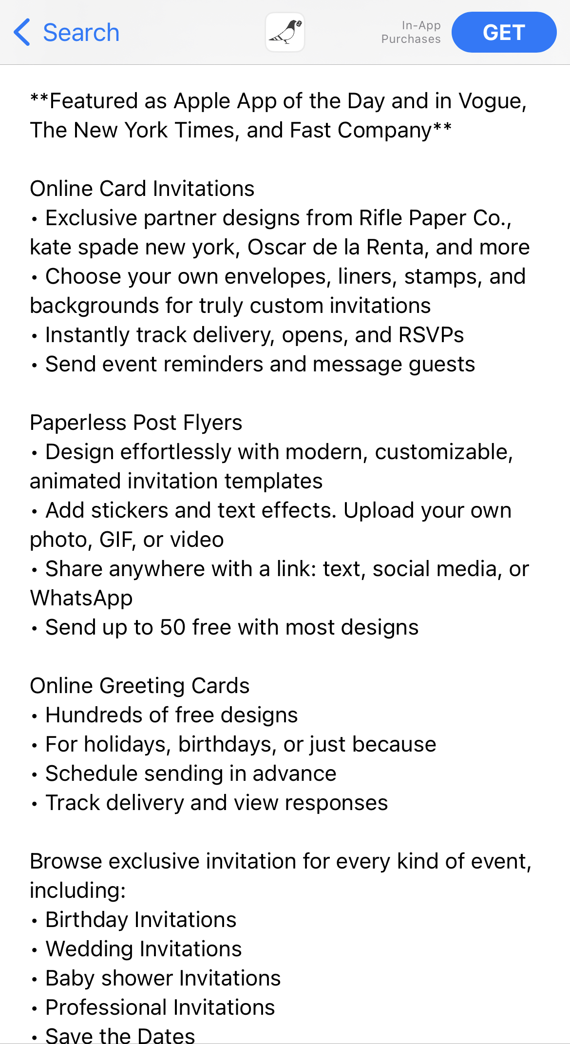
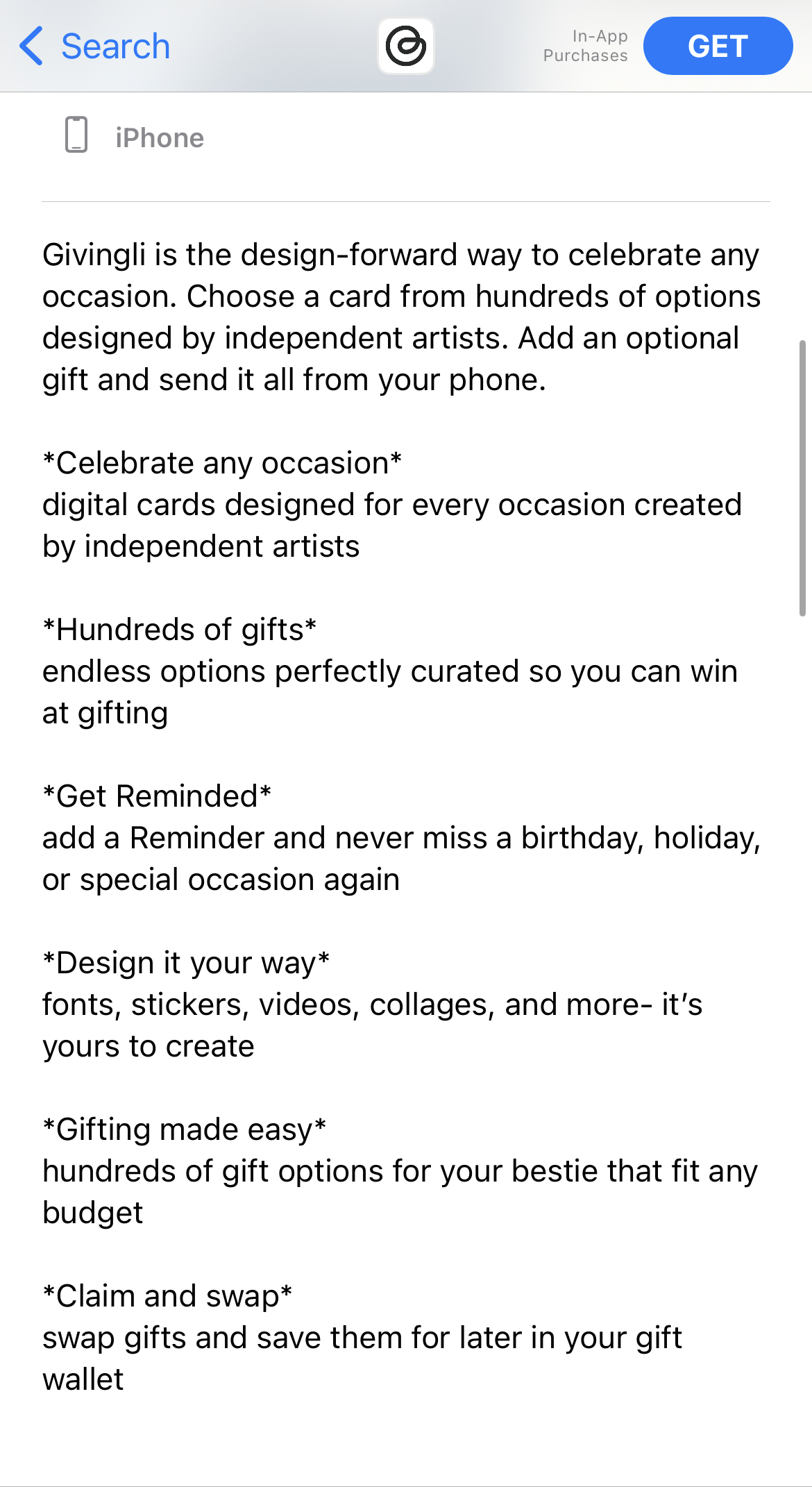
Paperless Post & Givingli App Store Descriptions
App Preview & Screenshots
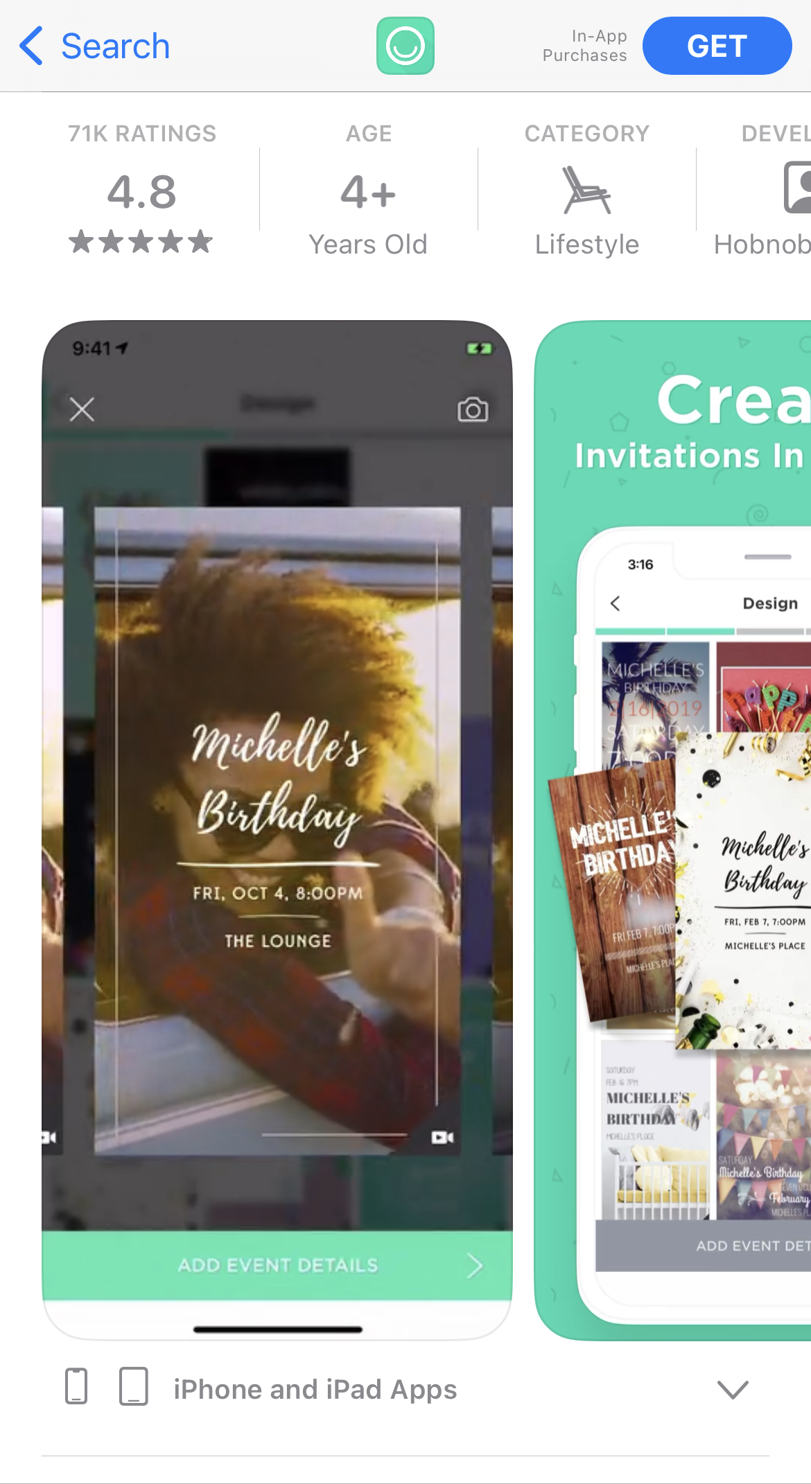
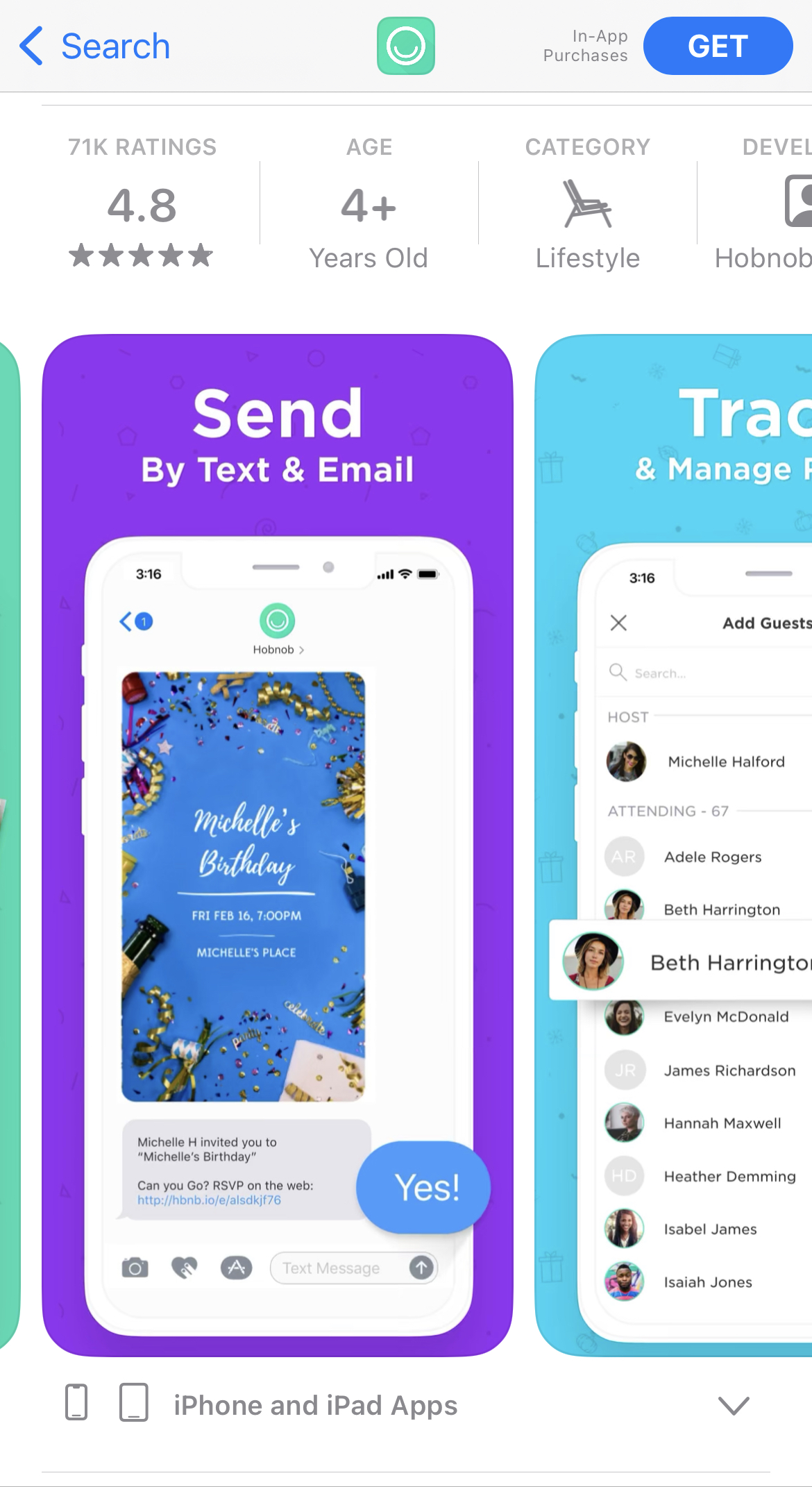
Among app store screenshot best practices, the use of iconography, emphasized UI elements, and in-app imagery are a few that can be found in Invitation Maker’s app listing. However, taking it a step further, the developers have also implemented several screenshot best practices in their App Preview video as well.
This combination of strategies not only makes for an engaging visual experience for users browsing the app listing but also provides the information quickly and effectively by including them in the App Preview video. Examples of chats, invitations being created, and sending them to contacts are just a handful of in-app activities shown in the screenshots and App Previews that check the boxes of what you should be doing when developing creatives.
Summary
For an example of how to create a quality App Store listing, Invitation Maker by Hobnob is a great starting point. When developing your own product page listing consider implementing the following:
- An app title that targets a hyper-relevant term
- A subtitle including specific events related to the app and user interests
- A description structure that individually highlights key features
- App creatives that make the viewing experience engaging and informative
By carefully developing each element in your app listing, keeping in mind ASO best practices, you can position your app in a way that keeps you relevant and competitive no matter the market.
More blog-posts like this:

Timeleft: Finding Friends, But Is It Finding App Store Visibility?
A/B testing alternative subtitle structures, and experimenting with screenshot designs could set Timeleft apart from its competition. Read more!
Checking In on Booking.com's ASO Strategy
Success in the App Store is driven by a combination of discoverability and conversion. Apps that excel in both areas consistently outperform the competition.
Mark Your Calendar: Howbout's ASO Audit
By introducing dynamic design elements & leveraging ASO tools such as App Store video and A/B testing, Howbout can significantly enhance its App Store listing.
