5 Best Practices for Apple Search Ads
Posted on July 3rd, 2024
Are you leveraging Apple Search Ads the right way? Take a look at these recommendations to optimize your paid campaigns and target the right users.

Adding screenshots of your app when submitting to iTunes Connect seems simple enough, right? Take screenshots, upload the files, done. However, the screenshot area is a very important part of how users perceive your app and you should be sure to know the answers to these technical and strategic questions.
One of the benefits of past-gen iPhones was their single screen size. This made it easier for developers to make an app without having to worry about a consistent user experience across multiple devices; everyone had the same sized device. Now that there are different iPhones with different screen sizes, developers must keep them each in mind when creating and submitting apps.
If your screenshots are not available in the newer iOS dimensions, it’s a red flag to users that the app hasn’t been updated in a long time. Some users may not give your app a second thought if it looks out of date. Even if your app was designed with only the smaller iPhone screen in mind, you can still show users how it will look on multiple devices. Having this option shows that you still care about maintaining your app in the modern App Store- even if the app itself is a bit outdated. Updating your screenshots can be very beneficial- and it’s a lot less difficult than redesigning your entire app!
iTunes Connect now asks for 4 different iPhone sizes when you’re preparing your app. If your app works on iPad, it’s important to include that as well. Remember, dimensions are displayed “width” by “height.” These are portrait dimensions; if your app is shown in landscape, just switch the numbers around.
* What’s great about the 4, 4.7 and 5.5 inch screenshots is that they are all about the same aspect ratio. Just make the largest one first and scale it down to make the other two!
When you’re exporting your images, remember to keep them high quality. Use PNG-24 or JPEG format. When using JPEG format, don’t compress the file too much or your users will see unsightly JPEG artifacting. Now that you’re a technical expert, what should you do with these images?
Calling these images “screenshots” is something of a misnomer.
Many successful apps use the screenshot area to display a mixture of in-app screenshots, text overlays and other artwork to create images that are both informative and engaging. Have a look at what the widely popular Heads Up uses for screenshots: 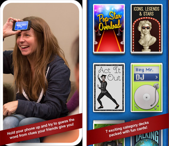 Imagine if these were in-app screenshots, rather than people using the game with instructional text.
Doesn’t sound very appealing, or informative for that matter. These screenshots tell a story about the app and engage the user. The point of the screenshot area is not to copy and paste pictures from the app; rather, it is to grab a user’s attention, let them know what they are in for and get them excited enough to tap “GET.” What order should they go in? Always put your best screenshot first.
In app store search and on iTunes pages, users will only see the first screenshot- this screenshot should be able to tell a story and engage a user on its own.
 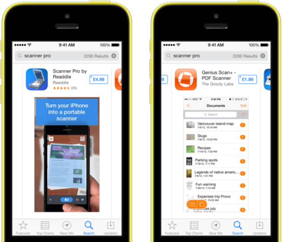 The first screenshot on the left communicates how a user will use the app right away; the one on the right simply shows an out of context screengrab from the app, which doesn’t communicate much.
Once a user is interested in your app and scrolling through the other four screenshots, they will have a context to go off of and you can show technical details about how the app looks.
Along with the technical and communicative ideas to keep in mind, remember these: - Use a high resolution source image. Your source should be much higher than the final sizes you are exporting to. - Make sure the text is legible. Keep in mind users will be reading this on phones, not a computer monitor. Look out for jaggles- watch the anti-aliasing! - Have a healthy mix of art, instructions and real screenshots. You want to make your images interesting and informative, but users still want to see some in-app images so they know what they are downloading. Hope that helps! Remember, on mobile App Store search results, the 1st screenshot takes up 50% of the screen.
If you want insight into what your screenshots are communicating to end users and how they may be improved, try running them through a mobile app focus group. Sometimes the end users respond in unexpected ways!

Are you leveraging Apple Search Ads the right way? Take a look at these recommendations to optimize your paid campaigns and target the right users.
Ghostly happenings are among us... and in your app listing too? If you aren't leveraging the power of app seasonality to make relevant tweaks to your store listing you're leaving precious engagement and conversions on the table.
Developers on the iOS App Store should plan in advance of the upcoming Holiday Schedule to allow enough time for apps to get approved during the busy holidays.