Poesie App Store Description Spotlight
September 3rd, 2020
 Tagged: App-Descriptions, App-Store-Spotlight
By Anh Nguyen
COO & Co-Founder at Gummicube, Inc
Poesie is a poetry app available on the Apple App Store as the App of the Day. It provides a library of poems, including audio recordings, weekly poet highlights and interactive features to help users understand the poetry more.
Yet as poetry is an art, there is also an art to writing the App Store Description that developers should keep in mind. Does the Poesie app use descriptions right? We’ll find out in today’s App Store Spotlight.
ASO Best Practices
App Store Optimization best practices include several points that descriptions should follow, including:
- Short and easy to read lines
- Present value propositions up front
- Bulleted feature lists the introduction
- Integrate keywords to connect the description to user searches
How well Poesie accomplishes each of these varies. While it gets many of the concepts right early on, there is room to improve and a few missteps that could be corrected. This could make the description more effective at informing users and gaining conversions.
App Store Description Overview
Is Poesie’s description designed to follow ASO best practices? It conveys key information properly, but there are areas where it could be adjusted for App Store Optimization.
Short Lines and Introduction
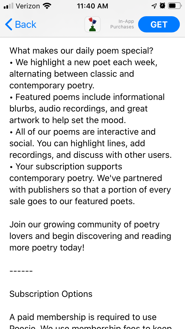
The description begins with a short introduction, introducing the value proposition and core features of the app. Each line is only a few sentences long, so it can be easily read as users scroll down.

While the description introduction should use short lines, it should still introduce the values and uses of the app. This short introduction does not convey much information or integrate many keywords, although it elaborates on everything in the feature list.
Feature List
It follows up the introduction with a quick bulleted list of features. Feature lists are great ways to convey all the various aspects and benefits of an app, although splitting one lengthy list into multiple smaller lists can be easier for users to read.
The list covers core features, such as the weekly featured poets, audio recordings and artwork. It doesn’t elaborate on those features, but it presents the core concepts.
Missteps
Where Poesie missteps is with the placement of the subscription details. Subscription apps must include information on their pricing and subscription rules, as Poesie does. When users reach the subscription information, it seems to signal that’s where the description ends and the legal text begins, so many will stop there.
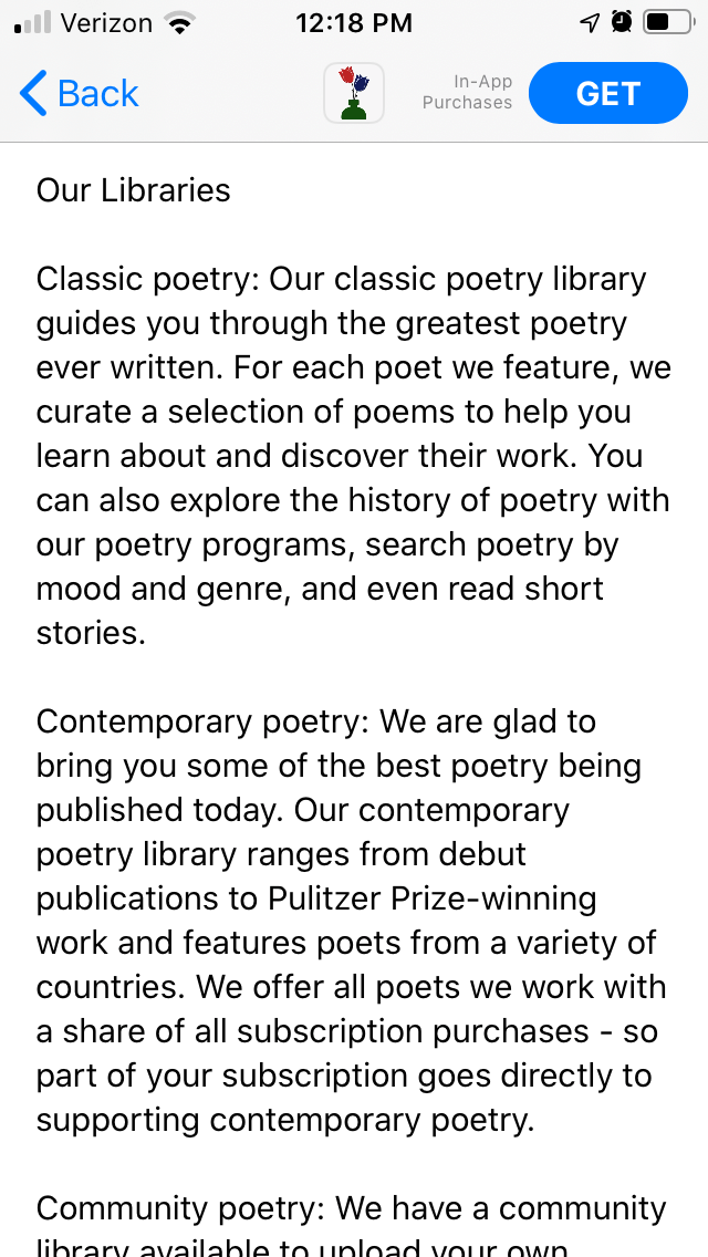
However, there are several more sections providing additional information about the app afterwards. These sections include another list of features and information about the variety of poetry available in the libraries within the app.
While it isn’t unheard of to divide free and premium features with pricing information, the app is based on subscriptions, rather than a free/premium divide. The additional features are valuable information that could be placed upfront so users can see it early on.

These sections are also larger paragraphs, which become blocks of text when viewed on a device’s screen. Breaking them into shorter paragraphs could improve ease of readability so users can learn everything important at a glance. Just like poems use stanzas to carry the rhythm, descriptions also need to be written with line breaks in mind.
The sections at the end include more keywords than the introduction, so it can connect to users with a wider variety of searches. This is another reason why it would be better positioned earlier in the description.
Competing Apps
How do other poetry apps utilize their descriptions? We can look at other apps offering similar features and see how their descriptions follow ASO best practices.
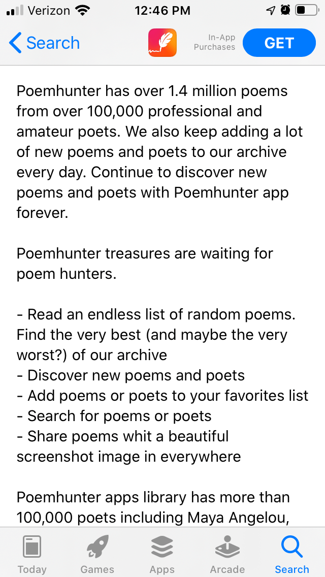
Poemhunter makes good use of its introduction, using short lines to quickly convey important information. At a glance, users can see how it has a large library of poems, how they can search for certain poems and the different poets included in the app. However, the lines do still run long and could be split into shorter sections.
The feature list is also very short, with only five bullets in the middle of the description. There is room to expand and elaborate there.

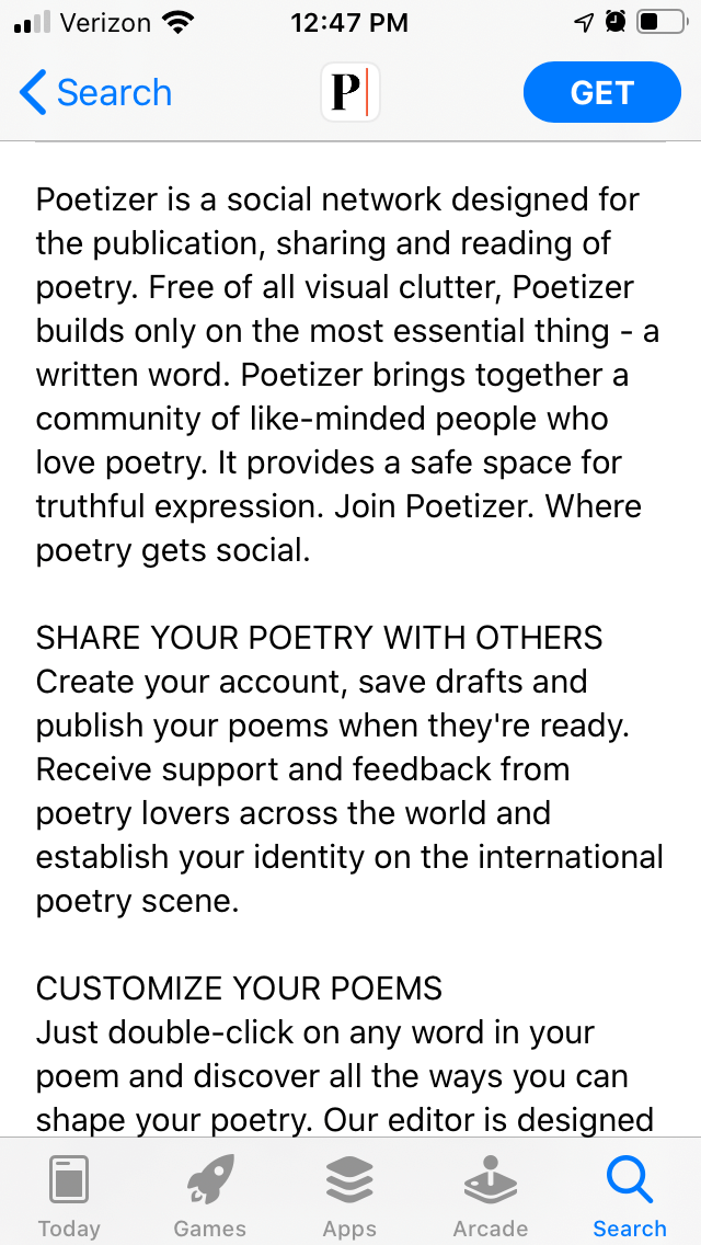
Poetizer, another competing app, tries to convey its features in a slightly different way. Instead of bulleted feature lists, it uses feature headers followed by a blurb describing the function. This can create larger chunks of text, but the headers are easy to read at a glance.

As these are poetry apps, the descriptions could try utilizing poetic structures for their formatting. This could allow them to provide information in a unique manner that relates to the features. While that is not an ASO best practice, it would be a creative way to engage with users looking for poetry.
Overall
Writing an App Store Description can be a creative endeavor, depending on the app in question. A poetry app like Poesie has a unique opportunity to utilize the structure of poems as part of its description, while following App Store Optimization best practices. Though Poesie is featured it has room to grow, and it could achieve that with good ASO.
Want to learn more about App Store Optimization? Contact Gummicube and we’ll help get your strategy started.
More blog-posts like this:

Timeleft: Finding Friends, But Is It Finding App Store Visibility?
A/B testing alternative subtitle structures, and experimenting with screenshot designs could set Timeleft apart from its competition. Read more!

Checking In on Booking.com's ASO Strategy
Success in the App Store is driven by a combination of discoverability and conversion. Apps that excel in both areas consistently outperform the competition.

Mark Your Calendar: Howbout's ASO Audit
By introducing dynamic design elements & leveraging ASO tools such as App Store video and A/B testing, Howbout can significantly enhance its App Store listing.
