Portrait v Landscape: ASO Best Practices to Make or Break Your Creatives
December 9th, 2017

by David Quinn
VP of Strategy & Partnerships at Gummicube, Inc.
App developers couldn’t ask for a better window of opportunity this holiday season to address their app’s core features and encourage users to tap “Get.” With new updates in the app stores and the release of long-awaited phones like the iPhone X, Google Pixel 2, and Samsung Galaxy Note 8, comes the perfect intersection for success. It’s more than likely that a good number of lucky recipients will be gifted a new phone before the year draws to an end – a phone that will be waiting to be filled with new apps. If you’re an app developer, you may be asking yourself, “How can I take advantage of this situation?” Regardless of whether your app is deployed on the App Store or Google Play Store, you have the option to choose the orientation (portrait or landscape) of your preview video and screenshots. A major question to consider is which option is right for your app? In this case, ASO doesn't have
a “one size fits all” solution. It is all dependent on what type of app you have. Luckily, there are pros and cons for each screenshot orientation: Portrait Pros:
In iOS App Store search results, the first
three portrait screenshots display. If a portrait preview video is included, then the first portrait preview video is displayed, followed by the first and second portrait screenshots .When using portrait screenshots for both iOS and GP, there are more opportunities to promote your app and show off its various features. Seeing more screenshots tends to increase the probable amount of time a user is likely to spend looking at your app.
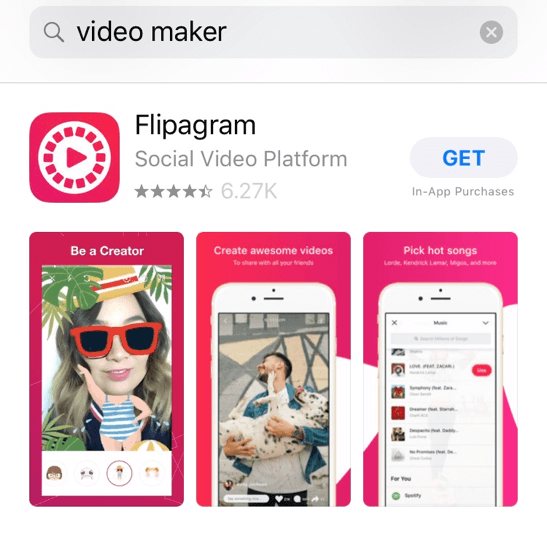
In the Google Play Store, screenshots display in the app page but not in search results. However, it displays similarly as iOS search results: three portrait screenshots display versus one landscape screenshot. With three screenshots, there is opportunity to showcase three features without having to scroll further in comparison to one landscape screenshot.
Portrait Cons:
In the App Store, since all three portrait screenshots will be crammed into a confined area on the screen, the content will be smaller and harder to see. At the same time, if the user is overwhelmed by the three options, they might skip over it if it looks too busy. If they cannot quickly and immediately digest what feature the image is trying to convey, they are less likely to convert.
In the Google Play Store, it is all too tempting to utilize the amount of media that is permitted. While Google Play allows for more screenshots (maximum of eight per device) than the iOS standard of five, it’s easy to include images that look similar or to call out redundant features. If all the screenshots look the same, developers lose the opportunity to explain their app in more depth.
 Landscape Pros:
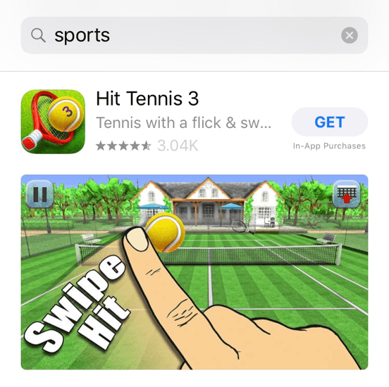
In iOS App Store search, only one landscape screenshot or preview video will appear at a time. Landscape screenshots allow for larger screen real estate for in-app images and content versus portrait. They are especially useful for mobile games, since many RPGs, multiplayer games and more are played horizontally.
Landscape Cons:
On the search results for the App Store, users can only see the first landscape screenshot. If a competitor has portrait screenshots and is able to address their app’s core features more effectively than you, then your app might not stand out against your competitors.
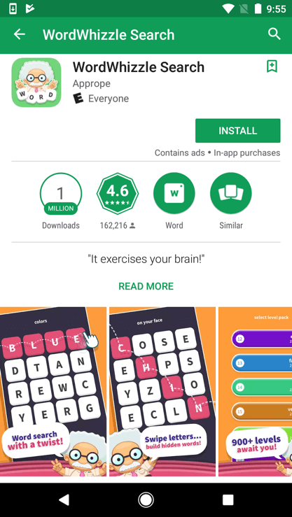
In the Google Play Store, one of the major drawbacks to using a landscape screenshot is the awkward layout. Users don’t just see the one landscape screenshot but also see a small portion of the following screenshot:
 Key Takeaways: Depending on what type of app you have, it will benefit more from having a different screenshot orientation. If you have a mobile game that displays in landscape, you can opt for landscape screenshots since it will represent realistic gameplay. If you’re ever unsure of what screenshot orientation fits your app best, you can always look at what your competition is doing or even utilize A/B testing. By weighing these pros and cons, you are sure to improve your chances of conversion.
Similar Articles

Posted on July 3rd, 2024
Are you leveraging Apple Search Ads the right way? Take a look at these recommendations to optimize your paid campaigns and target the right users.

Posted on October 6th, 2023
Ghostly happenings are among us... and in your app listing too? If you aren't leveraging the power of app seasonality to make relevant tweaks to your store listing you're leaving precious engagement and conversions on the table.

Posted on November 8th, 2021
Developers on the iOS App Store should plan in advance of the upcoming Holiday Schedule to allow enough time for apps to get approved during the busy holidays.


 Landscape Pros:
 Key Takeaways: Depending on what type of app you have, it will benefit more from having a different screenshot orientation. If you have a mobile game that displays in landscape, you can opt for landscape screenshots since it will represent realistic gameplay. If you’re ever unsure of what screenshot orientation fits your app best, you can always look at what your competition is doing or even utilize A/B testing. By weighing these pros and cons, you are sure to improve your chances of conversion.