CBS Sports: Analyzing its ASO Bracket
Posted on March 13th, 2026
Apps that evolve alongside their audience can maintain visibility in its app category through regular A/B testing, and iterations based on real user behavior.
Saturn Calendar – an app created by Gen Z developers for Gen Z and Gen Alpha students – has seen explosive success since its introduction to a larger body of students in 2020. With star-studded backers like Jeff Bezos (famously of Amazon), Marc Benioff (of Salesforce) and Dara Khosrowshahi (of Uber), the app has been relatively well-received on the App Store with a 4.7 star rating across over 60,000 ratings thus far.
Boasting an impressive rank of #9 in the Top Free Productivity apps for iPhone, at the time of writing this article, it can be safely assumed Saturn Calendar has an equally impressive amount of downloads coming in at the moment. However, category ranking being a better indicator of paid marketing traffic and not ASO success, how does Saturn Calendar stack up when it comes to the foundations of ASO?
In today’s App Store Spotlight, we will look to determine if Saturn Calendar is destined for the ASO stars or if their ASO has failed to launch at all.
As with any good adventure, space or otherwise, let’s begin as the user would – looking in the search results.
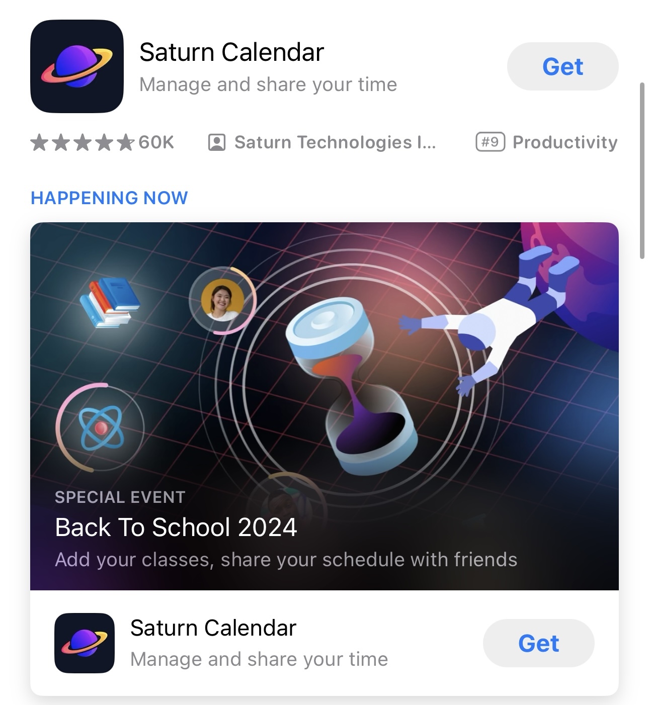
Introduced back in 2021, Apple’s In-App Events allow developers to show off limited-time events happening within their app or game, such as competitions, premieres, sales, and more. Despite this feature being in its third year of existence, a large number of apps in the App Store do not take advantage of this feature. Saturn Calendar decided they would not be one to miss out.
In-App Events show first thing in the search results before any of the standard app assets like screenshots or video. In their place is a large static image acting as a billboard with some information on the event and a “SPECIAL EVENT” notation. This not only draws the eyes of the user in the search result, with the large event image plastered immediately for all to see, but proves the app is active and producing content regularly – something a lot of users will be looking for in a galaxy of apps left abandoned to the update graveyard.
Especially notable here is that Saturn Calendar is utilizing In-App Events to their seasonal advantage. Back to School, typically spanning from August to October for high school and college students in the United States, is a prime opportunity for an app like Saturn Calendar to capitalize on. New and returning students will be looking for any way to make the school year easier – and Saturn Calendar promises to do just that, with the app’s schedule organizer and tracker for student’s classes, activities, and social life.
Seeing that Saturn Calendar seems to be reaching for the stars with their In-App Event content, how do their main product page assets measure up?
Unfortunately for Saturn Calendar, their title has less of a gravitational pull than their In-App Events do for users. Simply titled “Saturn Calendar,” with no additional title tags (search terms at the end of the title used to describe the app and index for additional keyword placements), the title is a paltry 15 out of the available 30 characters available. This is prime real estate left unused to the vacuum of space.
The subtitle does a little better, utilizing 26 of the available 30 characters available for this field. However, high volume, relevant keywords such as “tracker,” “organizer,” and “schedule“ are left noticeably absent. Additionally, the demographic is unclear within the title and subtitle with no mention of “students,” “high school,” or “college” based keywords. These support the calendar features and are key to Saturn Calendar being placed in front of the correct demographic’s eyes.
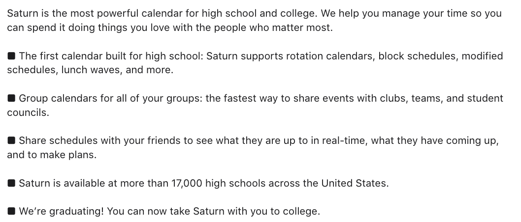
Saturn Calendar’s app description flies by so quickly, you might think it was traveling at light speed. Using only 687 out of the available 4000 characters for this field, there is a lot of work to be done here to flesh out more information for potential users.
Although the app description can be an area users might choose to skip over, favoring the more obvious at a glance screenshots or title and subtitle, for more particular users looking for more detail than the other fields provide, the app description is a developer’s last chance opportunity to convince any potential users still on the fence about downloading the app.
Additionally, the app description is a field that will be considered for placements by the Apple Search Ads’ algorithm, so if the developers of Saturn Calendar want to expand their scope even further with the support of paid search ads, it’s crucial they get their description in order with additional keyword placements (such as the ones mentioned in the previous section).
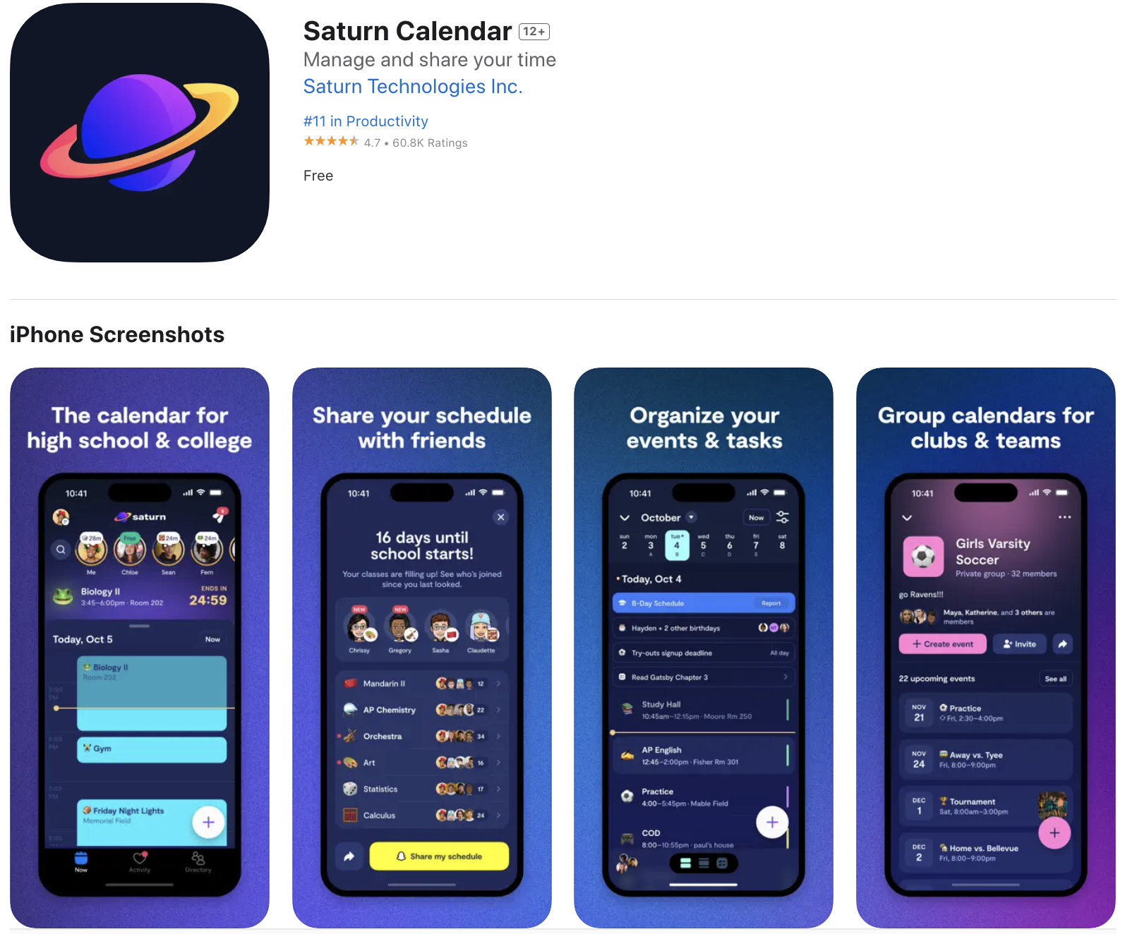
While Saturn Calendar does not currently have an app video (an asset that isn’t necessary but can be nice to further showcase functionality of the app), the app does have a set of 8 screenshots (out of the available 10 screenshots possible).
The developers for Saturn Calendar are following a number of good ASO best practices with their screenshots – relatively concise copy with a bold, easily legible font, high contrast backgrounds for both light and dark mode users, and relevant keywords within the copy targeting core features and demographics of the app (ironically left unused from what we can see in the visible metadata itself where they could be indexed).
While the screenshots have a lot of the basics down, further experimentation could be done to improve them. In-app images remain flat – zooming in a little closer by emphasizing the UI can help to highlight the most crucial features within the app.
The overall layout is simple, with front facing handsets placed evenly and equally from start to finish. Splash screens showcasing the intended demographic, positive user reviews, or accolades the app has received can be used to break up the monotony. Spanning handsets where a singular device extends across multiple screens can increase visibility on a particularly important in-app screenshot and provide further variation to the overall layout.
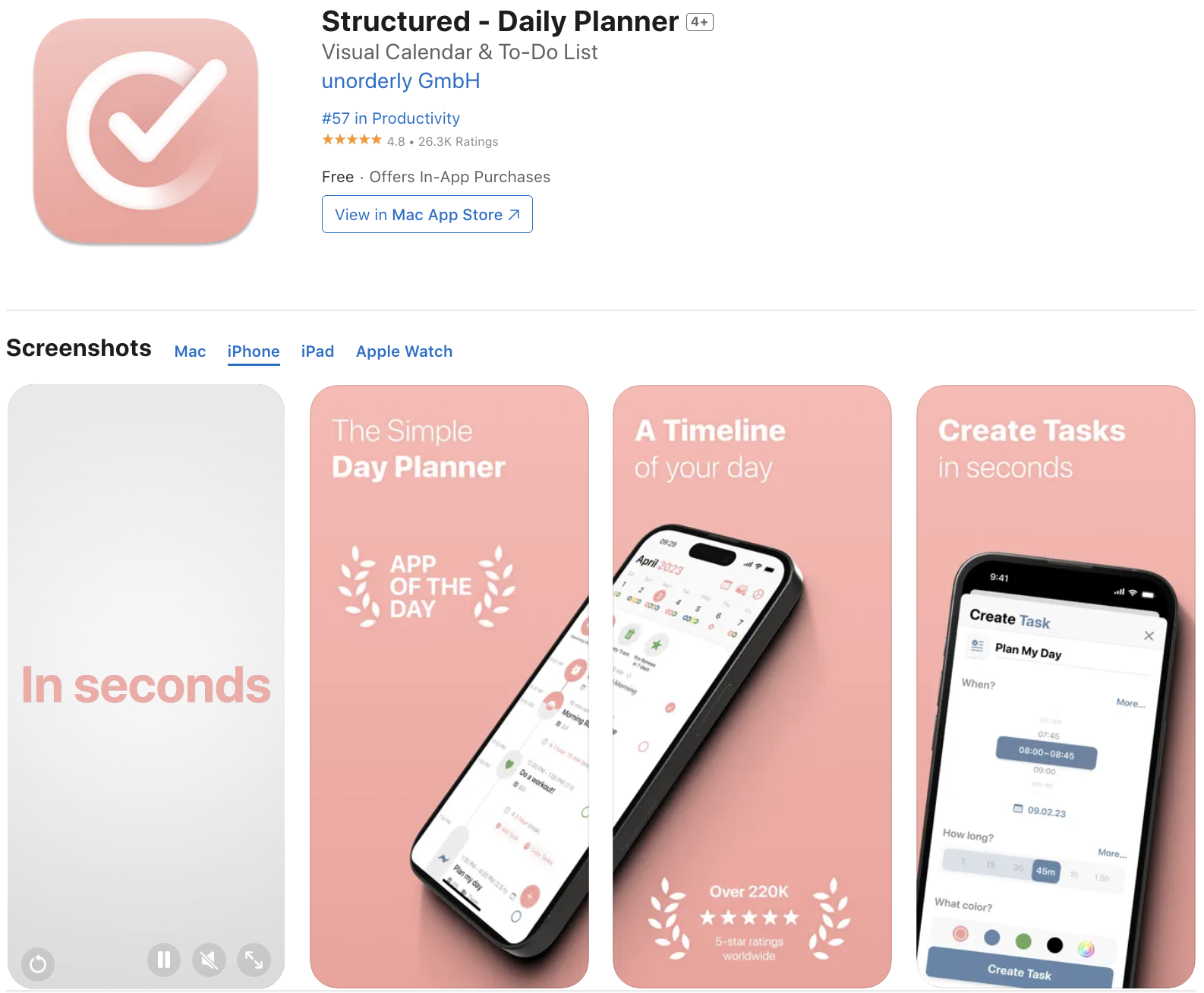
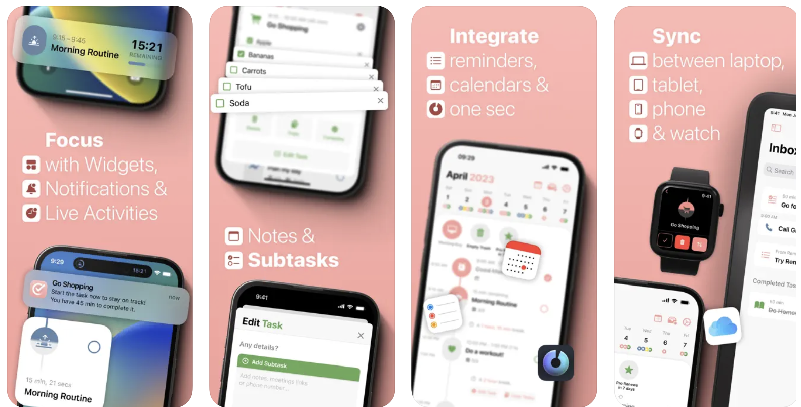
Competitor app, Structured, offers calendar and planning functionality similar to Saturn Calendar. Comparing the two apps’ screenshots, we can see examples of emphasized UI, spanning handsets, alternating layouts, and more advanced screenshot techniques to highlight and draw attention to the most important areas of the app.
Overall, Saturn Calendar has done well so far since its creation. Despite its missed ASO opportunities, the app continues to perform decently well, likely due in no small part to its heavy investment support and star-backed momentum. However, while paid marketing support is definitely a key part of a successful app promotion strategy, it cannot make up the entirety of it. Staying competitive in the world of ASO is an important partner to any paid strategy, bolstering its effectiveness and efficiency multiple times over.
Saturn Calendar’s ASO work so far shows a bit of a mixed result, with some aspects helping them to stay competitive (like the In-App Events) and some aspects falling flat. Embracing ASO will propel this rocketship forward even faster and at a consistent rate that paid marketing can’t always provide.
Until then, it looks like this app will remain here on Earth with the rest of the apps destined for ASO mediocrity.

Apps that evolve alongside their audience can maintain visibility in its app category through regular A/B testing, and iterations based on real user behavior.

By evaluating SeedTime's app title, subtitle, icon, screenshots, we can identify what the app is doing well & where ASO opportunities exist. Read more!

Even apps supported by healthcare providers must compete in search. The App Store is is an evolving marketplace shaped by user behavior, seasons, & algorithmic shifts.