Secret Neighbor App Store Spotlight
October 4th, 2021


by Anh Nguyen
COO & Co-Founder at Gummicube, Inc
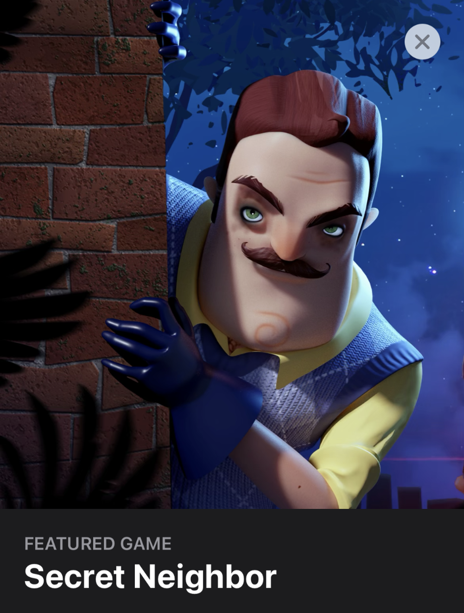
Hello Neighbor is a widely acclaimed mobile horror game by tinyBuild LLC, where you sneak into your creepy neighbor’s home to try to unearth his horrible secrets. Earlier this year, tinyBuild LLC released a multiplayer game that takes place in this same universe called Secret Neighbor, which is currently being featured by Apple to kick off October with a fresh update to a classic horror game.
In Secret Neighbor, players are split up as the inquisitive intruders tasked with infiltrating the creepy neighbor’s basement, with one mystery player selected as the neighbor himself. Secret Neighbor is a suspenseful game full of treachery and stealth sure to delight fans of the original series.

While featuring by Apple is sure to lead to extra visibility, will Secret Neighbor’s metadata and creative sustain its ranking in the long-term? Let’s snoop through this game’s current store listing to see if they employ the best ASO tricks.
Metadata
Secret Neighbor’s App Store listing only uses half of the 30 characters allowed, displaying only the branded title with no title tags. Relevant, high-volume keywords like “stealth” or “sneak” could be added to describe the app and target additional keywords.

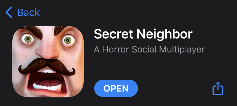
Secret Neighbor’s subtitle, “A Horror Social Multiplayer” is doing a a better job by using most of the space provided, at 27 of 30 characters. Additionally, the terms used here are great choices for representing gameplay and genre.
For both the Title and Subtitle fields, terms can be adjusted not just for keyword targeting, but to see how they impact conversion rates. In order to discover which keywords are the most relevant and competitive, tinyBuild LLC should look to include ASO tools into their workflow.
Popular horror games target diverse terms, especially in subtitles, which gives them a shot at improving ranking on a wide variety of keywords and phrases. The top ranked horror game on iOS, Endless Nightmare, uses the subtitle ”Best 3D Fun Scary Horror Game.” This subtitle is absolutely packed with popular search terms that drive visibility for the game.
Secret Neighbor’s description does a decent job of describing the app to users, but the features of the app could be highlighted more with quick bulleted lists that are easy for users to read.
While descriptions on the App Store are not indexed for organic search results, they are indexed for Apple Search Ads. Secret Neighbor’s short description - coming in at around 1306 of the 4000 maximum allowed - could use more of this space to target important terms for ASA.
Altogether, Secret Neighbor ranks for over 600 terms, with around half of them being high volume. Despite ranking for many high volume keywords, however, less than 5% rank in the top ten, which indicates that Secret Neighbor is not maintaining enough clicks on these terms vs other apps to achieve a high ranking.
Creative
Secret Neighbor’s screenshots communicate the suspense and almost cheeky horror narrative quite well. While the user interface is easy to see in the screenshots, the gameplay features are not as easy to discern. There are a few best practices for screenshots that Secret Neighbor could test to better communicate details about the game and see how it impacts conversion rates.


The most readily noticed absence in Secret Neighbor’s screenshots is the lack of text callouts. Users may skip past reading the description and simply decide to download a game based on what they gather from the screenshots; bold and visible screenshot text callouts can help get more information across faster to users quickly scanning through search results and product pages.
TinyBuild LLC could also test framing the screenshots differently. As long as the main focus of the screenshot set is still on the in-app gameplay, Apple’s guidelines permit framing in-app screenshots with additional supplementary art in the product page screenshot image. This would allow extra space for text callouts and background elements without interfering with the in-game images.
Secret Neighbor’s icon features the creepy neighbor staring directly at the user, in a close-up shot of his eyes. Users familiar with its predecessor, Hello Neighbor, will instantly recognize this design style; users unfamiliar with the brand will still likely be ‘creeped out’ by the character’s piercing gaze, instantly conveying the in-game experience. While the icon is definitely the stand-out creative that is executed well, it can still be tested to see if there is another implementation that yields higher conversion.
Overall
While Secret Neighbor can currently be discovered via a Today Tab featured game story, its search discoverability is limited by the lack of impactful keywords in the title and subtitle. While users are investigating the Apple iOS App Store, furtively searching for their next horror game addiction, Secret Neighbor might not jump out and catch their eye due to the lack of treatment to the screenshot set. A solid App Store Optimization strategy could help improve this game’s presence so more curious users can be lured in.
Want to learn more about App Store Optimization? Contact Gummicube and we’ll help get your strategy started.
Similar Articles

Posted on February 5th, 2026
App seasonality can directly impact visibility & conversion rates. See how Peacock could benefit from utilizing app seasonality to prep for Super Bowl weekend.

Posted on January 30th, 2026
Apps that succeed long term regularly refine their listings based on user behavior, competitive insights, & data. Read how Tiimo can improve its ASO strategy!

Posted on January 23rd, 2026
By learning from other lifestyle app competitors, prioritizing intentional screenshots, & embracing A/B testing, Badoo could unlock higher conversion rates.
