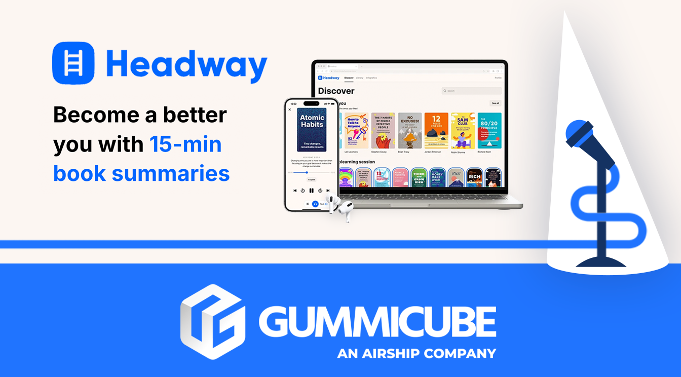
Headway- Daily Micro Learning's ASO Analysis
Posted on September 12th, 2025
See how Headway's ASO strategy stacks up against Nerdish. Learn where metadata, creatives, and A/B testing can help to unlock long-term growth.

The financial app landscape is highly competitive, with countless options available to users looking for tools to manage their money, track expenses, and save smarter. To stand out in this crowd, a well-executed App Store Optimization (ASO) strategy is essential. Oportun markets itself as an app that helps users build savings, track loans, and stay on top of personal finance with ease. But while the app has a clear focus, its ASO elements—such as its title, subtitle, and screenshots—can play a significant role in helping it reach the right audience and increase user engagement from the outset.
This review will explore Oportun’s ASO strategy, analyzing key metadata and creative elements, and identify areas where optimization could further increase its discoverability. We’ll also look at Buddy: Budget Planner App to see how a close competitor uses ASO effectively to capture a similar target audience and drive engagement.
When users first encounter Oportun in App Store search results, they see the app’s title, subtitle, and initial screenshots—each critical for grabbing attention.
By making subtle yet strategic changes to the title and subtitle, Oportun can improve its relevance in search results and reach a broader audience looking for comprehensive financial tools.
Oportun’s metadata (title and subtitle) provides an opportunity to further establish its place in the financial app market:
With these thoughtful adjustments to its key metadata elements, Oportun could attract a larger audience looking for easy-to-use yet comprehensive financial tools. Optimizing these areas can enhance discoverability and ensure that the app appeals to a broader spectrum of users who may be seeking solutions for their financial management challenges.
Screenshots are crucial for visually communicating an app’s value to potential users, often impacting whether they decide to download. Oportun’s screenshots, overall, are effective yet could benefit from small enhancements to improve user understanding and encourage downloads.
Oportun’s color scheme is clean and professional, reinforcing the app’s credibility and financial focus. The first three screenshots use bold and concise text, effectively showcasing the app’s main functions—helping users build savings, manage loans, and make budgeting simpler. However, the text in later screenshots becomes slightly more detailed, which can make them harder to skim through quickly. Simplifying these areas could help retain users’ attention while keeping the message clear.
Each screenshot in Oportun’s series includes icons that support the text without distracting from the main message. By adding icons that represent each feature clearly, Oportun maintains a professional appearance while ensuring that users understand its core value propositions at a glance.
Oportun could refine its screenshots by highlighting its primary benefits—savings, loan management, and ease of use—within the first three images. This ensures that users immediately understand the app’s core features without having to scroll through more screenshots. Including social proof, such as user testimonials or ratings, could increase trust and encourage more downloads. Displaying user testimonials or high ratings from satisfied customers can foster a sense of trust and credibility. Positive reviews act as endorsements, reassuring potential users that the app is reliable and beneficial.
Oportun’s visuals could be upgraded with a change in icons or graphics with clear, bold text paired with eye-catching graphics that pertain more specifically to loans or savings. A strategic approach to optimizing screenshots can significantly improve Oportun's user acquisition efforts by making a stronger initial impact and building trust with potential users right from their first encounter with the app.
Buddy: Budget Planner App is a comparable finance application that demonstrates a strong ASO presence by leveraging various ASO elements effectively to attract, engage, and retain users. A comprehensive analysis of Buddy’s approach reveals several strategies and best practices that Oportun could adopt to enhance its own ASO impact and achieve greater visibility in the competitive financial app market.
Buddy’s title, “Buddy: Budget Planner App,” and subtitle, “Money Manager & Tracker,” are filled with relevant keywords that boost its search visibility. With “budget planner,” “money manager,” and “tracker” included, Buddy positions itself well in the financial app market, appealing to users seeking comprehensive tools for budgeting and money management. These keywords broaden Buddy’s search appeal, helping it rank highly for users searching for versatile financial management tools.
By comparison, Oportun could similarly benefit by incorporating additional keywords into its title and subtitle. Keywords like “budgeting” or “money manager” could help Oportun reach a wider audience that is looking for an all-in-one financial solution.
Buddy’s screenshot strategy is notable for its clear, concise text and logical flow of information. The first screenshot showcases Buddy’s primary goal—budgeting—in a single, impactful phrase, accompanied by a “Rated #1 for Budgeting” award from Forbes. This social proof immediately builds credibility and positions Buddy as a trusted choice for budgeting.
In subsequent screenshots, Buddy highlights other core functions, such as expense tracking and budget creation, providing potential users with a quick yet thorough overview of the app’s offerings. By focusing on essential features upfront, Buddy effectively communicates its value proposition without overwhelming viewers with excessive text or graphics.
Oportun could take a similar approach by ensuring its primary benefits are emphasized within the first few screenshots. If the app has any notable achievements or positive user reviews, displaying this information early in the screenshot series could improve user confidence. By simplifying later screenshots and focusing on clear, easy-to-read text, Oportun can keep viewers engaged while showcasing its unique features.
Oportun has a solid ASO foundation with effective elements like a clear color scheme, professional visuals, and concise messaging. However, the app could make several refinements to improve its discoverability and appeal to a wider user base:
With these improvements, Oportun has the potential to elevate its ASO strategy significantly, allowing it to stand out even more in a crowded marketplace.
Looking to take your app’s ASO strategy to the next level? At Gummicube, we specialize in helping apps optimize their presence on the App Store to boost visibility, engagement, and downloads. Reach out to our team to see how we can partner with you to maximize your app’s success!

See how Headway's ASO strategy stacks up against Nerdish. Learn where metadata, creatives, and A/B testing can help to unlock long-term growth.

Analyze NFL Fantasy Football's App Store listing vs Yahoo Fantasy Football, Sports. Discover creative and metadata tips to help boost visibility and engagement.

Hotwire's ASO strategy shows promise, but leaves room for growth. See how app metadata, creatives, and A/B testing tools could boost visibility.