Starbucks App: ASO Strategies Amid In-Store Challenges
August 23rd, 2024
 Tagged: Creative Optimization, Keyword Optimization
By David Bell
CEO at Gummicube, Inc.
As Starbucks transitions to its new CEO, Brian Niccol, the company looks to address its in-store frustrations that include order delays, barista burnout, long lines, and an overall lack of a peaceful environment across busy city locations.
Yet, one piece of the Starbucks business seems unaffected by the chaos: its mobile app.
Maintaining its position as one of the leaders in the food and drink app category on iOS, Starbucks sets a strong precedent for apps in the mobile delivery space. Today, we’ll look into what appears to be contributing to their stance in the iOS App Store, in addition to areas of improvement that exist for Starbucks to continue to scale in an ever-growing market.
Starbucks’ App Store Order
With a 4.9 out of 5 star rating in the iOS App Store, and over 5.7M reviews in the United States alone, it is clear to see that the Starbucks app is well received amongst users seeking out a mobile delivery food and drink app.
However, outside of a positive in-app experience, we’ll want to better understand how they are performing in first attracting new customers.

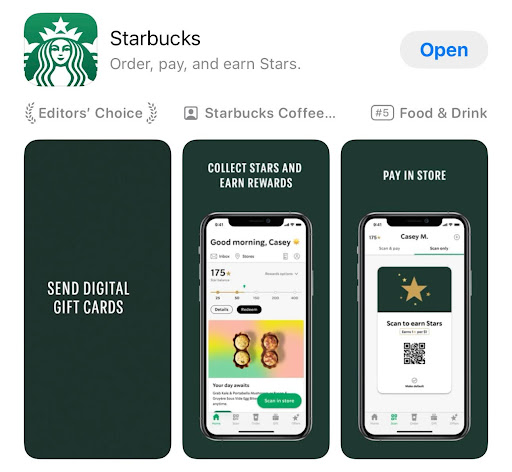
Currently, Starbucks maintains a brand-reliant title - utilizing 9 out of the 30 characters allocated for this field. The subtitle then works to lay out the key app functionalities: “Order, pay, and earn Stars," taking advantage of 27 characters.
While these fields do a sound job of providing users with an understanding of the app’s use case, it limits Starbucks’ full visibility potential when considering best practices of App Store Optimization. Leveraging only 36 out of 60 characters, there is ample opportunity to further expand upon the app product (as much as that may seem obvious) and increase keyword targeting to aid in Apple’s algorithm. Character usage is not the only key aspect to keep in mind here either. Of the 36 characters used, we would then need to consider search volume for said terms, their phrase building potential, and overall relevance to the app itself.
By maximizing usage of both of these high-impact fields (in terms of space and quality of targeting), Starbucks has the ability to further increase the level of visibility achieved in the App Store for priority terms. The high-volume keywords “coffee” or “food” for example - both of which are currently not targeted in the visible metadata - could be woven into the title field to aid in click-through rate and indexation for highly-relevant phrases such as “coffee app” (high-volume; currently ranked #16) or “food rewards” (high volume; currently ranked #19).

Scrolling past the title and subtitle field, coffee lovers will be greeted with an app preview video that works to break down how a user would interact with an app, and 8 screenshots thereafter - depicting core features within the app itself.
The creative set serves to emphasize the convenient, on-the-go app experience and exceptional rewards program - building off of the copy positioning first highlighted. In comparison to competitors, it’s clear to see that Starbucks opts to rely heavily upon the brand itself - with a significantly more understated creative set.
In terms of how Starbucks could work to improve upon these fields, elements visualized in competitor sets present ample opportunity for A/B testing. For instance, the inclusion of branded art elements to increase visual appeal, the usage of product visuals, feature order testing to better understand top-performing value propositions (such as shifting “Order[ing] Ahead” before in-store payment), and more!
Keep in mind: Users really only spend a few seconds looking at an app in search results before scrolling on to the next. In other words, it’s crucial that the initial impression is strong (or in Starbucks terms, a Blonde Roast). Starbucks exists in a category dominated by pops of color, rewards messaging, and product visuals. All that to stay - weaving in some of the bolder, seasonal marketing seen in-stores may prove to be the turning point for an app working to maintain its positioning in the top charts.
Comparing Starbucks to other delivery leaders

Let's compare Starbucks’ strategy to that of another leader in the food and delivery space, Instacart. Having blown up right before the pandemic and growing in awareness ever since, Instacart has solidified itself as one of the superior delivery platforms both in and out of the App Store.
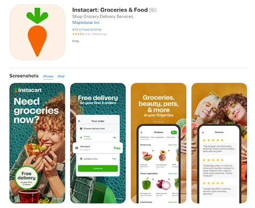
Leveraging nearly all of the allocated characters in the title and subtitle field, Instacart effectively targets 7 terms in total - with 6 of the 7 being of medium to very-high search volume, high search result relevance, and of phrase-building potential. When considering purely the messaging itself, the copy provides a clear understanding of the app services and product as well. Altogether, these two fields meet all recommended ASO best practices.
The application of strategic app store optimization is maintained throughout the remainder of the product page. Let’s breakdown what they are doing right here:
- Opening Splash Screen: In the first 2 screenshots, Instacart works to grab user attention through a call-to-action and user offer. While we wouldn’t necessarily recommend targeting “free” on iOS, the splash screen concept at large is our cup of tea.
- Emphasized Keywords: Across the vast majority of the set, the app works to increase emphasis on keywords related to user search queries, with smaller sub-copy thereafter that provides additional context and value incentives.
- Pop-Out UI: Bringing key sections of the UI closer to the user’s eye, Instacart works to emphasize UI elements to increase comprehension of the copy and in-app experience.
- Branded Background: Products, users, and a bright branded color palette serves to accent the background of the set.
Keep in mind that not all strategies work for everyone! Developers should always look to experiment prior to fully rolling out any changes to the visual product page; however, it’s clear to see that what Instacart has in production serves to aid in their app store presence.
Where do we brew from here?
The in-store frustrations in the Starbucks locations have not immediately affected its app ratings. Future streamlining processes inside the locations could have a negative impact on the individuals ordering from the app, and if that means slightly longer wait times for online order then we would likely see a small dip in its app performance.
In order to try and maintain, if not increase, app store KPIs - adjusting their app store strategy is a strong next step. Altogether, Starbucks presents a comprehensive and clean front in the App Store - but ample opportunity exists to apply ASO best practices and experiment with the latest trends in the mobile delivery space. Rather than relying on the brand alone to convert users, Starbucks can work to set itself up for success through a strategically crafted product page.
With small alterations made over time, Starbucks has the ability to pursue its positioning of “world’s largest coffeehouse chain” within the App Store space.
More blog-posts like this:

App Store Keyword Search Volume: What You Need To Know for ASO
When your keyword strategy aligns with how users actually search in the App Store, your app is positioned for sustained growth and long-term success. Read more!

How Can I Help New Users Find My App?
By aligning your strategy with platform differences, optimizing metadata, & leveraging data-driven insights, you can boost your app’s visibility & performance.

Leveraging ASO Tools to Boost App Conversion Rates
Developers who rely on data-driven insights gain a significant advantage, enabling them to optimize their App Store presence with precision and confidence.
