The Children's Place App: Shopping for ASO Insights
Posted on March 20th, 2026
Read more to see how The Children’s Place can implement winning ASO marketing strategies that could improve both app visibility & conversion rates.

As the holiday season draws near, tech gifts are rising to the top of many wish lists. Among the standout options, SwitchBot has emerged as a smart choice for anyone eager to create a more connected and efficient home environment. Offering a wide range of products designed to simplify everyday tasks, SwitchBot provides an array of solutions for users who want to enhance their living spaces with the latest in smart technology. Whether you’re a tech enthusiast, a busy professional, or a family seeking convenience, SwitchBot offers something for everyone.
What makes SwitchBot particularly appealing this season is its ability to cater to a variety of needs. From remote device control to the “Find My” Wallet Finder Card, these products combine practicality with thoughtful design, making them perfect for gifting. For those interested in gifting something that blends cutting-edge tech with everyday utility, SwitchBot is the ideal fit.
In this app spotlight, we’ll break down the app’s store metadata, focusing on key elements such as the title, subtitle, icon, and screenshots. We’ll identify areas where SwitchBot excels and provide optimization tips to ensure it stands out to holiday shoppers. By tweaking these elements, SwitchBot can position itself as the ultimate tech gift this season.
SwitchBot’s choice of a single-word title reflects its clean and recognizable brand identity, which is a definite strength. This simplicity helps establish brand recall and ensures that users can quickly identify the app in a crowded app store environment. The minimalistic approach also presents a missed opportunity to incorporate descriptive keywords that could improve its discoverability. For instance, adding context about the app’s functionality, such as “SwitchBot: Smart Home Control,” could better align the title with popular search terms and clarify the app’s purpose for potential users.
A more descriptive title would not only enhance the app’s visibility in search results but also help it appeal to users unfamiliar with the brand. For the holiday season, including festive or gift-related keywords could further boost its relevance and attract shoppers looking for tech gifts. With a strategic update to the title, SwitchBot can better communicate its value proposition and stand out in a competitive market.
Currently, SwitchBot’s app listing lacks a subtitle, which is a significant oversight in terms of app store optimization. Subtitles play a crucial role in app discovery by providing additional space to include descriptive keywords and highlight the app’s core features. Without a subtitle, SwitchBot is missing out on a valuable opportunity to connect with users searching for specific functionalities like “smart home automation” or “device finder.”
By crafting a compelling subtitle, SwitchBot could significantly improve its search rankings and user engagement. For example, a subtitle like “Simplify Smart Home Automation” or “Your All-in-One Gadget Controller” would effectively communicate the app’s primary benefits while incorporating relevant keywords. Seasonal subtitles, such as “Smart Gift For The Holidays,” could also tap into holiday-related searches and make the app more appealing to gift buyers. Adding a well-thought-out subtitle would not only enhance SwitchBot’s metadata but also help it stand out during the competitive holiday shopping season.
SwitchBot’s current app icon reflects the brand’s minimalist aesthetic, which resonates well with existing users. Its simplicity and clean design make it recognizable, ensuring that loyal customers can easily locate the app. However, the icon could do more to visually communicate the app’s functionality and attract new users.
To enhance its appeal, SwitchBot could consider adding subtle design elements that reflect its core features, such as a small symbol representing smart devices or automation. For the holiday season, incorporating a festive touch—like a snowflake or holiday-themed border—could make the icon more eye-catching and relevant to seasonal shoppers. Experimenting with bolder colors or gradients could improve the icon’s visibility on app store listings and draw more attention from users browsing for smart home solutions. By refining its icon, SwitchBot can create a stronger visual connection with potential users and increase its overall appeal.

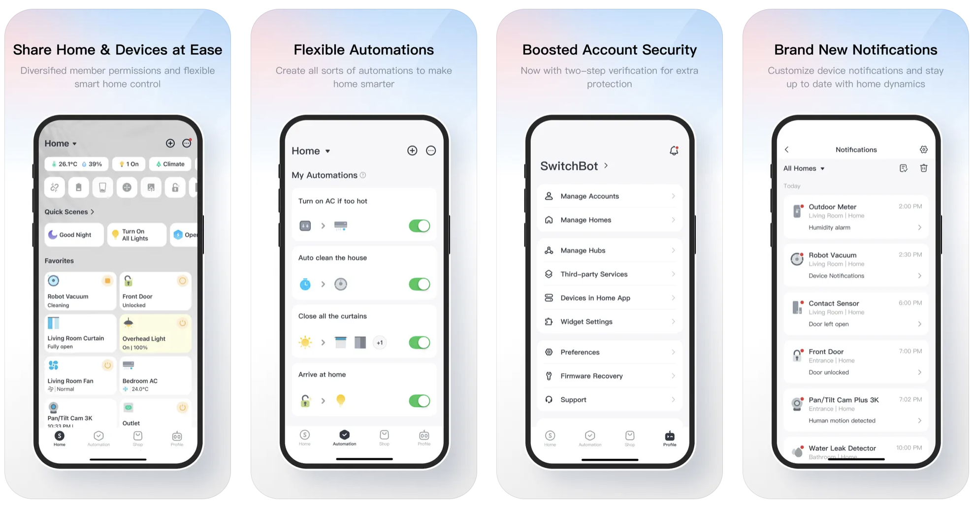
SwitchBot’s screenshots showcase a consistent design style and provide a clear representation of the app interface, which are commendable strengths. The uniformity across screenshots helps establish brand consistency, and the inclusion of device mockups gives users a realistic view of the app’s functionality. However, the screenshots fall short in fully engaging the audience. Additionally, the text is difficult to read due to its small size, with even smaller sublines under each header, which detracts from the overall user experience.
The broad overviews displayed currently in the screenshots lack focus, making it difficult for users to quickly grasp the app’s core value propositions. The text accompanying the screenshots, especially the second row, is in a light gray font that diminishes readability. The design also lacks bold or contrasting text colors that could help highlight key features.
To improve engagement, SwitchBot should consider showcasing individual accessories or specific use cases in its screenshots. For instance, highlighting features like remote device control, task scheduling, or the "Find My" Wallet Finder Card could better demonstrate the app’s unique value. Using vibrant background colors and clear, bold fonts would enhance the visual appeal and ensure that users can easily read the text. Incorporating animated-style diagrams or real-life application imagery could also make the screenshots more dynamic and relatable. By refining its screenshots, SwitchBot can better communicate its features and convert more users.

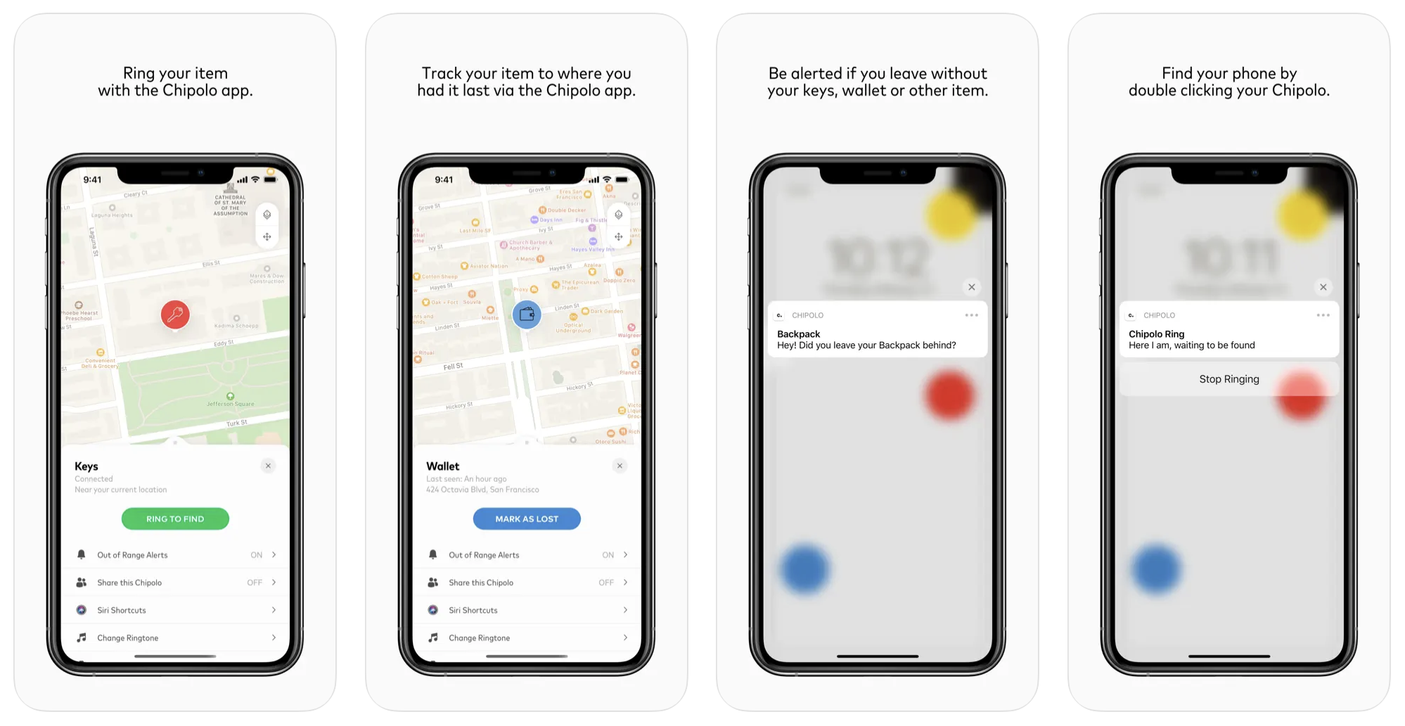
When compared to competitors like Chipolo, SwitchBot’s app store presence reveals areas for improvement. Chipolo’s metadata offers valuable lessons in simplicity and effectiveness. For example, Chipolo’s concise title, “Chipolo – Find Your Everything,” clearly communicates the app’s purpose while incorporating keywords that improve discoverability. Although Chipolo also lacks a subtitle, its title compensates by being both descriptive and appealing.
Chipolo’s icon design is another area where SwitchBot can draw inspiration. With a clean and minimalist design, Chipolo’s icon uses a bold “C” on a white background, making it easily recognizable across devices. In contrast, SwitchBot’s icon could benefit from similar simplicity while incorporating a distinctive element that reflects its core functionality, such as a symbol representing automation or device control.
Chipolo’s screenshots stand out for their aesthetic appeal and effective communication of features. Each screenshot uses minimal text and clear visuals to engage users. The text is clean, legible, and supported by well-chosen color contrasts. In contrast, SwitchBot’s screenshots feature very small text, often much longer than necessary, which can make it harder for users to quickly absorb key information. SwitchBot can enhance its own screenshots by focusing on individual features and improving text contrast to make key information more accessible. Streamlining its screenshot designs to avoid overwhelming users with too much information will further enhance SwitchBot’s app store presence and competitiveness.
In the competitive landscape of app store optimization, strong metadata is essential for increasing visibility and user engagement. SwitchBot has a solid foundation with its clean branding and consistent design elements, but there are several opportunities to refine its app store presence and make a bigger impact during the holiday season. By enhancing its title, adding a descriptive subtitle, refining its icon, and improving its screenshots, SwitchBot can better communicate its value proposition and capture the attention of tech-savvy shoppers.
As a practical tool and a thoughtful holiday gift, SwitchBot has the potential to stand out as a must-have smart home solution. Optimizing its metadata will not only boost its discoverability but also solidify its position as a leader in the smart home market. With strategic updates, SwitchBot can maximize its appeal and ensure its place on holiday shopping lists this season.
If you’re ready to enhance your app’s visibility and optimize its presence in the app store, we’re here to help. Gummicube’s experts specialize in app store optimization and can guide you through the process to maximize your app’s potential. Whether you’re looking to refine your metadata, improve your screenshots, or boost your overall visibility, our team here at Gummicube is ready to support your journey.

Read more to see how The Children’s Place can implement winning ASO marketing strategies that could improve both app visibility & conversion rates.

Apps that evolve alongside their audience can maintain visibility in its app category through regular A/B testing, and iterations based on real user behavior.

By evaluating SeedTime's app title, subtitle, icon, screenshots, we can identify what the app is doing well & where ASO opportunities exist. Read more!