How to Write an Apple App Store Description
Posted on July 17th, 2024
Learn how to approach App Store descriptions the right way so you can effectively engage and convert users.

In the competitive market of mobile games, it’s important to stand out if you want to see downloads and have active players. A forgettable user experience will drive users to play the game once and never think about it again. The games need to stick in their minds, secure a spot in their memories and continue to draw them back in. Players tend to continue playing a game because of its user interface and experience, particularly the music and imagery. Strong visuals and a compelling soundtrack can make all the difference between a user saying, “oh yeah, I think I played that game once” and “I will never forget this game.”
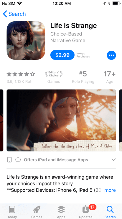
In today’s gaming environment, it often seems like everyone is competing to have the most realistic graphics, even on mobile platforms. Top-selling PC and console games such as Life is Strange and Injustice 2 were able to successfully make the switch to mobile while keeping their incredible graphics, smooth animation and detailed worlds. While games with that level of detail and quality do take up a large amount of storage space, any fan would say it’s worth it for the experience they get. However, it is also very possible to have a hit game that goes the opposite direction. Many games draw users in because of their “retro” style, using 32-bit sprites, or 2D animated graphics. Look at the ever-popular Plants vs Zombies franchise and its cartoon sprites. Not only does the game keep users of all ages engaged, the game’s design and characters are instantly recognizable, and properly set the tone for a humorous and addictive game. While there’s no one specific style of graphics that converts and retains users, game developers need to find the style that best suits their game. The tone and mood are influenced heavily by the graphics, so the style, designs, lighting and color all play an immense role in providing the user with the exact experience that the game is aiming to give them.
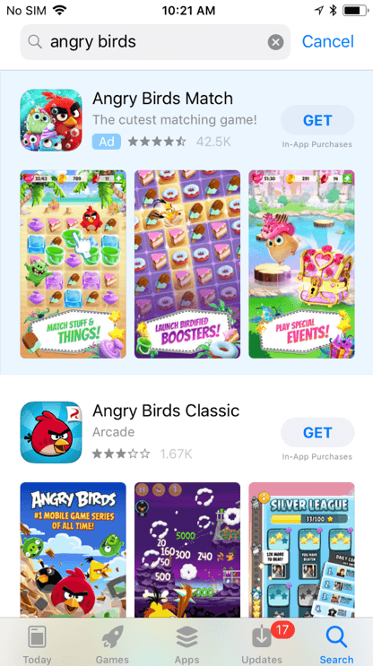
While developers know their game’s features and gameplay can be important, setting the proper tone with colors that are brand-specific and engage with users is also vital. Through the use of specific color pallets, developers can apply the psychological aspect that comes from color psychology, a tactic commonly used in marketing and branding. The general idea is that certain colors invoke specific emotions. It’s not just the fact that “bright colors are happy,” it also connects certain colors and shades to emotions commonly felt by people looking at those colors. Color psychology is why users will often see recurring colors on similar apps while browsing the app store. Developers look at what colors engage with users best and try to apply them to their own game. If you look through the puzzle games category, you’ll notice a lot of them use green or blue backgrounds in their creatives. This is not a coincidence – it’s an intentional choice by app developers to affect players on an emotional level before they even download the game. Developers need to utilize color schemes that make the brand and game easier to recognize. Angry Birds, for instance, has a recognizable color scheme and design that features a vibrant red bird on a blue background. The color red tends to invoke passion, excitement and energy and is also a contrasting color to blue. Its design and color scheme are iconic and can be seen repeated throughout each iteration and spinoff of the app.
While the visuals may be key to setting the initial tone, it’s the music score that carries it throughout each moment of the mobile game. As with the graphics, it should match the style and carry a certain motif throughout, but should have different scores for various levels, in-story moments and menus. A memorable score, even if it’s just the start menu, can make a big difference. If players find themselves humming along with the theme song, or re-hearing it later with a feeling of nostalgia, then you’ll know your mobile game is a hit. A great example of a mobile game that uses music effectively is Kingdom Hearts Union X [cross]. This game is a mobile addition to the Kingdom Hearts console game series that has an easily recognizable score. From the moment the game loads, players hear an instrumental version of “Dearly Beloved” by Yoko Shimomura. The familiar tune, a constant throughout the franchise, brings them back to their times spent enjoying the console games, which can serve as nostalgia when playing a different game within a series they love. Hit games like “Candy Crush” have catchy tunes that play from the start menu and at the end of each level, setting the tone and awarding the players for completing levels. Some games have a soundtrack that changes depending on the tension, emotion or success. The “Ace Attorney” games, which are available on mobile devices and Nintendo DS systems, have different tracks designed for various aspects of the games:
The tempo or style of the music can help convey if the players should feel “Cornered” in the courtroom or if they selected the right piece of evidence. Music that can quickly change depending on success or failure engages with users and lets them know that they’re headed in the right direction when playing the game.
The UI and UX can play just as big a role as the gameplay itself when determining the success of a mobile game. The graphics, color scheme and music all set the tone throughout the entire game and can be the reason why players keep coming back and recommending it to their friends. These concepts should also flood over into other aspects of the game, such as their app store listing. While color, experience, and sound can make a game last forever, a strong App Store Optimization (ASO) strategy will help get the users started in the first place. If they don’t apply the thinking that occurs due to ASO, then they’ll never understand what engages with their users best.

Learn how to approach App Store descriptions the right way so you can effectively engage and convert users.
Learn how to grab your audience's attention through effective and engaging app store preview videos.

Welcome to this week’s ASO Weekly - The App Store halts gambling ads amidst outcry and the Apple takes a bite out of NFT app sales.