
How to Write an Apple App Store Description
Posted on July 17th, 2024
Learn how to approach App Store descriptions the right way so you can effectively engage and convert users.
The key success factor in any industry, especially amongst retailers, is the continual optimization for consumer buying trends as new technology emerges. Shopping has changed from brick and mortar stores to e-commerce, then from e-commerce to m-commerce. This shift in consumer shopping behavior has impacted many retailers' bottom line.
Retailers need to keep up with these changes in order to grow and sustain their business. Additionally, having an app available and marketing it are very different – good App Store Optimization can make a major difference for mobile retailers.
Forever21, which dominated the affordable fashion space for nearly two decades, filed for bankruptcy this past September. Experts state this is in part due to the rise of mobile commerce. To illustrate the importance of focusing on App Store Optimization, we will review elements of the Forever21 app from other top retail apps.
Forever 21 was a trendsetter in the retail space. It was the first to market with affordable clothing, but it was not the first to market with its mobile app. By the time it entered the m-commerce space, other competitors had established themselves as leaders. Forever 21 continued to focus on its brick and mortar stores while the shopping space transitioned to m-commerce, contributing to Forever 21’s decline.
Keeping up with user’s shopping behavior is important both in retail and in the app stores. More users buy online and on apps than ever before. This means that a significant market segment is now fully mobile.
Apps need to remain relevant in order to thrive. This requires App Store Optimization, refreshing the product page to attract more users and keep up with trends. Many factors contributed to Forever 21 filing for bankruptcy, but a more competitive ASO strategy may have helped. If we look at shopping apps and their ASO, we can see where and how ASO could have helped the Forever 21 app remain competitive.
An app’s screenshots are essential for conveying its branding, design and functionality to users. Good screenshots should be visually engaging, demonstrate different aspects of the app, utilize callout text to inform users and display the core value propositions first.
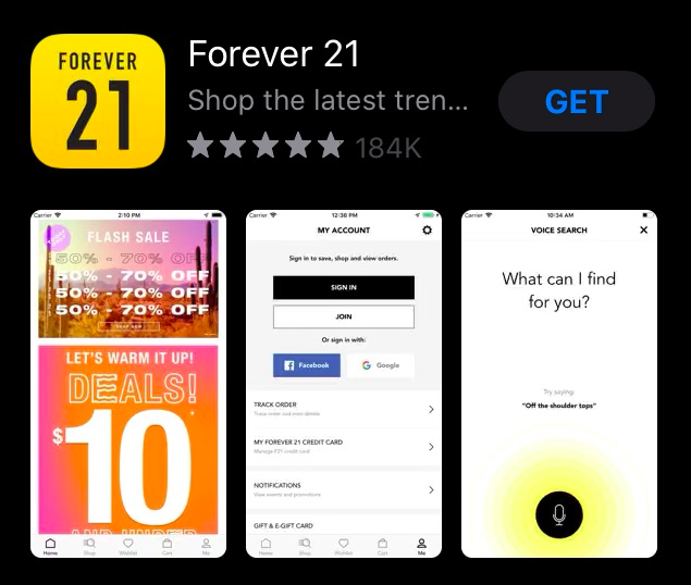
The Forever 21 app’s screenshots on the Apple App Store are not organized by features or value. Although the first screenshot advertises a sale, the second one is a picture of the “My Account” page, and the third is its voice search. As these are the screenshots that appear alongside the app when it appears in search results, they should showcase the biggest selling points.
Screenshots highlighting the products for sale appear later on. Users searching for the latest in fashion or ability to buy clothes have to click on the app and scroll through the images before finding anything relevant to their queries. For shopping apps, it is important that the screenshots keep up with fashion trends and user needs.
While the screenshots have been occasionally updated over time, they have not been updated with changing styles or seasons. Including screenshots and promotional text calling out sales like Black Friday can also help improve conversions.
Additionally, none of the screenshots use callout text to highlight the app’s features or benefits. Callout text can provide quick information to users about what they can get from the app and how it works, which can help conversions. Using keywords in callout text can also connect the app to user search queries.
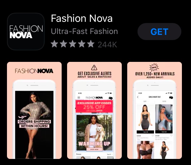
If we compare Forever 21’s creative set to that of a competing app, such as Fashion Nova, we can see where the differences lie. Fashion Nova’s screenshots highlight the variety styles and clothing for sale, all while showcasing different features of the app. This focuses on the key values and provide information for users. The screenshots also use callout text at the top of each image, highlighting information like “Get exclusive alerts” and “shop by category.”
Fashion Nova also updates for every seasonal shift, capitalizing on seasonal traffic throughout the year. In October, the creative set featured an orange theme and pictures of costumes, calling out the Halloween selection. After Halloween, it changed to an image featuring warm clothes for Fall. These changes help keep the app relevant based on user needs and trends.
The descriptions can also impact an app’s conversions. Descriptions must be tailored to each storefront (i.e. the iOS App Store or the Google Play Store) and provide key information about the app in a way that’s engaging and easy to read. Integrating keywords in the description can let users see how it’s relevant to their search queries, and is used for keyword indexation on Google Play. As with the keywords, the features should be mentioned in order of priority to quickly appeal to users.
The description for Forever 21 is sparse; one introductory line and a feature set four lines long. It does not mention styles or fashion, nor does it provide anything unique about the app to make it stand out from its competitors.
In this case, the app’s description also needs to adjust its feature list in order of priority. It doesn’t mention shopping until halfway down the list, after “app exclusive promotions” and how users can manage their Forever 21 Credit Card account.
On Google Play, its description does include more information about the app’s features. While this is a step up from the iOS version’s page, the description also needs to be written for Google Play’s algorithm to target keywords. The description also needs to be updated over time to reinforce its keyword indexation; leaving a description unchanged for too long can lead to the app’s rankings stagnating. Forever 21’s description most recently updated in January, where it removed a few lines from the introduction and left the rest unchanged.
Although the mobile app does rank #1 for its name, #2 for “clothing apps” and #4 for “fashion stores,” its rankings fall immediately after that. It’s #12 for “shopping app,” #15 for “buy clothes” and #25 for “cute clothes.” Most of the keywords it ranks for are competitors, which helps it appear in searches for other brands, but the mobile app still needs to stand out in searches for other related terms. If it were to use a description that swapped out terms like “Fit rating” and “easy checkout” at the start of its features for keyword-focused terms, it could potentially have helped index higher.
Mobile marketing outside of the App Store and Play Store can still have beneficial effects on App Store Optimization. Looking again at Fashion Nova, we can see how it uses the description to call out social network hashtags users can search for and use in their own posts. This helps the brand reach new potential customers via online word of mouth, as well as through paid promotions from social influencers, which can lead back to the app.
As users turn to mobile commerce for their shopping needs, retailers need to ensure that their mobile offerings can keep up with their brick and mortar stores. Fully optimizing apps to reach users and convince them to install can help keep a business competitive.
There were many factors behind Forever 21 filing for bankruptcy, but the company’s lack of attention to m-commerce played a critical role. Fully optimizing its app by following ASO best practices could have helped Forever 21 convert more users and appear higher up in more searches.
An app must constantly optimize and improve its performance on the app stores and in the ever-growing mobile commerce space. Even well-established brands can fall behind the competition if they do not focus on a mobile strategy. App Store Optimization is irreplaceable for retailers looking to succeed in a mobile world.
Want more information regarding App Store Optimization? Contact Gummicube and we’ll help get your strategy started.

Learn how to approach App Store descriptions the right way so you can effectively engage and convert users.

Learn how to grab your audience's attention through effective and engaging app store preview videos.

Welcome to this week’s ASO Weekly - The App Store halts gambling ads amidst outcry and the Apple takes a bite out of NFT app sales.