X Block Feature Removal & Google Play Store Testing Changes
August 21st, 2023


by David Bell
CEO at Gummicube, Inc.
‘X’ Breaks The Rules, But Who’s Paying Attention?
X (formally Twitter) seems to be getting another free pass when it comes to iOS App Store & Google Play Store compliance. With the social media platform’s recent rebranding came Apple’s momentary decision to block the name change. The App Store’s guidelines include having at least two characters in the app name, but for X that requirement did not apply. In an exclusive rule change, Apple allowed X to rename their app without a hiccup.
Now, both Apple and Google seem willing to skew the rules in favor of Mr. Musk once again with the removal of the ‘Block’ feature. The two platforms require apps to contain a block feature for user-generated content and other users to help prevent abuse, but how that rule is interpreted can determine whether it will even affect X at all.
Elon Musk stated the block feature “makes no sense” and will only apply to direct messages. However, the announcement of a new “mute” functionality could bridge the gap between what a traditional block feature normally does, allowing the social media app to leverage a policy loophole.

What Does This Mean For ASO?
Apple and Google’s leniency with X begs the question as to what is actually permissible and what is forbidden on each platform. If App Store and Play Store guidelines can be subjectively interpreted based on how features function, it may open the door for other developers to modify their apps in compliance with a seemingly malleable set of requirements – from the in-app experience itself to their App Store and Play Store listings.
Google Play Store New Search Layout
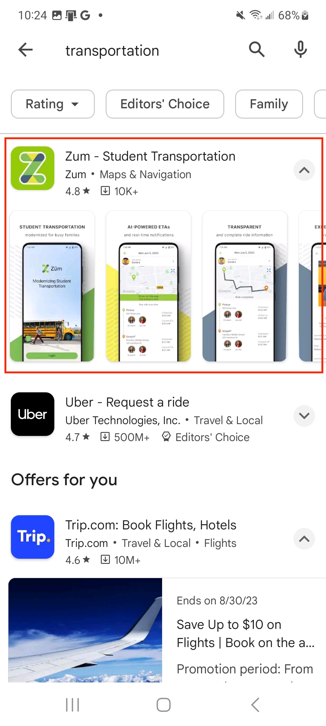
Installing an app directly in search results can be a streamlined way for users to discover and download apps. Seeing screenshots in search can provide a glimpse into the in-app experience before jumping into the full app listing. Promotional content in search can help boost engagement and provide relevant time-sensitive information. The possibilities are endless for what users can discover on search – or at least that’s what Google looks to test.
When navigating search results, each app that appears can have vastly different information. Google’s recent Play Store changes show signs of experimenting with the content that appears in the dropdown section of each app’s results listing. Whereas previously the only metadata assets users would see in search are the app icon and app name, Google has been experimenting with showing different content in each app’s dropdown section.
From the current short description and promotional content to the app screenshots, apps now have an opportunity to showcase different app listing elements in search results.


What Does This Mean For ASO?
The introduction of new content in search listings provides additional opportunities to attract users depending on what is being showcased. As a result, developers will want to make sure every single app listing asset is optimized to appear in this new section. They should also leverage native app marketing tools like Promotional Content to capitalize on the increased engagement and opportunity to communicate timely information.
Play Store Gets An Even Darker Theme
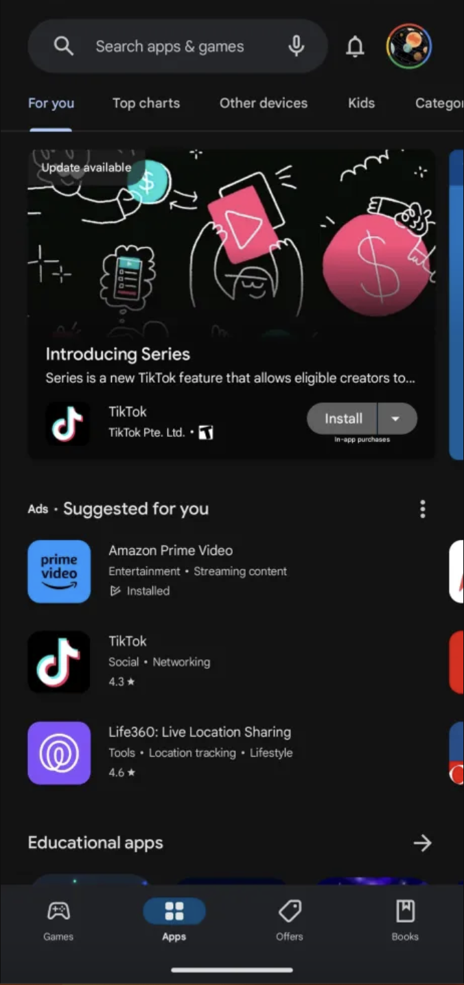
Fan of the dark theme? Well, it’s getting even darker. Google has been spotted testing an even darker grey for their native apps, including the Play Store. The new near-black background creates increased contrast with the app listings, creatives, and other elements in the store. For some, the higher contrast between the backdrop and text makes it easier to read and makes Google’s new ‘blue theme’ more noticeable.
App developers should consider this if and when it rolls out live and adjust any creatives so that they fit well with the new color. As reported by 9to5Google, the new color has been seen on all tabs of the Play Store and looks to accommodate OLED displays for improved viewing.


What Does This Mean For ASO?
A darker display means developers should consider the contrast between their creatives and the Play Store’s background to adjust accordingly. A great example of this can be seen in the above image where we can see little difference between TikTok’s logo and the newer dark theme backdrop. While it is an app that is instantly recognizable, other apps will want to make sure their color palette and elements within each image differentiate themselves effectively.
Need help with your ASO? Get in touch with the app marketing experts at Gummicube today!
Similar Articles

Posted on July 31st, 2024
Google continues to incorporate even more ways to increase discoverability across the Play Store. In this ASO News article we'll go over the newest updates, covering App Highlights, Curated Spaces, and all new personalized Game Recommendations

Posted on July 24th, 2024
Is your app safe? Google announced a wave of deletions coming to the Play Store, targeting apps they deem to provide a low-quality app experience. Make sure you know what that entails and how you can avoid being affected by the new policy updates.

Posted on May 16th, 2024
The new Google Play has arrived. With Google I/O 24 come announcements to changes to the Play Store layout, native tools, and monetization. Learn what to expect from the latest changes and prepare your app marketing strategy.


