Finding the Right Rhythm in ASO with Musixmatch
Posted on March 27th, 2025
This week, we explore how Musixmatch can update its ASO strategy to improve App Store search rankings, enhance visuals, and drive more downloads.

Prior to Apple’s upcoming “Events” feature announced at WWDC, a Story titled “Don’t Miss These Gaming Events” has been featured on the Today Tab of the App Store. The Story is primarily filled with popular games and IPs, like UNO, Minecraft, One Punch Man and Call of Duty, that have limited-time in-app events.

Along with these familiar brands and games that have seen success across multiple platforms, a minimalist, online multiplayer game users not familiar with the iOS App Store is featured: 1sland.
1sland, by nada studio, has users compete in small boats to be the first to find an island. With the cheeky subtitle “Paddle Royale” this game is sure to attract competitive gamers who want a break from the complex gameplay that has become the norm for the Battle Royale genre.
Being featured among heavy-hitters in the In-app event featurette is sure to put some wind in this game’s sails, but after the fame fades will 1sland sink or swim? Let’s dive in and check out 1sland’s App Store Optimization strategy to see if they have what it takes to maintain ranking.
1sland sticks to minimalism when it comes to the game’s title and subtitle. While this may be great for its gameplay, it may not be the best option for its metadata structure. Apple provides space for 30 characters in both of these fields, and the words included here are used in conjunction with the backend keyword bank to build high volume keyword phrases. While simply including “more” terms does not guarantee success, as the terms must be relevant for a user looking for a game like 1sland, not utilizing them at all is a missed opportunity.

1sland’s subtitle, “Paddle Royale” is a fun play on words that does a great job conveying the games core features, but again by using so few of the available characters 1sland is hurting its chances of bringing new players aboard. While “Paddle” and long-tail variants may not yield relevant search results, the play-on-words may resonate with users and help with conversion. Along with addition additional descriptors to fill out the remaining character space, using this vs a strictly keyword-driven Subtitle is also something that can be tested, measured and iterated upon.
Even combining these fields provides leftover space for additional keyword targeting: “1sland: Paddle Royale” utilizes 21 of 30 characters and leaves the full 30 additional characters in the subtitle for a creative, informative, and keyword flush supplementary tagline.
1sland’s description does a great job of explaining the core mechanics of the game in an enticing way, but there are a few considerations that nada studio could keep in mind that can potentially improve their store presence. This listing could benefit from restructuring it’s description to make certain features more readily seen by perusing users, such as adding a streamlined, bulleted feature list after a brief introduction. This can allow users to briefly scan the description and understand the app’s features and value propositions faster, rather than seeing large paragraphs and skipping it over.

Apple provides space for 4,000 characters in the description field, and 1sland is using fewer than one-fourth of this space. Again here, using “more” does not automatically equate to “better,” but there is definitely room to expand upon core concepts of the game. Incorporating keywords in this field will not directly impact organic ranking like the title, subtitle and keyword field will, however it may help index the app in Apple Search Ads and does have an impact on conversion rates.
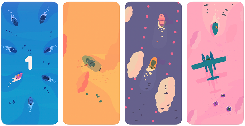
1sland features beautifully rendered screenshots, with rich colors and an attractive composition that perfectly convey the game’s minimalism. But this praise is mainly for the game’s UI itself- there is no design treatment applied to the store listing screenshots.

Screenshots serve multiple purposes in the process of App Store Optimization; they should accurately convey gameplay (or function, for non-gaming apps) and set themselves apart from competitors by calling out unique features, value propositions, and/or accolades in the form of text callouts.
1sland’s screenshots do show in-game imagery, however gameplay mechanics are a mystery and text callouts are missing entirely. The listing could benefit greatly from including a glimpse of the user interface and a few short and simple phrases that elucidate the main reason new players should want to download this unique game. Testing a composition that shows the in-app UI, along with a design treatment that allows for quick text callouts related to the game’s core keywords, functionality and value propositions while still keeping its minimalist aesthetic intact.
1sland is a unique, minimalist game centered around a playful “paddle royale” mechanic, where players compete globally to be the first sailor to find an island. While this game has excellent visuals and fun gameplay, they suffer from flaws of invisibility when it comes to App Store Optimization. With a few tweaks to the listing, 1sland could find its way to many more players around the globe, and set sail to the top of the charts.
Want to learn more about App Store Optimization? Contact Gummicube, and we’ll help get your strategy started.

This week, we explore how Musixmatch can update its ASO strategy to improve App Store search rankings, enhance visuals, and drive more downloads.

Discover how 23andMe can enhance its App Store presence with strategic ASO tweaks, and learn key ASO tips to boost visibility and conversion rates.

This App Store Spotlight on theScore explores title, subtitle, and screenshot optimizations to boost visibility and conversions during March Madness and beyond.