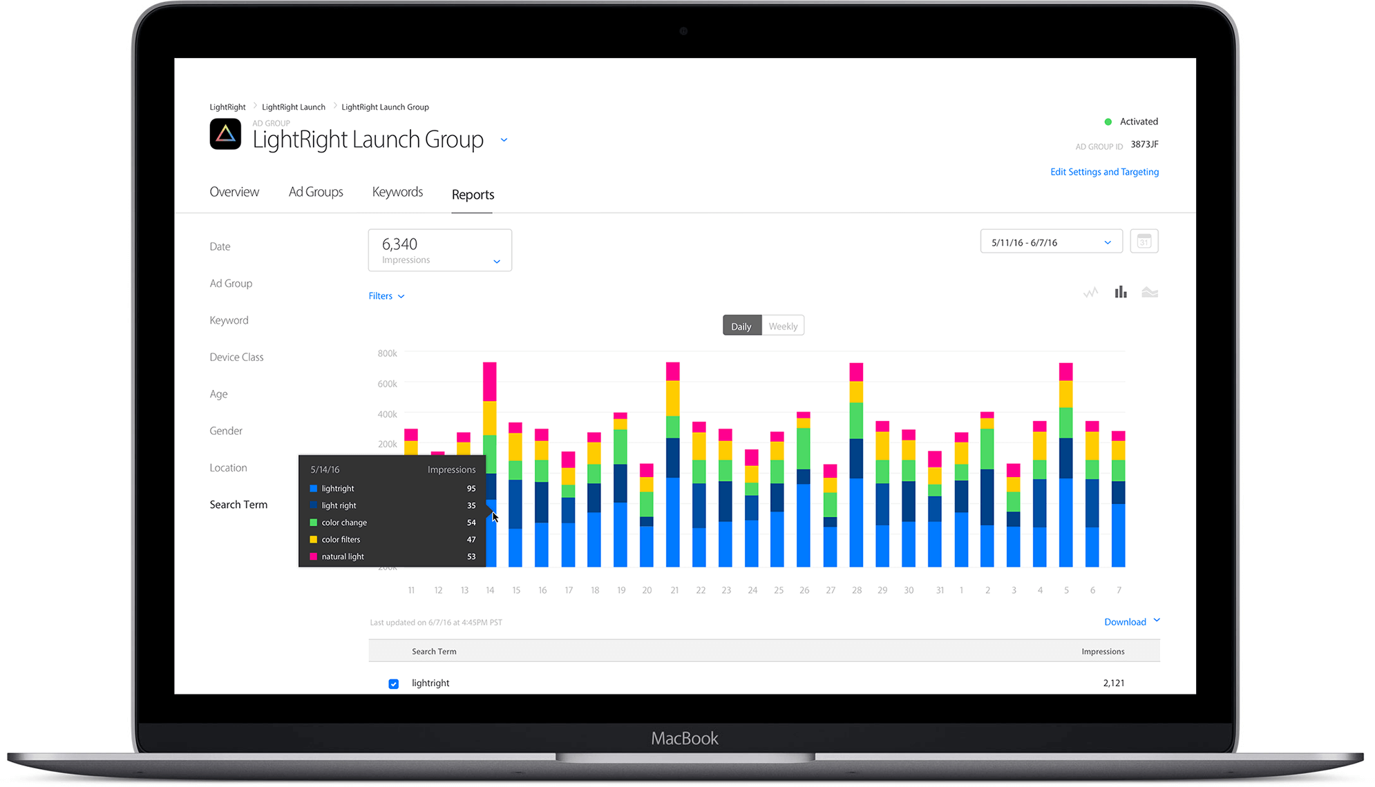
App Store Search Ads - Top 5 Strategies for the Best Search Ads
January 30th, 2017

By David Bell
CEO at Gummicube, Inc.
Apple’s new Search Ads initiative has opened up a whole new route to the top of search results. Bidding on a Search Ad is easy, but don’t think that just because you paid the highest amount you’ll suddenly see a huge increase in downloads. To fully take advantage of App Store Search Ads, your app needs to be optimized. Here are the top five strategies for creating a successful App Store Search Ad.
- Target Popular Terms
Deciding which terms to target should be the first step for each of your App Store Search Ads. While it might seem simple to pick and choose terms that are relevant to your app, stop for a moment to consider what exactly your potential users are searching for in the App Store. The terms most closely tied to your app may not always be the terms that will drive the most high-quality traffic to your page. The idea terms are both relevant to your app, and frequently searched by users in the App Store.
2. Establish Relevance for Your Terms
While you do want to target frequently searched terms, remember that Search Ads are ultimately based on relevance. That’s why Search Ads and App Store Optimization often go best together. Say you have a workout coaching app. The most relevant terms for your app would primarily be fitness and health related – you could get away with targeting “free workouts” or “personal trainer”, for instance. On the other hand, don’t expect to land any terms that aren’t related to your app, like “free games”. Some terms fall in between, though. The term “run”, for example, could refer to either a game or a fitness app. If you find that it is in your best interest to target a fringe term, or a term that isn’t explicitly discussed in your app description, you will need to create relevance for that term by optimizing your app listing. This involves establishing relevance through your description, among other things.
3. Show off Your App in the Best Light
When it comes to displaying your Search Ad, Apple affords you numerous options. You can opt to show off merely a small Ad featuring only your app icon, title, developer and ratings, or you can include screenshots in a variety of layouts. If you opt to include screenshots, the orientation does matter. Just like in traditional App Store search results, the best layout for your App Store screenshots depends on the layout and features of your app itself. You’ll get three times the number of screenshots in your Search Ad if you opt for portrait, but landscape is ideal for apps that are naturally landscape and need that space to show off additional information. Similarly, make sure that your icon is polished and your reviews average is solid. Even if your app is placed on a pedestal at the top of search results, fewer users will bother with your app if they don’t like the look of the ratings or can’t tell what it does.
4. Optimize Your Screenshots
On that line of thinking, should your Search Ad include screenshots it is necessary to optimize them for conversion. This will enable users to see clearly and precisely what your app does and whether or not it is of interest to them. Just as in traditional App Store search, your screenshots are essentially your advertising banners. Use this space to show off the key functions of your app. There are several key differences in the presentation of Search Ads versus traditional search results that necessitate a few addendums to the classic rules. First, using portrait screenshots in a Search Ad affords you with three screenshots to show off instead of two (this includes your preview video, if you have one). While this does put you at an advantage compared to traditional search results, consider how this difference affects the size of your screenshots on a user’s mobile display. Even with an iPhone 7 Plus, your screenshots will be smaller than they would look in search results. Cluttered screenshots can lead to confusion on the part of the user as they try to make out what is happening in each image. Make sure that if you intend to use screenshots, the imagery and text in them is legible to users on both standard and Plus-sized iPhone screens.
5. Track Trends
Remember Step One, where you plucked out the search terms with the highest growth potential for your app? Chances are, those terms won’t always reign supreme. Trends change all the time in the App Store, whether as a result of new app releases or external events. Consider a few trends that came and went in 2016 – from politics to Pokémon, many terms reached an astronomical peak before settling down to a more reasonable, albeit still often highly-searched, position. Your goal is to have your Ad at the top of search results when those terms peak, not afterwards when other developers are also scrambling to purchase Ads. Whether you use software or simply devote time every day to tracking trends, be sure to stay on top of what’s hot in the App Store and how it can be relevant for your app.
More blog-posts like this:

How to Write an Apple App Store Description
Learn how to approach App Store descriptions the right way so you can effectively engage and convert users.

App Store Preview Video: Best Practices for ASO
Learn how to grab your audience's attention through effective and engaging app store preview videos.

App Store News - Gambling Ads Nixed, New NFT & Crypto App Regulation
Welcome to this week’s ASO Weekly - The App Store halts gambling ads amidst outcry and the Apple takes a bite out of NFT app sales.
