Unleashing Success: ASO Breakdown of Pupford's Puppy Training App
Posted on April 24th, 2025
A deep dive into Pupford’s App Store listing, with tips to improve visibility, boost conversions, and turn more browsers into loyal users.

Nintendo’s foray into the mobile space has had some ups and downs, starting with the short-lived Miitomo and progressing through more and more successful apps. One of its bigger hits is Fire Emblem Heroes, a mobile game that made $295 million in its first year alone. It instantly appealed to fans of the Fire Emblem franchise, but while that propelled it to success, is its App Store Optimization strategy helping it reach that height or hindering it from achieving even greater success? Brand name recognition can only take an app or mobile game so far. While anyone familiar with the Fire Emblem franchise will find and enjoy the app, it can’t and won’t reach players outside the existing fanbase without optimizing its ASO accordingly. Relevant and properly utilized metadata will help it reach potential users outside of current Fire Emblem fans, while creatives that appeal to users whether or not they know the franchise will help increase conversions. As it is now, Fire Emblem Heroes is an app for Fire Emblem fans and no one else.
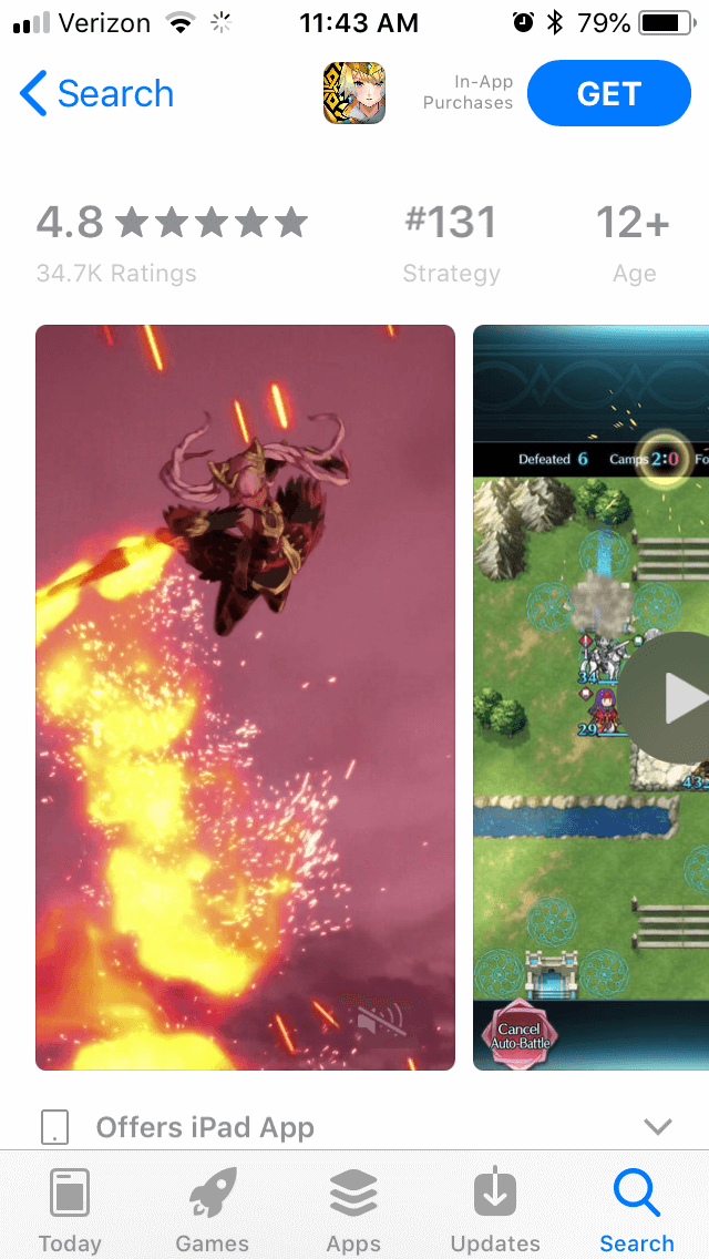
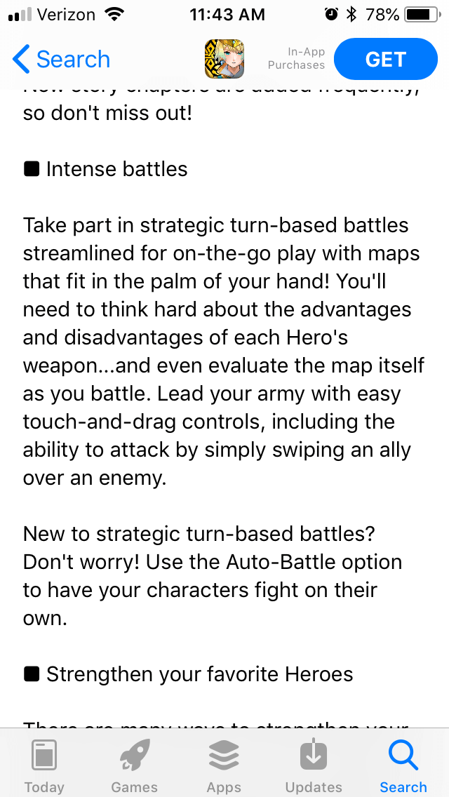
Fire Emblem Heroes immediately starts off with a strong set of creatives. It utilizes two videos, both of which show off the game’s features, graphics and gameplay. The very first image shows an epic animated battle, before switching to the smaller, more cartoonish in-game graphics, and includes artwork showing off the unique character designs. Fans of Fire Emblem will recognize several of their favorite characters banding together. Those unfamiliar with the franchise will not be able to identify who is who, but they’re still clearly heroes battling foes with unique character designs.  The following screenshots show various aspects of the game, including summoning heroes, how the combat works in-game and the team formation. Each one includes clearly visible callout text that highlights the features, including a screenshot calling out the latest promotion. They do not rely on knowing the specifics of Fire Emblem, as they choose to highlight designs that are interesting even without knowledge of the game’s lore. When it shows up in search, the first video automatically plays, featuring the characters in action. Two screenshots appear beside it, advertising the ongoing bonus campaign that lets everyone get a five-star hero and showcasing a popular character. These are good choices as each one demonstrates a different value of the game. While the character is only popular for those familiar with the franchise, she’s also appeared in other Nintendo games such as “Super Smash Bros,” allowing for a better appeal to users who have not played a Fire Emblem game before. With that said, there are only two videos and five screenshots. Apple allows up to ten creatives, so it could easily fit in three more screenshots highlighting more features or events, such as the current Summer event. While the creatives are strong, there are other areas where it falls short. For instance, its subtitle is just “Strategy RPG.” While this is accurate, it doesn’t come close to utilizing all the space that Apple allows for an app’s subtitle. This is empty space that could be used for a more keyword-heavy subtitle. As the subtitle plays as big a role in keywords for search ad relevancy and conversion as the title and keyword bank, leaving empty space there fails to utilize every tool at its disposal. Furthermore, its description is not optimized for iOS. It does include some sections that are formatted well, using a few short sentences to not take up too much space. There are many more, though, that are on the lengthier side and could easily be split into smaller paragraphs or bullets under their headers.
  While the description does utilize several important keywords, such as “strategy RPG” and “heroes,” it doesn’t use as many as it should. On the plus side, it is still a well-written description; it probably builds hype for the game while describing and selling each of its features.
On Google Play, Fire Emblem Heroes begins with a beautiful video. It uses cell-shaded animation to tell a story of heroes uniting against villains, with fluid action and epic music. While the video doesn’t demonstrate any of the actual gameplay features, that is acceptable on Google Play (unlike the Apple App Store). The creatives serve the same purpose as on iOS, calling out the game’s features with relevant screenshots and calls to action. It also features more screenshots than on iOS, showing off more of the available characters.  The description is identical to the iOS version, although the formatting works better here. Google Play users can use their computers for app discovery, so the larger paragraphs are easier to read than they would be on an iPhone. The description is divided into appropriate sections for each feature, calling out all the game’s features and benefits. The sections could stand to be rewritten so as to better place its keywords. While the section headers are acceptable, the way many paragraphs are formatted will make Google’s algorithms pick it up for “the game” and “We hope you’ll try” as keywords before relevant terms like “turn-based battles.” It’s important that apps tailor their descriptions to each App Store. Without understanding how Google Play indexes apps for keywords, Fire Emblem Heroes will not be able to reach its full ASO potential.
Fire Emblem Heroes is another example of a popular app with great creatives but a description that’s not optimized for either store. Its description is neither spaced out properly for the Apple App Store nor utilizing keywords enough for the Google Play Store, which will impact its rankings on both. No matter how beautiful its opening video is or how effective its creatives are, no one will be able to see them if they can’t find the app in searches. In spite of the game’s success within its existing fanbase, Fire Emblem Heroes still ranks poorly for several keywords. These are all terms that are relevant and high-volume, so targeting them would improve its visibility significantly. On the Apple App Store, it’s #20 for “fantasy RPG” in spite of that being its subtitle, #181 for “free RPG” and #67 for “hero games.” On Google Play, it’s ranked 20th for “turn-based games,” in spite of utilizing that keyword. It’s also ranked at #53 for the keyword “gacha,” another popular search term that it fails to properly target. The only way it shows up in the top ten results is when people are specifically searching for it, which severely limits its discoverability outside of the Fire Emblem fanbase. Clearly there is room to improve Fire Emblem Heroes’ ASO strategy. With the proper optimization, it could very well rise to the top of several relevant keywords and categories. Without ASO, it will only be the top app for its own name.

A deep dive into Pupford’s App Store listing, with tips to improve visibility, boost conversions, and turn more browsers into loyal users.

Discover how Orbit can boost visibility and conversions with smarter keywords, optimized creatives, and a stronger App Store presence.

Explore how Home Contents can improve its App Store listing with smarter ASO tactics, from stronger keywords to better screenshots and video strategy.