Unleashing Success: ASO Breakdown of Pupford's Puppy Training App
Posted on April 24th, 2025
A deep dive into Pupford’s App Store listing, with tips to improve visibility, boost conversions, and turn more browsers into loyal users.

An App Store Description should convey the uses and purpose of an app in a way that users can read easily. It can be tricky for apps that serve an important purpose to condense everything down, but it is necessary. Be My Eyes, an app designed to help the visually impaired through user volunteers, needs a good description to convert users into new volunteers. In this week’s App Store Spotlight, we focus on Be My Eyes and its App Store Description.
On the Apple App Store, Be My Eyes begins with a short pitch: “Small acts of kindness with global impact!” This is a good hook, which it then follows with a list of awards the app has earned.
After that, however, the App Store Description becomes lengthier and difficult to read on mobile devices. The description is five paragraphs long, with each paragraph taking up a good portion of the screen. Consequentially, users are likely to miss important information as they scroll through it.

The description contains important information, so it could be broken into smaller lines. Short lines are easier to read at a glance, so turning a long paragraph into a few shorter lines can help improve conversions.
There’s a short feature set at the end of the App Store Description, consisting of three bullets. This could be expanded into feature lists, which would provide more information in easy-to-read lists. This elaborate on the uses and benefits of the app in an easy to digest form.
The App Store Description on Google Play is significantly different from the iOS version. It begins with an explanation of the app’s purpose: “to help people see the world better, together.” Following that is a short paragraph explaining the core functionality, then the description delves into more detail.

The App Store Description also uses lists to describe the functionality. It has a three-point list on how the app works, a bullet list on its popular uses and another list for specialized help. The user testimonials and awards follow at the end.
What this description lacks is keyword usage. App Store Description needs to properly utilize Google Play keywords in order for the app to index for them. The description begins with phrases like “Whether you need a pair of sharp eyes or have some sight to lend” and “Sign up as a user to get free visual support.” This keyword placement will make it difficult for Google’s algorithm to index Be My Eyes for many of the terms it could target.
Looking at App Store Descriptions for competing apps, we can see how other apps in the field are optimizing their descriptions.
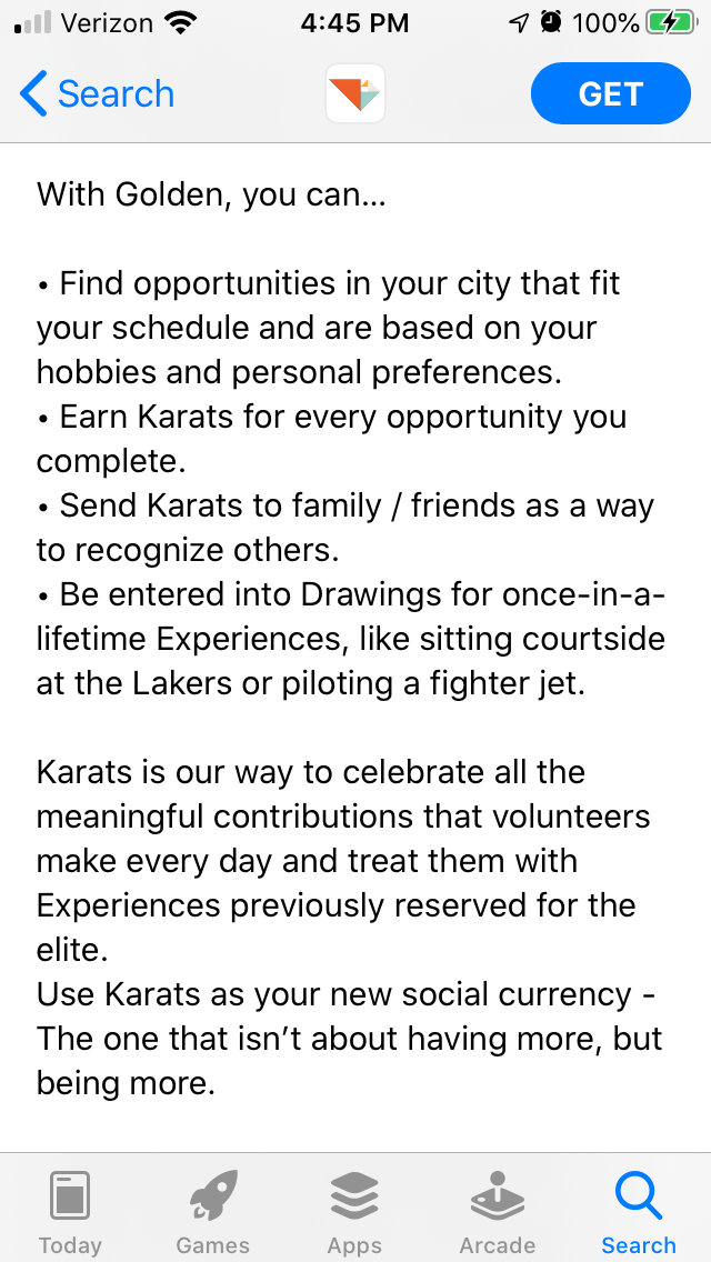
On the Apple App Store, Golden Volunteer Opportunities uses short lines and bullet lists to make the description easier to read while scrolling. There are some spacing issues near the end of the description, but it still uses shorter lines than Be My Eyes.

On the Google Play Store, Supersense uses its feature list to describe the app’s uses in a more keyword-centric way. It begins lists with terms like “Read texts” and “assistive app” to better index for those terms.

Be My Eyes’ App Store Descriptions convey a significant amount of information, but formatting and keyword placement are important for App Store Optimization. This app is a helpful tool for the visually impaired, so its developers will want to reach as many users as possible. For an app to appear in relevant searches and improve conversions, a good App Store Description can make a big difference.
Want more information regarding App Store Optimization? Contact Gummicube and we’ll help get your strategy started.

A deep dive into Pupford’s App Store listing, with tips to improve visibility, boost conversions, and turn more browsers into loyal users.

Discover how Orbit can boost visibility and conversions with smarter keywords, optimized creatives, and a stronger App Store presence.

Explore how Home Contents can improve its App Store listing with smarter ASO tactics, from stronger keywords to better screenshots and video strategy.