Unleashing Success: ASO Breakdown of Pupford's Puppy Training App
Posted on April 24th, 2025
A deep dive into Pupford’s App Store listing, with tips to improve visibility, boost conversions, and turn more browsers into loyal users.

A well-written can help a website gain subscribers, while a good App Store Description can convert users and get downloads for an app. To see how this works, we can look at the description for a popular app with news and list articles, such as BuzzFeed.
As a news and entertainment website, BuzzFeed knows the value of getting views on its articles. Is its app optimized to get clicks and downloads on the App Store and Play Store? We find out in today’s App Store Spotlight - the answer may shock you!
The BuzzFeed app uses the same description on both the Apple App Store and Google Play Store. It utilizes a short introduction followed by a feature list, calling out core aspects of the app.
The feature list includes several popular aspects of the app and website, including quizzes, videos and recipes. It also lists functionality designed to make the app easier to use, such as summaries, sharing and bookmarks. While this effectively describes how the app works in a simple manner, that alone does not make it entirely optimized.
The short introductory line works well for the Apple App Store, where it’s advised to use shorter lines in the description. These are easy to view at a glance as users scroll through the description.

The description does sprinkle in keywords throughout, such as “news” and “quizzes” terms. This helps establish relevance to those terms for potential users reading the description. At the same time, the description is very short, so it still has room to expand on the features and show why users should download the app rather than access the website from a mobile device.
There are a few ways this description could be improved. Adding in a few small lines to the introduction would help provide more information to users while still maintaining the ease of readability. This could be used to call out key features that differentiate the app from the mobile website.
Breaking up the feature list into smaller lists can also be beneficial. Instead of listing “news, videos, quizzes and lists” in one bullet and the BuzzFeed shows on another, it could use individual feature sections for each of those. This could add more emphasis to each of the features by letting them stand out within the description.
In order to index for keywords on Google Play, the app description needs to utilize them properly. This includes placing the keywords near the start of each line.
While the introductory line helps reestablish the app name positioning, the feature list does not target keywords at all. Each line begins with phrases like “Never be bored again,” “use the explore tab” and “Get push notifications,” none of which are valuable keywords.
As a result, BuzzFeed does not rank high for many keywords on Google Play. It ranks in the top five for its name, “buzzfeed quiz,” “quizzes” and “funny news,” but its rankings quickly fall after that. By expanding on the description and reworking it to integrate more keywords, the BuzzFeed app could potentially improve its positioning and visibility on the Google Play Store.
This is another area where splitting the feature list into multiple smaller lists could be beneficial. Not only can the headers catch attention quickly, they can also help target relevant keywords.
What are competing apps doing for their descriptions? By analyzing a competing app, we can see ways in which similar apps can optimize their descriptions.
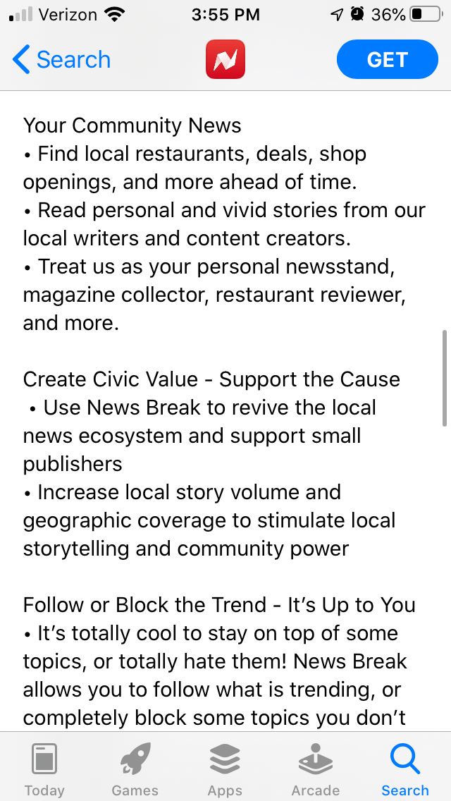
On the Apple App Store, News Break is an app focused on breaking news. It boasts “curated local briefings” and “national/world headlines” in its description, which quickly establishes relevance to user search queries.
The News Break description uses a slightly longer introduction, with three short paragraphs leading up to its feature lists. These provide a clear statement about what the app is and what it has to offer before delving into the specifics.
The feature list is also divided into smaller lists, with headers such as “Highlights – Your Local Briefing” and “Your Community News.” These smaller lists help users quickly identify features relevant to their needs and interests.

BuzzFeed’s app uses a description that is direct and to the point but can still be expanded upon. By providing more information in the introduction and splitting the feature list into multiple smaller lists, it could make it easier for users to find the information they’re looking for. Adding keywords into the Google Play description can also help the app index and rank for relevant terms.
BuzzFeed’s website is well-designed for Search Engine Optimization and gaining views from engaging article headers. If it wants to see the same kind of traffic from App Store search, it will need to focus on App Store Optimization.
Want to learn more about App Store Optimization? Contact Gummicube and we’ll help get your strategy started.

A deep dive into Pupford’s App Store listing, with tips to improve visibility, boost conversions, and turn more browsers into loyal users.

Discover how Orbit can boost visibility and conversions with smarter keywords, optimized creatives, and a stronger App Store presence.

Explore how Home Contents can improve its App Store listing with smarter ASO tactics, from stronger keywords to better screenshots and video strategy.