Unleashing Success: ASO Breakdown of Pupford's Puppy Training App
Posted on April 24th, 2025
A deep dive into Pupford’s App Store listing, with tips to improve visibility, boost conversions, and turn more browsers into loyal users.

An App Store Description needs to entice users while describing the app to them. There are many ways developers attempt this, from calling out their awards and accolades to presenting lists of all the features the app provides, but each store has different best practices.
For today’s App Store Spotlight, we take a look at the description for the Day One Journal app, which is currently featured as the App of the Day on the App Store. Is the description effective at following App Store Optimization best strategies, or is the journal app in need of a rewrite?
Descriptions need to be written for each store the app is on, following different best practices for the storefront. Day One Journal does this by using distinct descriptions for both the Apple App Store and Google Play Store.
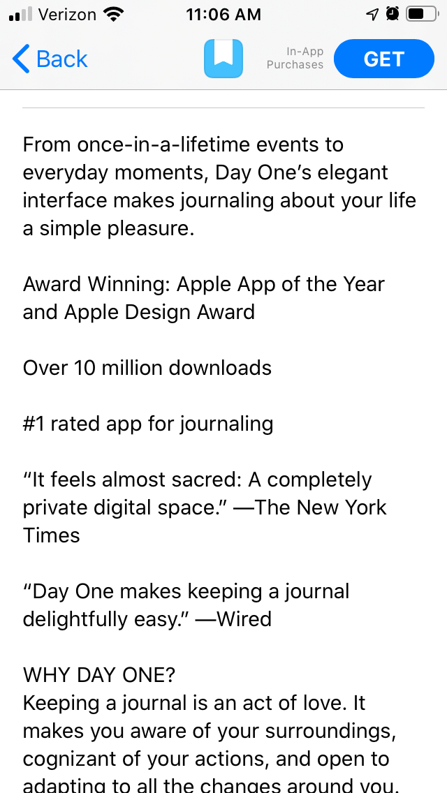
The App Store Description on the Apple App Store begins with a value proposition, calling out Day One’s interface and the benefits of journaling. This creates an effective introduction that presents the core value upfront.

Before going into the features, the description calls out accolades, including:
Doing so establishes credentials for the app to let users know it’s popular and well-reviewed.
The description then reiterates the importance of journaling before going into the features. These are done as individual feature sets, with one capitalized header and one line per feature. It does not use bullet points, but it does keep the sets distinct and separate.
Each line of the description is kept short, as per ASO best practices. This makes it easier to read at a glance on small iPhone screens.
On the Google Play Store, Day One’s description makes full use of the ability to use bold text and emoji, which cannot be done on Apple App Store descriptions. Using them here helps draw attention to distinct sections and values for ease of reading.
The description begins with an introductory paragraph, which bolds the “daily journal app” value. It uses just one line to highlight accolades, although it’s accompanied by five star emoji to indicate the five-star review.

The description primarily consists of feature lists, which are presented as multiple bulleted lists. Each list header includes a relevant emoji and bold text in order to make them more eye-catching.
The formatting works well by ASO best practices. Where it falls short is the keyword usage. For Google Play app listings, keyword usage and placement are essential for indexation.
Several headers and lines do not utilize keywords, such as “Reap the rewards of your consistency,” “Metadata automatically records the finger points of life” and In-app and System Notifications.”
There are some lines that do utilize keywords properly, such as “Keeping calendar & journal of every day” and “Our daily journal app will keep track of every chunk of your memory.” This is a good start, but there is room to target more keywords.
The Day One Journal app demonstrates an understanding of App Store Optimization best practices in many ways. It uses distinct descriptions for each store, both designed according to ASO best practices.
On iOS, it uses short lines designed for ease of reading. On Google Play, it includes feature lists and draws attention to headers with bold text and emoji. There are still some areas where it can improve, such as through the use of keywords, but it has a solid foundation to work from.
Want to learn more about App Store Optimization? Contact Gummicube and we’ll help get your strategy started.

A deep dive into Pupford’s App Store listing, with tips to improve visibility, boost conversions, and turn more browsers into loyal users.

Discover how Orbit can boost visibility and conversions with smarter keywords, optimized creatives, and a stronger App Store presence.

Explore how Home Contents can improve its App Store listing with smarter ASO tactics, from stronger keywords to better screenshots and video strategy.