Designing Your Creative Sets for Dark Mode

October 9th, 2019

Designing Your Creative Sets for Dark Mode
David Bell

by David Bell

CEO at Gummicube, Inc.

An app’s creative set will be a potential user’s first impression of your app. A study by neuroscience research company Neurons Inc. found that mobile advertisements trigger reactions in less than half a second. Similarly, developers only have a brief moment to make an impactful first impression on users who discover their app while scrolling through App Store search results. A split second can make all the difference in converting users, particularly in search, where 70% of installs come from.

Following iOS 13’s release, developers now also have to consider how their apps look in Dark Mode. Research shows that 87% of smartphone users are on their phones within an hour of going to sleep each night, so any app on the App Store has a good chance of being discovered while the phone is in Dark Mode. Users can also choose to set Dark Mode as their default interface style. As such, how the creative sets stand out in Dark Mode will have an impact on conversions.

While many developers have worked on adjusting their apps to look great while being used in Dark Mode, they may have overlooked how their Product Page looks in Dark Mode. Developers should check their creative sets to ensure that they are still optimized for conversion, whether they’re viewed in Light or Dark Mode.

Dark Mode and Apple’s Visual Design Guidelines

Apple has provided visual design guidelines for developers to keep in mind when building their apps to be displayed in Dark Mode. This is specifically for in-app content, but the advice can be carried through for consideration when designing creative sets for Product Pages. While most of these Dark Mode Visual Design guidelines apply to how apps change when a user selects Light or Dark Mode, some also apply to creative sets:

  • Test your design in both appearances and adjust to accommodate each one.
  • Soften the color of white backgrounds to prevent glowing against the surrounding dark content.
  • Text - Vibrancy can help maintain good contrast of text on darker backgrounds.

These guidelines can provide a valuable starting point for designing creative sets that work in both Light and Dark Mode.

It is essential to test the app’s icons and screenshots for both Light Mode and Dark Mode. This may require adjusting colors or designs to find a balance that works optimally on both modes. What may be an impactful visual element in one mode may be lost in another. Developers can run A/B tests and see if the overall conversions change, or test them with focus groups to see if the different modes make a difference.

Creative Best Practices

Whether in Light Mode or Dark Mode, an app’s creative set should still follow ASO best practices. When designing the screenshots, developers should research the market and identify trends that are performing well, such as design elements, color palettes, what features are focused on first and so forth.

Keep these best practices in mind for screenshots:
  • Each screenshot should highlight a different aspect of the app, starting with the core features or values.
  • Consider screenshot orientation based on how the app is viewed and the layout of the images, along with how similar competitors display their creatives.
  • Use colors consistent with brand identity where applicable.
  • Include highly visible callout text relevant to each image.
  • Incorporate top ranking keywords in screenshot callout text, so users can associate their search query with your app.
  • Display up-to-date imagery, including the latest UI or character designs.
  • Use each of the ten screenshots allowed, keeping in mind the first three are most important for conversion from Search Results while the remaining images are important for Search Ads creative sets.
  • Localize when applicable.
  • A/B test your screenshots to identify what elements perform best and design accordingly.
  • Ensure the elements of your creative sets - including callout text, background, device frame and UI - stand out from the background of App Store Search Results and Product Page view. With the introduction of Dark Mode, both views need to be considered.

Dark vs Light Mode: Elements to Consider & Examples

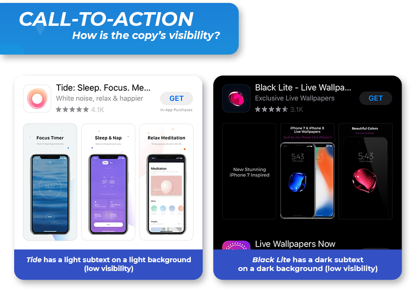
  • Highly Visible Call to Action
    • Do’s
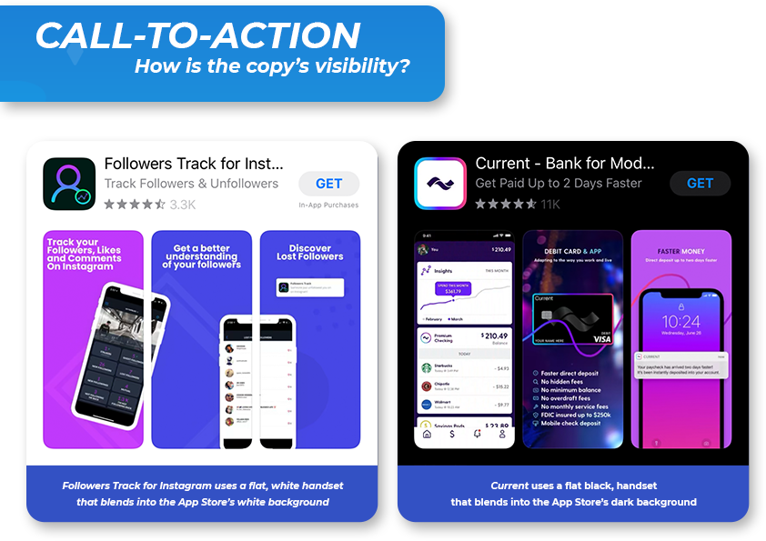
      • Including a call to action that is a large font size and a heavier weight can allow for easy and clear visibility on both light and dark mode.
      • Include text colors that have clear visibility.
    • Don’ts
      • Using a thin font weight usually causes readability issues against a dark background color. If combined with dark mode then this could further decrease visibility.
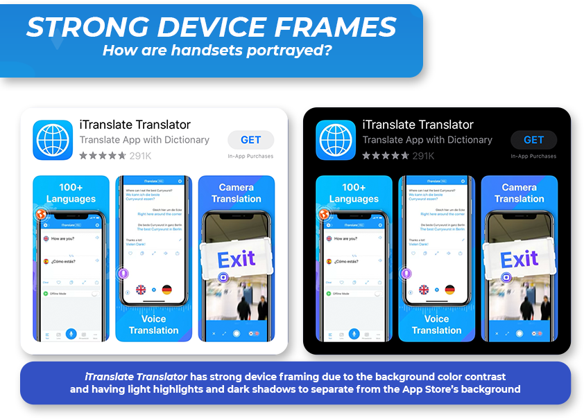
  • Clearly Visible Device Frame
    • Do’s
      • Including a realistic device frame that has a treatment along the edges, such as light highlights can allow for a black device stand out even if it runs off the screen on dark mode and prevent it from blending in.
    • Don’ts
      • Including a frame that is a flat color (black or white) and does not have a clear separation will result in the device blending in with the App Store background.
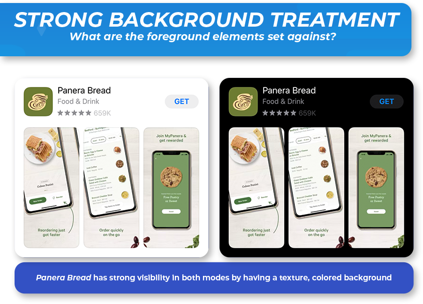
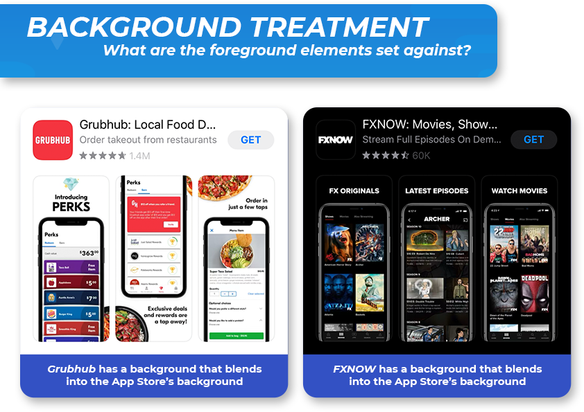
  • Complementary Background Treatment
    • Do’s
      • Including a textured or pattern-based background can help lighter colored backgrounds stand out in light mode.
      • Including splashes of colors can help apps stand out in both modes.
      • Layering images so there’s a sense of foreground and background helps create a separation between the screenshots and the App Store background. This can help screenshots that have colors resembling white or black. For example: Panera Bread’s foreground food items.
    • Don’ts
      • Using a straightforward black or white background will cause the screenshots to blend into the App Store background in either mode.
  • Ensuring a Strong Color Contrast Between Elements
    • Do’s
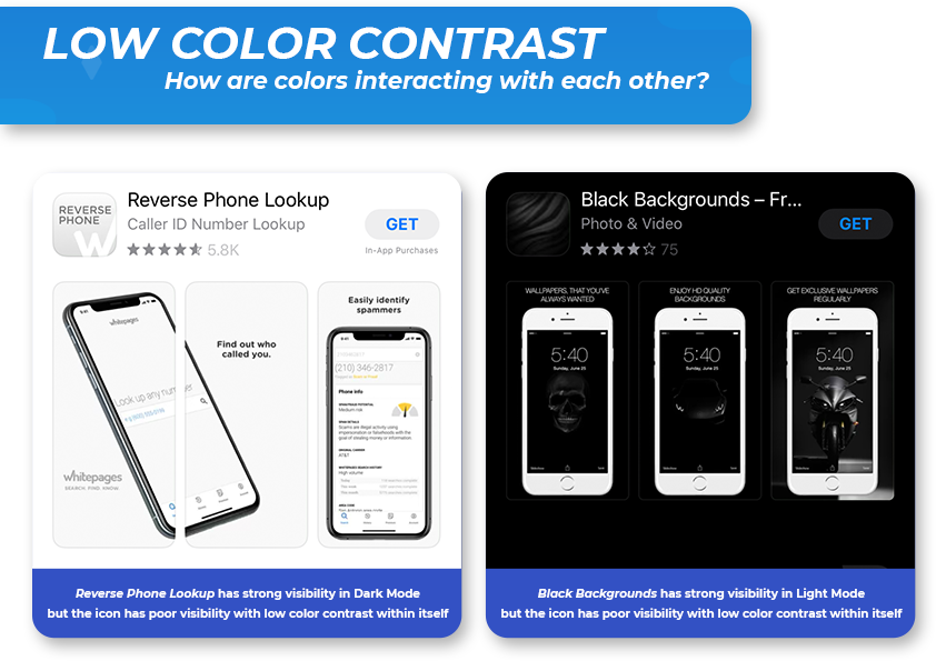
      • Choosing a color other than black or white will allow for the screenshot colors to stand out against both modes.
      • If a white or black is used, ensure it is encapsulated by a different color to allow for more contrast.
    • Don’ts
      • Depending on how the color is used, if a majority of the icon or screenshot has white or black it will cause it to blend in with one of the backgrounds of the App Store.

Takeaways

  • Highly Visible Call to Action
    • Including a call to action that is a large font size and font weight can ensure that readability is clear and easy. Using text colors that have high contrast against the background can help make sure the text does not lose readability in either light or dark mode.
  • Clearly Visible Device Frame
    • Displaying your in-app images within a device is an ASO best practice. With the inclusion of dark mode, it is important to make sure whatever device type or color you choose stands out against the app store's background for both modes — otherwise it can blend into the background.
    • When using a black handset, it is important to show highlights along the phone’s edge, an outline or other methods of contrast to prevent it from blending into the dark mode background of the App Store.
  • Complementary Background Treatment
    • When it comes to the background, using a visible color across your screenshot set for both modes is crucial. Including mid-toned, patterned or textured background can help background colors stand out against similarly-colored light/dark mode.
    • Using a solid white or black background will result in your screenshots blending into the background.
  • Ensuring Strong Color Contrast Between Elements
    • Displaying colors that are not too dark or light can ensure that the screenshots are visible in both modes. For example, Adidas includes colors such as green, blue and orange to ensure that a user can see app store screenshots across both modes with ease.

An app’s creative set is critical for a conversion. Any changes to how the App Store displays these can impact their effectiveness and should be taken into consideration as new changes roll out. With iOS 13 and Dark Mode, developers should reassess how their creatives look in both Light and Dark Mode to ensure that they have creatives that stand out among competitors, no matter which view a user has selected.

Want more information regarding App Store Optimization? Contact Gummicube and we’ll help get your strategy started.

Similar Articles