Finding the Right Rhythm in ASO with Musixmatch
Posted on March 27th, 2025
This week, we explore how Musixmatch can update its ASO strategy to improve App Store search rankings, enhance visuals, and drive more downloads.

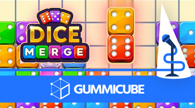
Dice Merge is an addictive match and merge game available on The iOS App Store and Google Play Store. Matching games are some of the most popular games available on mobile platforms, and Dice Merge brings you this familiar game style in a board game layout.
In Dice Merge, you start out with a game board grid with an assortment of randomly numbered dice. Each turn you are provided with a numbered set of dice which you must match with two identical dice on the board to merge them into a larger number. As you progress through the levels new dice with special abilities become available.
n today’s App Store Spotlight, we take a closer look at Dice Merge’s Google Play ASO strategy to see what is working well and where it could stand to roll again.
The Google Play Store indexes apps in a similar manner to Google’s search engine. An app’s listing is crawled top-to-bottom and left-to-right to gather keywords from the declared on-page text. Text order is extremely important in this process, as Google weighs the importance of keywords based on their positioning. Google also builds keyword phrases from the existing text but will not reorder them to build more complex and diverse phrases like Apple’s iOS App Store does.
The Title and Short Description are the most heavily weighted text fields available for indexing, as they are the first words encountered. Looking at Dice Merge’s title, “Dice Merge! Puzzle Master” we can see the high-volume keywords “Dice Merge” and “Puzzle Master” as well as “Merge! Puzzle” squeezed in the center. This isn’t a bad start, but using only 25 of the available 50 characters leaves so much potential untapped. While Google has announced the character count will soon be changing to 30, Dice Merge still has time to utilize this field to help it index for more terms. Some high-volume keywords relating to number merging or block puzzles could fill up those remaining 25 characters nicely.
Moving on to the short description, “Fun Drag & Match Puzzles Game,” there is an even more obvious need for relevant high-volume keywords. “Fun Drag” is a high-volume keyword phrase, however viewing other apps that rank high for this phrase suggests that it might not be the most relevant for Dice Merge. “Drag & Match” is more relevant while also being high-volume, moreso than the lower volume term “Match Puzzles Game”.
Like the title, the Short Description is not even close to utilizing the characters available with only 29 characters used out of a whopping 80 characters allotted. Google will not be changing the character limitations for this field any time soon. Without optimizing, all of this space is, and will remain to be for the foreseeable future, underutilized.
Much like the Title and Short Description, the Full Description is nowhere near close to using the space provided to its maximum potential, with a description that uses only 860 characters out of 4,000 available. Dice Merge isn’t targeting many high-volume keywords in advantageous positions for Google’s algorithm here either. As an example of missed opportunities from this underoptimized listing, Dice Merge doesn’t rank for the relevant, high volume phrase “merge dice” as it isn’t included in any text field on the Store Listing.
An additional area of improvement that really pops out is the features area at the end of the description. This is an excellent space to provide keyword-heavy yet engaging language that describes the fun and unique features of the game. Enriching this space with strategically chosen keyword phrases that elaborate on why Dice Merge is the best dice merging puzzle game would not only help it index better, it can also entice new users to download the game and check out the unique gameplay features.
Icons are the most visible creative asset in the Play Store, appearing on both the store listing and in search results. Dice Merge has a clean and simple icon, but the gameplay features are not readily discernible based on the icon alone. It doesn’t provide prospective players with the “match three” functionality they are looking for in such a game. Providing three matching dice or a snippet of the in-game game board could provide more context and be worth testing. As it stands, the icon is more akin to a traditional dice game than a matching game.
Screenshots are another important creative element that could encourage a user to download one game over another. The screenshots should instantly communicate how the app works, as well as provide calls-to-action and exciting feature highlights. Dice Merge has screenshots that adequately fulfill those requirements, however there is room for improvement and testing.
Without a video, users will only see around three or four screenshots on an app’s store listing in the Google Play Store. Screenshots beyond this horizontal fold may not be seen by users at all as they make their decision on whether or not to install an app. This makes it important to pack the most important and alluring features into the first three screenshots, with large eye-catching text and high-quality images.
Dice Merge has a large gallery of screenshots, but the most important features may be cut off from immediate view. Rearranging the order to keep the most compelling images up front, as well as reevaluating the font, text size, and colors used to be more in-line with top merge game competitors is worth testing to see its impact on conversion. Just as with the icon, users may respond better to different visual cues around how much of the game is “dice” oriented vs “merge” oriented.
2048 is arguably the progenitor of this style of number matching merge games. The game is so well-known today that it might be a struggle to find the original game amidst all of the copy-cats out there. Even though 2048 is very well-known, it is a great example of how not optimizing an app for indexation could lead to even the best games losing visibility to less desirable competitors.
This same concept holds true for Dice Merge, which has its share of copycat apps. While it may be the first, resting on its laurels and not continuing to innovate and optimize for search visibility could leave Dice Merge underperforming in a sea of similar competitors.
Drop the Number is another great number matching game that provides decent keyword utilization, though directly referencing their competitor, 2048, is a faux pas in app description writing etiquette. Dicedom is very similar to Dice Merge, complete with a casino-style game board, colorful dice, and similar matching mechanics. Dicedom has higher visibility likely due to featuring high-volume keywords at the front of sentences in the Full Description. However, it should be noted that both Dicedom and Drop the Number suffer from screenshots that provide even less context than Dice Merge, with no text call outs to accompany the gameplay images.
Those aforementioned games might be close in features, more well-known, or stronger in keyword utilization, but all-in-all a competitor that is a better example of how to structure a matching game for great visibility is Woody Dice Merge Puzzle. Woody Dice has a Title and Short Description featuring high-volume keywords upfront, and a Full description with sentences and feature points that use higher volume keyword choices in as many places as possible. Furthermore, Woody Dice’s screenshots are clean and simple, with an attractive background behind bold, concise text callouts. All of these elements are worth a look from Dice Merge and testing for conversion.
Even with great gameplay features and a well-known developer, Dice Merge suffers from low visibility. Visibility could be expanded to bring more players to Dice Merge by incorporating higher volume keywords in strategic areas of their listing, as well testing screenshots to communicate important features more quickly, experimenting with colors utilized by competitors, and seeing where the sweet spot is in their “dice” vs “merge” concept. With proper app store optimization, this great game could become a favorite for merging enthusiasts everywhere, who may not yet know it exists.

This week, we explore how Musixmatch can update its ASO strategy to improve App Store search rankings, enhance visuals, and drive more downloads.

Discover how 23andMe can enhance its App Store presence with strategic ASO tweaks, and learn key ASO tips to boost visibility and conversion rates.

This App Store Spotlight on theScore explores title, subtitle, and screenshot optimizations to boost visibility and conversions during March Madness and beyond.