Unleashing Success: ASO Breakdown of Pupford's Puppy Training App
Posted on April 24th, 2025
A deep dive into Pupford’s App Store listing, with tips to improve visibility, boost conversions, and turn more browsers into loyal users.

With the holidays approaching, seasonal apps are seeing an increase in popularity. In order to appeal to users, these apps need to include strong creatives. This includes app store screenshots and videos, especially for photo and video apps. One such example is ElfYourself, which lets users add their faces to dancing elf videos. In this week’s App Store Spotlight, we look at ElfYourself and see if the app store screenshots it uses can help draw in the holiday crowd.
On the Apple App Store, ElfYourself ranks #36 in the Entertainment category. The app has focused on holiday-themed keywords, and as such ranks #1 for high-volume keywords like “Christmas,” “Dancing elf” and “Christmas card video.” It also ranks in the top five for “Christmas app,” “Magic Mirror” and “xmas dance.” Its rankings begin to fall for terms like “photo Christmas cards” at #21, “xmas” at #28 and “photo clone” at #33.
On Google Play, ElfYourself ranks #1 for its name and variations such as “elf your self free.” It also ranks #2 for “elfie” and “elves.” Its rankings for other relevant terms fall somewhat lower, with “dance video” at #17, followed by “Christmas apps” at #51 and “face video” at #102.
ElfYourself is an app designed to create videos and greeting cards, so its app store screenshots are especially important. The app store screenshots are where the app can showcase its features, visuals and effects to users, so they play a major role in driving conversions.
ElfYourself needs to use its app store screenshots to show how the app works, the visual effects, variety of options and more.
On both the Apple App Store and Google Play Store, ElfYourself uses the same six screenshots. This is four fewer than Apple allows, and two fewer than they can use on Google Play, so there’s room for more app store screenshots on each one.
All of ElfYourself’s screenshots are in landscape mode. This means that each screenshot will be visible one at a time when viewed in the store search results, rather than the three at once that portrait mode provides. Since the app is designed to work in landscape mode, the design choice is understandable.
The screenshots all feature a handset on a green background, which matches the green of the elf uniforms. They all include callout text on the top of the screen that describe the functions of the app, although they can be a little lengthy and therefore more difficult to read at a glance. Adding additional screenshots could help spread out some of the value propositions. For instance, one says “Watch your elves star in fun holiday videos and share with friends,” which could be split into a screenshot for videos and a screenshot for sharing.

The app store screenshots are designed to walk users through using the app. The first screenshot features the home screen, followed by adding faces to the elves, using personalized greetings and creating the videos. This puts screenshots showing the key value of the app – making dancing elf videos with users’ faces – near the end of the list.
App store screenshots should be placed in order of value to users, so that they can find the features that matter most first. The screenshots showing the dancing elves are bright and colorful, as appropriate for the holiday season, but users will have to click past images showing how they can align their faces with the camera first.
The app does feature a video on both stores. The video also walks users through the app, showing how it works and several different versions of the dance. It does not include music in the video, which could be detrimental for an app featuring dancing elves. Music can engage users, impact their mood and provide the elves in the video with something to dance to.

Let’s compare ElfYourself’s app store screenshots to several competitors. The Xmas Dance app also begins with a video showing the app in action, but it includes cheery music. The app store screenshots are all portrait mode, so multiple pictures appear on screen at once, and screenshots showing the dance appear early on. The screenshots for Xmas Dance do not include callout text, so that is one aspect that ElfYourself does better.

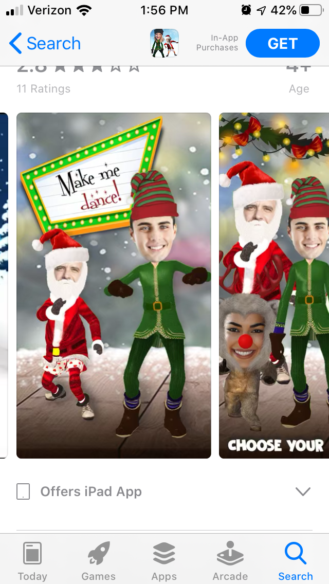
Another competitor, Elf Dancing – 3D Avatar, has a similar design. This app also begins with a video with “Deck the Halls” playing in the background as the characters dance. The first portrait-mode screenshot shows two characters with large callout text stating “Make me dance!” on a billboard. This presents the purpose and value of the app upfront with a picture that clearly illustrates its functionality and callout text that’s easy to read quickly.

App store screenshots serve an important purpose for informing users and driving conversions. ElfYourself needs to use its screenshots to show users what they’ll get from the app, and while it does succeed at that, there’s always room for improvement. Clear and easy to read callout text is a must, in addition to placing the app store screenshots in order of importance. Adding music to the video could also help engage with users and show the elves dancing to a beat.
There’s always room for improvement, and ElfYourself can look at what competitors are doing right to see how it could perform even better.
Want more information regarding App Store Optimization? Contact Gummicube and we’ll help get your strategy started.

A deep dive into Pupford’s App Store listing, with tips to improve visibility, boost conversions, and turn more browsers into loyal users.

Discover how Orbit can boost visibility and conversions with smarter keywords, optimized creatives, and a stronger App Store presence.

Explore how Home Contents can improve its App Store listing with smarter ASO tactics, from stronger keywords to better screenshots and video strategy.