Unleashing Success: ASO Breakdown of Pupford's Puppy Training App
Posted on April 24th, 2025
A deep dive into Pupford’s App Store listing, with tips to improve visibility, boost conversions, and turn more browsers into loyal users.

With a new year comes plenty of New Year’s Resolutions to lose weight, which means health and fitness apps are seeing an upswing in popularity – searches for “Fitness app" doubled their average in the beginning of January. One such app is Fitlist, which is designed to track workouts and help users reach their fitness goals. For this week’s App Store Spotlight, we take a look at the Fitlist app and see if its App Store Optimization is in good shape and working out.
On the Apple App Store, Fitlist is the top app under searches for “exercise log,” “exercise tracker,” “fitness journal” and, of course, its own name. It also ranks in the top five for high-volume terms built around tracking and following workouts, such as “gym tracker,” “weight training log” and “workout tracker”. Its rankings get lower for terms for specific types of exercises, like “strength training,” where it’s ranked #11, “fitness routines,” where it’s #19, and “gym trainer,” where it comes in at #39.
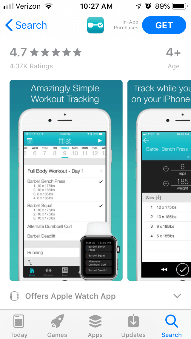
Creatives: Fitlist has five screenshots, each of which use a teal background that matches the color scheme of its icon. Each one shows a different feature of the app, such as how the tracking works and the community aspects. Since the app is also available on the Apple Watch, some of the iPhone creatives include an Apple Watch in the image to show how the specific features work between the devices.

Each image includes callout text above the screenshot, stating the features in large text. This makes it easy to see at a glance what the app can provide in the related screenshot, such as “a fitness community to keep you motivated” and “amazingly simple workout tracking.” At the same time, these could be condensed into shorter bite-sized lines with large and easy-to-view font. This would make it easier for users to see and understand everything they have to offer quickly. The screenshots need to provide engaging information about the app as quickly as possible to convert users the best.
Apple allows developers to include up to ten images, but Fitlist only has five. The five remaining images could be used to display other tools or features the app has to provide, such as the calendar view or variety of exercise types. While the images it uses are well-chosen and designed in a simple but visually pleasing style, including more and reorganizing them could be beneficial. The first three screenshots are also the most important, as they’re the first ones that users see while searching for apps. In Fitlist’s case, the first screenshot just shows a checklist of workout plans, followed by an example of set tracking. These are not as visually engaging as the following screenshots, which show examples of exercises and sharing successes. Starting off with more visually interesting screenshots could help draw more users to the app.
While Apple allows promotional videos, the app does not include any. Showing a workout app in action would require showing people working out, and videos on the Apple App Store can only show in-app footage. Several competing apps, such as ToneUp, include in-app videos demonstrating proper form for the exercises, which can then be included in the promotional videos. This helps them create engaging videos that can demonstrate the app’s features while following Apple’s guidelines. If the video cannot make the app look interesting and exciting, it is better off without one.
Title & Subtitle: The app’s full name is “Fitlist – Gym Workout Log,” with the subtitle “Bodybuilding & Fitness Tracker.” The title uses 25 of the 30 characters Apple allows, while the subtitle uses all 30. Both utilize valuable keywords, which help it rank highly for terms like “fitness tracker” (#3) and “workout log” (#2).
Yet its first ranking for the term “bodybuilding” is under “bodybuilding and fitness,” a low-volume term that it only ranks #46 for. “Bodybuilding workout” is high-volume, but the app is the 49th app under that term. Fitlist could either target “bodybuilding” terms more to try improving its ranking or replace the term in its keywords for one it can rank better for. Other apps that rank high for “bodybuilding” terms, such as “Bodybuilding.com” and “Shortcut to Shred,” include shopping for vitamins and supplements or providing training programs. Competing exercise logging apps such as “Fitbod Weight Lifting Tracker” and “Fitness Buddy” still rank well for that keyword while targeting similar demographics, so Fitlist could potentially improve its positioning for it.
Description: Fitlist’s description is lengthy, but it is divided into smaller lines and sections for ease of reading. Each feature is called out with a bullet point and a short line or two describing how it works. The keywords are integrated throughout the description, reminding users how they can “create workouts easily” and calling out the exercise types.
The introductory paragraph is on the longer side, creating a block of text when viewed on iPhone screens. It could easily be split into a few shorter lines, making it easier for users to read at a glance. The section talking about what users are saying could also be moved to after the feature set, so users get a better idea of what the app has to offer first. Overall, though, the description is well-written and manages to properly convey all the features the app has to offer.
On Google Play, Fitlist is the top-ranked app for its name only. The next highest term is “gym tracker,” but even then, it’s only ranked #18. Its rankings in the results continue to decline, placing it as the 25th app for “fitness log,” 29th for “workout tracker” and 80th for “track workouts.” There are terms that it ranked highly for on iOS, like “exercise log” or “fitness journal,” that it does not rank for at all on Google Play.
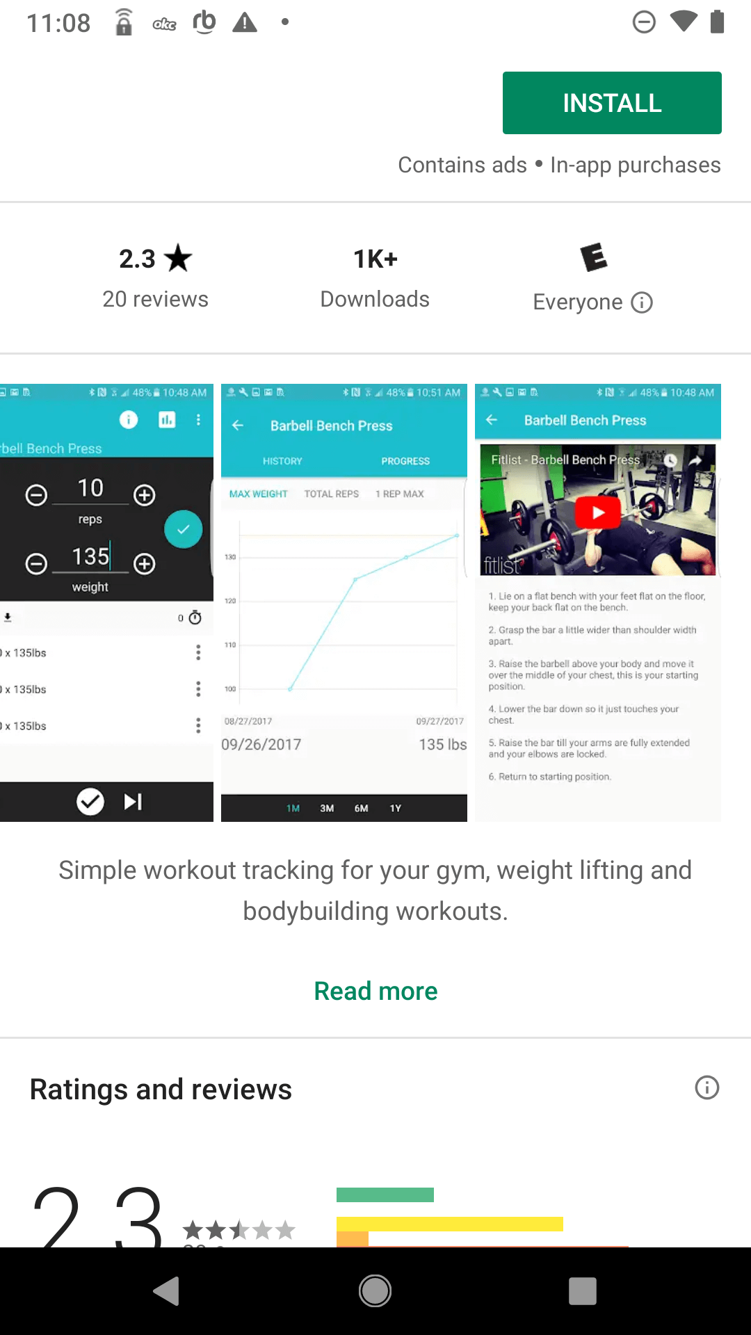
Creatives: Fitlist’s creative set on Google Play appears out of date, featuring four screenshots with no background designs or callout text. While each one does show a different feature of the app and is presented in a way to show users the process of tracking a barbell bench press routine, there is nothing to make them stand out. Without the callout text, they’re presented without context and do not provide users with information about what the app does or its benefits.

If Fitlist were to update its creative set, it could include four more screenshots. Each screenshot could be placed on a background similar to those it uses on iOS and include a brief text description of what the app has to offer, including keywords to let users know how it’s relevant.
As Google Play does not have Apple’s restriction on videos, Fitlist could also include a video showing how users can use the app to track their workouts. A good video could demonstrate how users can easily track their progress and reach their workout goals, highlighting the app’s value.
Description & Metadata: The Google Play description is identical to the iOS one. While the lengthier introductory paragraph is acceptable on Google Play and the bullet lists of features works on either store, this is detrimental to the app’s keyword indexation.
Google Play crawls the description for keywords, so they must be placed early on in each line and sentence. While this works for section headers, it does not use the terms with enough frequency to rank well for many of them. The rest of the description begins with terms users aren’t searching for, such as “Join over a million people” and “with the tap of a button.”
If Fitlist were to rework its description to emphasize the keywords, it could improve its rankings for them. For instance, one feature line begins with “tracking a workout has never been easier.” If it were to reword it to “workout tracking has never been easier,” it could reinforce its relevance for the “workout tracking” keyword and potentially boost its ranking from #33.
While Fitlist does well on iOS, its Google Play listing is lacking. It ranks well for many high-volume terms on the Apple App Store, although it could potentially rank for more if it refocused on keywords in need of improvement. The iOS screenshots do a good job illustrating the app’s features and highlighting them with callout text, although it has room for more. While its description is well-written, there are a few formatting changes that could improve it even further.
On Google Play, Fitlist needs to rework its App Store Optimization. The four screenshots it does use do not fully illustrate all the benefits of the app and are presented without callout text or visual designs that make them eye-catching. Its description does not utilize keywords enough to index for them as well as it should, making it harder for users to find.
It’s important that apps have unique ASO strategies for Google Play and iOS. What works on one may not work on another, and the disparity between Fitlist’s iOS and Google Play keyword rankings demonstrates this clearly. Without a good App Store Optimization strategy on both stores, Fitlist is only getting half a complete workout.
Want more information regarding App Store Optimization? Contact Gummicube and we’ll help get your strategy started.

A deep dive into Pupford’s App Store listing, with tips to improve visibility, boost conversions, and turn more browsers into loyal users.

Discover how Orbit can boost visibility and conversions with smarter keywords, optimized creatives, and a stronger App Store presence.

Explore how Home Contents can improve its App Store listing with smarter ASO tactics, from stronger keywords to better screenshots and video strategy.