Unleashing Success: ASO Breakdown of Pupford's Puppy Training App
Posted on April 24th, 2025
A deep dive into Pupford’s App Store listing, with tips to improve visibility, boost conversions, and turn more browsers into loyal users.

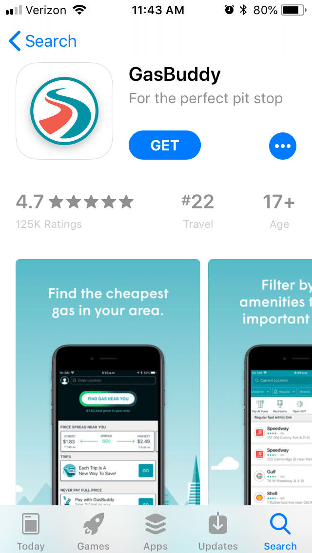
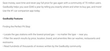
GasBuddy is an app designed for people trying to find affordable gasoline. It provides searches for gas stations with a wide range of filters and options, making it a popular app for anyone who drives. However, is it optimized for the App Stores it’s available on? iOS GasBuddy is not utilizing the full 30 character iOS Title space to target additional keywords, opting to only use its branded name. The subtitle, “for the perfect pit stop,” could utilize more advantageous keywords as well- while “pit stop” is a high-volume term, most of the top results for the search term are games.  On the Apple App Store, GasBuddy’s description starts off strong. The description itself immediately lets users know the value of the app as it tells them that they can save time and money on gas. The introduction is three short lines, and while it could be split into two smaller paragraphs of 1-2 lines, it’s still short enough to be read easily on mobile devices. The description’s features list is succinct and utilizes bullet lists under headers. It calls out the two most appealing benefits – finding gas and saving money – then elaborates on them in the bullets and describes the app’s various features. The third part is just used for “Other Features,” which could stand to utilize more keywords, but maintains proper formatting. While the description does include a good range of keywords, there are sections where it doesn’t seem to include any. Utilizing keywords throughout the description can help build relevance the for the keywords targeted in the Title, Subtitle and Keyword fields, while also helping index the app for impressions on keywords targeted in Apple Search Ads. After the main description, the bottom section includes praise and positive reviews from news outlets, showing users that the app is acclaimed by users and third parties. However, it could still benefit from a call-to-action at the end, encouraging users to download the app once they’re done reading. GasBuddy’s creatives are effective, utilizing screenshots that showcase different features of the app. It shows how users can find and compare gas prices, showcases savings and so on, each accompanied by callout text that describes its benefits. The light colors it uses are easy on the eyes, and the rolling city background at the bottom of each one provides a sense of continuity from screenshot to screenshot. They are also utilizing 8 screenshots, allowing users to see multiple features of the apps and problems it can help users address. That being said, the callout text used on the screenshots could be more concise and keyword-driven to allow users to more immediately connect their search term to the app’s features and functionality. With a few exceptions, GasBuddy’s Apple App Store page is well-optimized. As a result, it ranks as the top search result for valuable keywords like “cheapest gas,” “fuel prices” and “gas finder.” Google Play The Google Play Store page listing for GasBuddy is nearly identical to its Apple App Store page. It uses the same screenshots, just in a slightly different order, although the screenshots themselves are still very effective. Unlike Apple, Google allows developers to upload a video that shows off more than a screen-capture of the app in action- GasBuddy could potentially benefit from including a video showcasing people using the app to find cheap gas, although it would have to test the video to ensure effectiveness; a bad video can be just as detrimental to an app store listing’s effectiveness as a good one can be beneficial. The description is the same on both App Stores, and while the feature list and bullet points works well for both, the description on Google Play needs to be formatted differently than the Apple App Store listing to get the most out organic visibility of its metadata.
  Since Google’s algorithm crawls the app listing to find relevant keywords near the start of each line, GasBuddy’s Google Play description could rank for irrelevant phrases such as “earn achievements.” It does still rank well for relevant keywords, including “cheapest gas” and “gas money,” but its Google Play rankings drop quickly after those. The remaining keywords it ranks well for are not high-volume or relevant and includes terms like “help find,” “playing for cheaps” and “fundango.” While the description may be formatted well for readability, and the bulleted lists are great for quickly calling out the app’s features and benefits, it needs to be reworded in such a way to make better use of its description for organic indexation potential.
While GasBuddy’s description works very well on the Apple App Store, the same description is less effective on Google Play. The formatting and use of keywords help GasBuddy rank at the top for many relevant keywords on iOS, with a wide variety of gas and fuel-related keywords. Yet the opposite is the case on Google Play, where it only ranks as the top keyword for a handful of relevant search terms. This is a prime example of how ASO differs between the two App Stores. The formatting that works for one will not necessarily work for the other, and you need a different description for each store to optimize each listing. With that said, GasBuddy’s creatives are still effective on both stores. They clearly demonstrate the app’s features and value, so users know what they’ll get once they download it. Different strategies are required for each platform, and developers must track how their apps rank to understand how to use their metadata. A good App Store Optimization Strategy can maintain an app’s rankings and relevance in both stores.

A deep dive into Pupford’s App Store listing, with tips to improve visibility, boost conversions, and turn more browsers into loyal users.

Discover how Orbit can boost visibility and conversions with smarter keywords, optimized creatives, and a stronger App Store presence.

Explore how Home Contents can improve its App Store listing with smarter ASO tactics, from stronger keywords to better screenshots and video strategy.