Unleashing Success: ASO Breakdown of Pupford's Puppy Training App
Posted on April 24th, 2025
A deep dive into Pupford’s App Store listing, with tips to improve visibility, boost conversions, and turn more browsers into loyal users.

Gwent: The Witcher Card Game recently hit the App Store and is already ranking strong. While it is not yet available on Google Play, analyzing its App Store Optimization can provide good insights for developers looking to compete or learn from its success, as well as see how the app’s page can improve and work should the game be made available on Google Play.
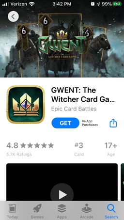
Gwent is already off to a very solid start, ranking at #3 in the Card category (right behind UNO and Solitaire). In searches, it ranks #1 for its name, as well as “The Witcher” and “Witcher 3.” It ranks #2 for “CCG,” although its rankings then begin to fall. It ranks #11 for “card battles” and #15 for “Gwent card game.” Its rankings then fall to #70 for “card apps” and #78 for “CCG Games.” The app is very new, so it still has room to grow.
The title, “GWENT: The Witcher Card Game,” takes up 28 characters of the 30 Apple allows. This is a great use of space (leaving only 2 characters empty) and focuses on valuable keywords – its name, the franchise it’s from and the type of game it is. That quickly conveys to the user exactly what kind of app they’re getting with it. Additionally, each of the keywords are high-volume.
Should the app be released on the Google Play Store, it should use similar terms. Google Play allows up to 50 characters for a title, which could be utilized to include more relevant keywords that describe the app.

The subtitle, “Epic Card Battles,” does leave room for improvement. At only 17 characters, it has room for 13 more, which could add additional keywords and information.
The “card” keyword is repeated in the title and subtitle, so its usage in the subtitle is redundant. The “epic” keyword has the app currently ranking #97 for “epic,” #19 for “epic free” and #35 for “epic battle fantasy.” “Battle” is still important for “card battle” terms, so that is worth continuing to focus on.
Gwent’s creative set starts off with a video. It uses intense music from the game to accompany clips of card battles, blending cinematic animation with the gameplay to show off the visuals and the card game aspect. It follows Apple’s video guidelines and uses in-app footage only while clocking in at just under 30 seconds.
Following the video, it has six screenshots. Each one is well-designed, showing off various aspects of the game while maintaining a consistent design theme. They show off the card battles, the artwork and animations while showcasing characters from “The Witcher.”

Each screenshot also includes callout text with font designed to match the brand. While some of the screenshots include keywords in their callout text, not all of them do. For instance, “Engage in Epic Battles Online” is a great call to action that includes several keywords.
There is still room for more screenshots. Apple allows ten images, so it could fit in four more images to provide further information about the app.
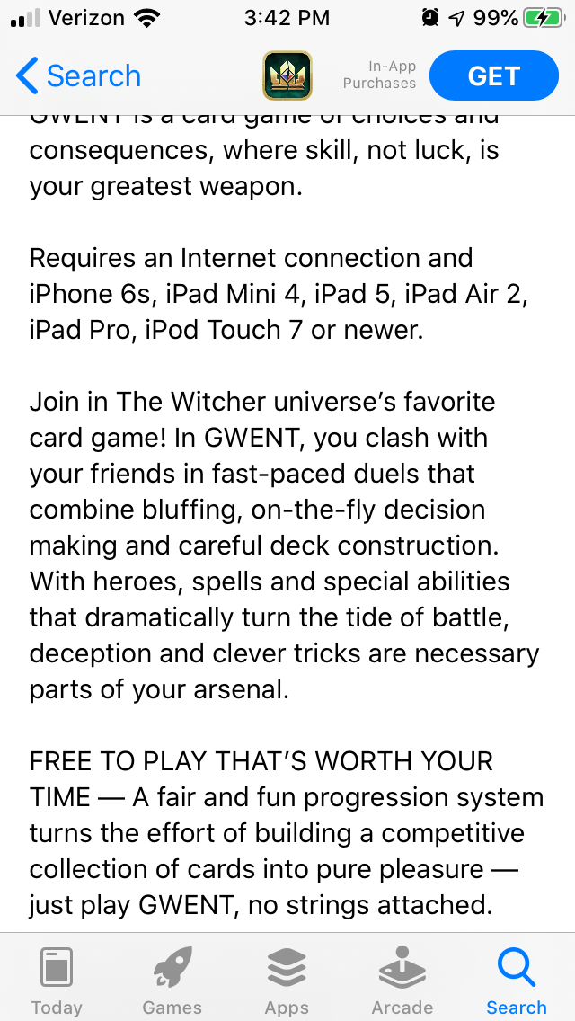
Gwent’s description starts off with promotional text describing the app as “a card game of choices and consequences.” This quickly conveys the purpose of the game.
The description then mentions the internet and device requirements before delving into the game itself. This section could be moved further down into the description to entice users with the app’s features first. Including it where it is also makes sure users know the requirements in advance, so they are less likely to leave negative reviews complaining about it later.
The rest of the introduction is one paragraph. It conveys how the app works and mentions its connection to the Witcher universe, although it appears as a large block of text when viewed on a mobile device. This could be easily broken into two shorter lines for ease of reading.

Finally, it has a list of features. Rather than presenting bullet lists, it has a header in all-caps then a moderately long description connecting to that feature. These could be broken into bullet lists, so that users can quickly read them while scrolling. Otherwise, they might miss important information while glancing through.
If Gwent is released for Google Play, the description will need to be revised for keyword indexation. It will need to place the keywords it wants to target at the front of each line, focusing on the most valuable terms while conveying the purpose of the app. Utilizing bullet lists can also help with this, since every bullet is a new line to include a keyword.
Gwent is seeing the kind of early launch success most developers dream of, but the launch is just the start. The app needs a strategy to maintain its rankings while building new ones over time, and App Store Optimization is essential for that.
Looking at its keyword rankings, one can see where it can work to grow and where it’s currently strong. As the initial featuring ends and Gwent continues to index, its ranking visibility will need to be reassessed to see where it can be improved. Its screenshots and video show off the app, but it has room for more and to revise its callout text. While its description provides good information about the app, it can also be restructured for ease of reading on mobile devices. Focusing on these aspects could help Gwent improve even further and keep its momentum going strong throughout the app’s lifetime.
Want more information regarding App Store Optimization? Contact Gummicube and we’ll help get your strategy started.

A deep dive into Pupford’s App Store listing, with tips to improve visibility, boost conversions, and turn more browsers into loyal users.

Discover how Orbit can boost visibility and conversions with smarter keywords, optimized creatives, and a stronger App Store presence.

Explore how Home Contents can improve its App Store listing with smarter ASO tactics, from stronger keywords to better screenshots and video strategy.