App Store Holiday Schedule 2020
Posted on November 23rd, 2020
When is the App Store Holiday Schedule 2020? Learn about the dates of this year's shutdown and how to prepare.

Now that the iPhone X is released to the public, more and more app developers are realizing that they’ll need to create different sized screenshots to accommodate the new display size. While many users are excited about the brand-new retina display, they are also excited about its 5.8-inch display, which is larger than any iPhone Plus display of 5.5-inches. iPhone X screenshots are currently optional, but they will not size down to scale for other devices, meaning developers will need to create another set of screenshots just for the iPhone X. If developers want their users to get a feel for how their app would look and feel on the iPhone X, it’s smart to bite the bullet and create screenshots that match the required resolution. Below are the resolution sizes for the new iPhone X screenshots:
Apple is also suggesting that developers do not mask or call attention to key display features such as the iPhone X notch. While some developers have already tried hiding the notch, it’s rumored that those screenshots might be rejected by Apple. Since the iPhone X is brand-new, users are most likely interested in finding new apps to download. Now is the time for developers to improve their conversion rates, and they’ll need ASO best practices to achieve that goal.
If developers weren’t following ASO best practices to create their screenshots, they can now sit down and take the time to make sure that their screenshots are engaging and optimized to target their audience.
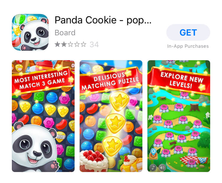
The screenshots are the primary section that users will reference to see the app or game in action. It’s important that the app’s core features are immediately addressed. Since the iOS 11 update, it’s become particularly important to emphasize the core features within the first three portrait screenshots. If developers don’t focus on their screenshots, it will either make or break their app’s chances of getting downloaded. Developers need to encourage users quickly to tap on the listing page or immediately tap “Get,” and the only way to do that is by quickly, and clearing addressing their app’s core features.  2. Visible Callout Text That Incorporates High-Volume Keywords Callout text need to address what the app does while incorporating high-volume keywords that are relevant to the app and its targeted audience. The callout text needs to be compelling enough to entice the user that wants to learn more and download the app. If the callout text is confusing or too long, users are less likely to convert because they don’t understand what the app does. Developers should leave long sentences for the description and make the callout text short, sweet and to the point.
  3. In-App Images Should Clearly Reflect Core Features Screenshots must reflect accurate in-app usage and mirror its accompanying callout text. If the in-app image represents something else, the user is less likely to convert because the screenshots are confusing. Developers must take the time to highlight each core feature individually instead of combining or repeating. Developers should also note that if the in-app image is busy or confusing, the user is more likely to become confused too. In-app images shouldn’t clash with any additional images or callout text and should stand alone so the user can plainly understand what they are looking at.
  4. Design for the Target Audience Developers need to follow one of the crucial suggestions of ASO best practices, which is designing their screenshots with the target audience in mind. Think about RPG games; users want to see the core features that truly matter to them. If the screenshots don’t reflect how users can attack, customize, or explore, users might keep scrolling in the App Store.
  5. In-Line with App Branding Even if the app isn’t a well-established brand, it’s important that the screenshots reflect the brand and is consistent to what users will see when using the app. If the screenshots don’t match the brand’s color theme or tone, it’s possible to confuse or even distract users. Let’s say there are varying font types and weights displayed on the screenshots. Though it may seem like a minute detail, users might have trouble clearly reading and comprehending the screenshots, leading them not to convert.
  Follow ASO Best Practices When Creating Screenshots Even though the iPhone X has been out for nearly a week, not many developers have taken the time to create screenshots that match the new device’s display size. If developers are unsure about which set of screenshots look best, whether that be portrait of landscape, they can A/B test them or run surveys to see what set engages best with their users. Keep in mind, developers don’t have to go with the first set of screenshots they create. They are better off testing and running surveys to see which set engages best with users and test different variables such as colors, fonts, orientation and more. Developers should, however, make sure that ASO best practices are in mind while creating screenshots that fit the iPhone X. Developers need to get started on making new iPhone X screenshots today to provide users a better understanding of what their app will look and feel like.

When is the App Store Holiday Schedule 2020? Learn about the dates of this year's shutdown and how to prepare.

Apple's App Store Guidelines have strict privacy requirements. Developers now must provide information to users on the App Store listing regarding the data they access.

The Google Play Developer Console has been updated with a new design and adjusted tools. What's different, and how will it impact App Store Optimization?