Unleashing Success: ASO Breakdown of Pupford's Puppy Training App
Posted on April 24th, 2025
A deep dive into Pupford’s App Store listing, with tips to improve visibility, boost conversions, and turn more browsers into loyal users.

The App Description provides key information about an app to its potential users. The description should be clear and easy to read, provide in-depth information about the app features and be written with the ranking algorithm and store listing display each store in mind. For today’s App Store Spotlight, we take a look at the description for Marco Polo, a communications app available on iOS and Android devices, to see how its description is formatted for each store.
On the Apple App Store, Marco Polo’s description begins with a clear value proposition. In one line, it states the purpose and benefits of the app. This is a good introduction, as it’s concise and easy to read on an iPhone device while stating what the app provides users.
The introduction does not elaborate in additional paragraphs. Instead it goes directly to feature sets. Feature sets are useful for App Store Descriptions; they quickly educate users on what the app provides and are easy for users looking for a specific feature to scroll through. However, the formatting for each set matters as well.
In the case of Marco Polo, each feature set is presented as a header and then a paragraph describing the feature. These can vary in length, but on average they run for several sentences. These longer features become large blocks of text when viewed on an iPhone screen, so users are more likely to glance over them without fully absorbing the information.

It may be more effective for Marco Polo to list out the information in the feature sets, rather than present them in a single paragraph. This is easier for users to take in as they scroll through the description as it breaks the information into bite-sized pieces.
Marco Polo’s App Store Description integrates important keywords into the description nicely. Using headers like “Is it social media?” and “Similar to video calls?” emphasizes the keywords while answering questions users may have. Using keywords in an Apple App Store Description builds relevance for Apple Search Ads and shows users searching for those terms that the app is related to their query.
Marco Polo uses the same description on the Apple App Store and Google Play Store. However, the stores use different algorithms to rank apps on keyword searches; the descriptions across the different platforms should be written with this in mind.
While Marco Polo utilizes keywords throughout its description, they’re placed closer to the middle of the sentences they’re in. Strategic keyword placement can help an app index for keywords on the Google Play Store.
For instance, Marco Polo does not currently rank for the “text messaging” keyword. It does use the keyword in a feature set beginning with “Yes! Just like text messaging, you can communicate on your own time.” Adjusting that line to put “text messaging” closer to the front and utilizing it more throughout the description could help Marco Polo rank for the keyword. Other lines do not utilize keywords at all, such as “You can't search and find anyone without their mobile number.” This is a good value for the app, but without using any keywords, it does not help its indexation.
Using bullet lists for its features would be helpful here as well. Not only are bullet points an easy way to convey information to users, they’re also helpful for keyword placement.
Google Play also allows developers to use bold text, text colors and emoji in their descriptions. Since Marco Polo’s description uses a casual, friendly tone, using these could help add to the description’s voice. Adding bold or colorful text can help draw attention to specific keywords or features, while emoji can influence the tone of the description. It is important to A/B test these variations to determine if they create a higher conversion rate.
Marco Polo’s competitors in the communications space tend to use similar descriptions, but we can identify some key variations.
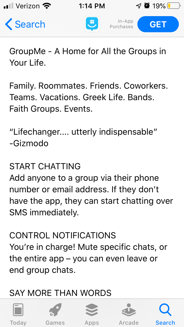
For instance, GroupMe on the Apple App Store also begins with a short value proposition, but it expands on the introduction in the second paragraph. It also uses feature sets, but each line is shorter than Marco Polo’s making it easier to read at a glance.

On Google Play, JusTalk is an app competing with Marco Polo for the “video message” keyword. This description utilizes bold text at the start of each feature, making the feature sets stand out more. While JusTalk also has room to add more keywords, it also begins its features with keyword-focused headers like “Live Video” and “Free Calls.”
Marco Polo’s App Store Description is a solid foundation, starting with a value proposition and building on it with feature lists. The description could be enhanced by adjusting its formatting for each store, including line length on the Apple App Store and keyword placement on Google Play. Doing so could improve its App Store Optimization and help its keyword indexation.
The App Store Description is an essential part of any app listing. It should be used to delve into what an app does and how it can benefit users, while using keywords to connect to search queries. Doing so can help an app improve its optimization.
Want more information regarding App Store Optimization? Contact Gummicube and we’ll help get your strategy started.

A deep dive into Pupford’s App Store listing, with tips to improve visibility, boost conversions, and turn more browsers into loyal users.

Discover how Orbit can boost visibility and conversions with smarter keywords, optimized creatives, and a stronger App Store presence.

Explore how Home Contents can improve its App Store listing with smarter ASO tactics, from stronger keywords to better screenshots and video strategy.