Unleashing Success: ASO Breakdown of Pupford's Puppy Training App
Posted on April 24th, 2025
A deep dive into Pupford’s App Store listing, with tips to improve visibility, boost conversions, and turn more browsers into loyal users.

App Store Screenshots can convey many important aspects of an app, from its design elements to the variety of features it provides. For apps focused around the outdoors, it has to strike a balance of inspiring users to go outside and to bring the app with them.
Such is the case for the National Park Trail Guide app, which is currently featured on the Apple App Store thanks to the approaching anniversary of the National Park Service’s founding. The app is designed to help users discover and explore trails and sights in national parks across the country.
For today’s App Store Spotlight, we help celebrate the National Park Service by analyzing the App Store Screenshots for the National Park Trail Guide app. Do they manage to convey the technological functionality of the app and the natural beauty of the parks simultaneously?
On both the Apple App Store and Google Play Store, the National Park Trail Guide app uses five screenshots. The layout and screenshot copy are identical on each, focusing on:
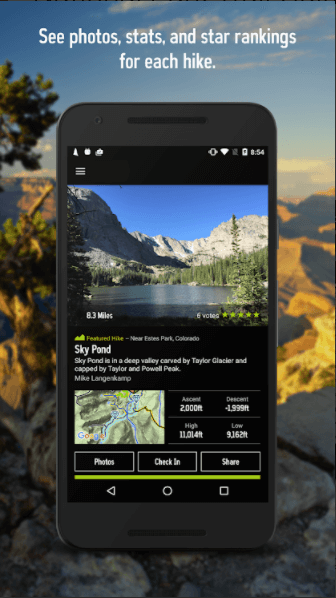
While the copy, value propositions and features displayed are the same, they do use different in-app imagery for a few of the creatives.

The Apple App Store allows up to ten screenshots, while the Google Play Store allows for up to eight. This provides developers with more opportunities to show various aspects of their app.
In the case of National Park Trail Guide, it could provide additional information on the range of parks available, the park information it provides, different environments or updates based on current events. Each screenshot is an opportunity to convert more users that should not be overlooked.
Do the screenshots get the functionality of the app across? The app uses screenshot copy at the top of each screen to tell users how the apps work. While they are informative, they are not concise, so it may be difficult for users to read them at a glance.
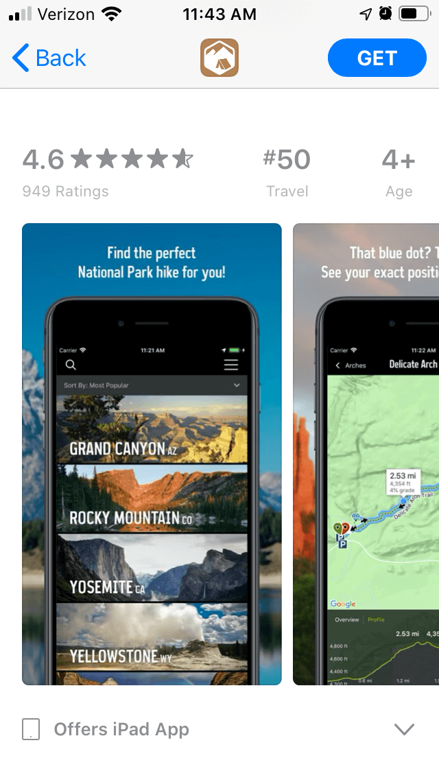
As an example, the second screenshot uses a copy that states “See that blue dot? That’s you! See your exact position, even offline.” That takes up two lines in small text. It could provide the same message in fewer words by eliminating the first two sentences and focusing on the value proposition.
Using screenshot copy that focuses on features and keywords in large, clear font is advised. Additional information can then be provided afterwards in a smaller font. This would make the font larger and easier to see while scrolling through and make it quicker to read.
Brevity is the soul of wit, especially when it comes to screenshot copy.
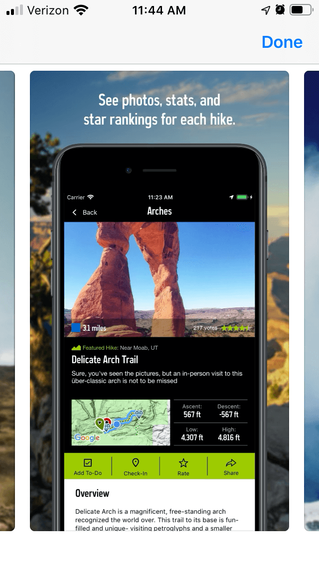
While the screenshot copy can be shortened, it does highlight important features. The first screenshot showcases a variety of parks while the copy presents a key value proposition. The following screenshots highlight other tools or features, including hike rankings, insider tips and difficulty rankings.
The screenshots and copy are fully aligned, making it easy to see how the app works.
Since the app is focused on national parks, it has a unique challenge: how can it convey the beauty of the parks in its screenshots while simultaneously focusing on the functionality?
There are two ways in which it accomplishes this. First, the in-app imagery includes pictures from the various national parks. These range from the Grand Canyon to Yosemite, all with bright summer imagery.
While the screenshots use the same copy, they do occasionally feature different imagery between the App Store and Play Store versions. It could be helpful to A/B test the variations to see which ones result in more conversions.


It appears that the screenshots are not updated frequently. If the app does not change the screenshots over time, it could potentially help to rotate through them based on the season to show how each park looks in the winter or fall. Seasonality is a helpful element of optimization, especially for nature and outdoors apps.
The second way it showcases the parks themselves is with the backgrounds of the screenshots. Rather than use a single color or decorative background, the creative set places the handsets over imagery from the parks.
Not only does this add outdoors imagery to the screenshots, the use of the handset and backgrounds makes it look as though the user is looking at the app while visiting the parks. It’s an effective use of the background that adds thematic elements to the design.
The National Park Trail Guide app uses screenshots that showcase the parks on display but can still improve their messaging. By using more screenshots and concise screenshot copy, it could convey more information quickly to users and potentially increase conversions.
Testing screenshot variants and updating based upon the time of year could also help keep the app relevant to users whenever they go on a trip, whether they want to find a park for hiking or need to check if a park is open during the winter.
While there are areas where the screenshots can be improved, the imagery does capture the parks nicely and can help give users ideas for their next vacations while convincing them to install the app.
Want to learn more about App Store Optimization? Contact Gummicube and we’ll help get your strategy started.

A deep dive into Pupford’s App Store listing, with tips to improve visibility, boost conversions, and turn more browsers into loyal users.

Discover how Orbit can boost visibility and conversions with smarter keywords, optimized creatives, and a stronger App Store presence.

Explore how Home Contents can improve its App Store listing with smarter ASO tactics, from stronger keywords to better screenshots and video strategy.