Unleashing Success: ASO Breakdown of Pupford's Puppy Training App
Posted on April 24th, 2025
A deep dive into Pupford’s App Store listing, with tips to improve visibility, boost conversions, and turn more browsers into loyal users.

An App Store Description should tell a user everything they need to know about an app. It must be formatted in a way that’s easy to read while scrolling through on a device screen and written for each store. For today’s App Store Spotlight, we take a look at Piano Academy and see how its descriptions work on the App Store and Play Store.
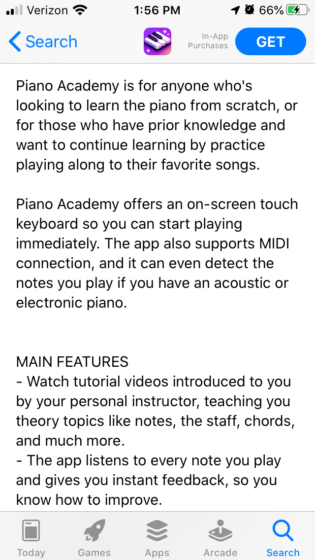
Piano Academy’s App Store Description begins by presenting its core value: it helps people learn to play the piano by playing along with songs they know. This is presented in a short sentence upfront.
The description goes on to explain how it offers an on-screen keyboard and MIDI connection in a second short paragraph. This is effective description formatting, as it allows users to read and absorb the information quickly.

The following feature set is a single list, describing the main features. It could be expanded into sets based around specific values, each presenting a key feature in its header. This would provide additional information about what the Piano Academy app has to offer, such as the variety of songs available and how it works for mobile devices or when connected to an actual piano.
The formatting begins to change after the feature set, as it includes a “Who is it for?” and “How does it work?” section. This is information that could be included in the introduction, then expanded on in the feature set.
The intro should establish a proper flow, so users can understand the app while glancing through the introduction, scan the description lists, then read about what they want to know more about. This helps users find the information that they need, whether it’s about how the MIDI connectivity works or what songs they can learn to play.
Additionally, the “How does it work?” section gets lengthy at times, creating large paragraphs that could be broken into smaller lines.
Piano Academy uses an identical description on the Google Play Store. As with the Apple App Store, it could be reformatted to present the information in order and include a longer feature set. This would also present an opportunity to adjust the description for keyword optimization.
Google Play descriptions should place the keywords near the front of each line and sentence. Piano Academy rarely starts off a line with a keyword, instead beginning with lines like “We have designed and built this app from the very beginning to help transform even the complete beginners into actual pianists” and “As you progress, you’ll learn to play with both hands” which does not help its keyword indexation. These are value propositions and key differentiators that the description can highlight, but are not optimal for keywords.
If Piano Academy were to target keywords throughout its description, it could potentially index for keywords it’s currently unranked for, like “Learn Piano” and “Music lessons.” This could increase its visibility in the Play Store for a relevant audience.
Looking at competing apps, we can see some variations in how their features are presented in the App Store Descriptions.
On the Apple AppStore, OnlinePianist begins with a single sentence introductory line. The rest of the introduction is also short, before it moves into feature sets for the app’s main features and “Player Learning Features.”

On Google Play, Piano – Play & Learn Free songs utilizes bold text and emoji to make the description more visually engaging. While it also uses a short feature set, it begins several lines in the features with keywords. Beginning lines with terms like “Piano game” and “Real Piano Sound” help it appear in searches for piano terms.
The description also includes a list of popular songs, which can help the app appear in searches for them; as it includes “Let It Go” from “Frozen,” for instance, it ranks #11 in searches for “Frozen music.”

Piano Academy has a good foundation for its App Store Description, using short and easy to read lines while calling out the core features of the app, but there is always room to improve. By adjusting its formatting, it could improve the flow and readability of its description to potentially improve conversions. Including keywords in its Google Play Store description can also help it rank in searches for relevant terms, thus improving its visibility.
App Store Descriptions are valuable assets for apps, as they build relevance for keywords and can help drive conversions. Understanding the App Store Optimization best practices for App Store Descriptions can make a big difference for an app.
Want more information regarding App Store Optimization? Contact Gummicube and we’ll help get your strategy started.

A deep dive into Pupford’s App Store listing, with tips to improve visibility, boost conversions, and turn more browsers into loyal users.

Discover how Orbit can boost visibility and conversions with smarter keywords, optimized creatives, and a stronger App Store presence.

Explore how Home Contents can improve its App Store listing with smarter ASO tactics, from stronger keywords to better screenshots and video strategy.