Unleashing Success: ASO Breakdown of Pupford's Puppy Training App
Posted on April 24th, 2025
A deep dive into Pupford’s App Store listing, with tips to improve visibility, boost conversions, and turn more browsers into loyal users.

Swimming in the sea of millions of apps in the App Store is a large school of dating apps, all fighting for a bite at the top positions.
Amongst those apps is Plenty of Fish, a pioneer in the dating space. With a lengthy web presence stemming as far back as 2003, and its mobile apps releasing in 2010, it only makes sense that they dominate the dating space too. Boasting over 50 million all-time downloads on the Google Play Store alone, is there anything else that POF could be doing to improve their status on the stores?
For today’s App Store Spotlight, we take a deep dive into the dating space and understand whether or not Plenty of Fish is doing enough to stay afloat.
Plenty of Fish seems to have a hold of its overall App Store Optimization strategy.
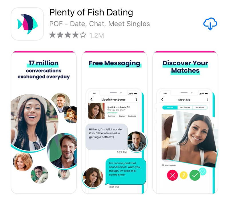
The app title “Plenty of Fish Dating” takes advantage of the majority of the allotted character space, allowing them to capitalize on one of the most popular terms, “dating”.
The Subtitle is a clever use of space, including the “POF” acronym, another high volume term that allows them to be defensive with their keyword strategy. The additional relevance stemming from its brand allows Plenty of Fish to rank #1 for “POF”.
It also leverages a series of additional relevant keywords such as “date”, “chat”, “meet” and “singles” which allows it to rank for terms like “date singles”, “meet singles”, “chat with singles” among others, giving it wide coverage amongst popularly searched phrases in the store.
Plenty of Fish’s description only briefly goes into specific functionalities that users could be interested in. The majority of the description highlights “FREE” (in all caps) throughout, letting users know that certain features are, in fact, free. This is shortly met with the subscription disclaimer that takes up almost 50% of the entire description.
This alone can be a point of frustration to users looking to truly interact with a “free” app model.
Plenty of Fish clarifies that messaging, matching and viewing said matches are all FREE, “unlike the paid dating apps”, with a higher likelihood of finding a relationship.
However, users are met with over 1100 character’s worth of disclaimer text, immediately conflicting with the rest of the description.
In order to best serve user needs and curiosity, while still remaining compliant with subscription disclosures, Plenty of Fish could:
This would clear up any kind of question a user would have if they read the description.
Despite being the dating app equivalent of a “household” name, Plenty of Fish struggles to rank in top positions for high-volume dating-related terms.
To break it down, Plenty of Fish ranks as such:
Ranking in the top 10 allows it to get the necessary visibility it needs to thrive, but not ranking in the Top 3 puts Plenty of Fish at a serious disadvantage against apps like Tinder in the store.
Click-through rate determines the rankings in these top positions, meaning that less users are clicking or converting on Plenty of Fish for these search terms relative to those who rank #1, #2 or #3.
Part of that could come down to how the screenshots appear in the search results.

While Plenty of Fish includes “Dating” in its main title, none of its screenshots in the search result highlight anything about dating.
Apps like Tinder, Hinge and Bumble all prominently display “Dating” in these initial screenshots. If users were to search with “dating app” in the iOS App Store and saw apps that didn’t explicitly display or describe dating in the screenshots, they would be more likely to pass onto an app that does.
Conversion and click-through rates are almost always higher for apps that include those terms in their screenshots, helping users draw a closer correlation between what they were searching for and what they’ve found.
Plenty of Fish has certainly made a splash in the dating space but has a bit of work to do to make sure it keeps swimming in the App Store.
Want to learn more about App Store Optimization? Contact Gummicube and we’ll help get your strategy started.

A deep dive into Pupford’s App Store listing, with tips to improve visibility, boost conversions, and turn more browsers into loyal users.

Discover how Orbit can boost visibility and conversions with smarter keywords, optimized creatives, and a stronger App Store presence.

Explore how Home Contents can improve its App Store listing with smarter ASO tactics, from stronger keywords to better screenshots and video strategy.