Unleashing Success: ASO Breakdown of Pupford's Puppy Training App
Posted on April 24th, 2025
A deep dive into Pupford’s App Store listing, with tips to improve visibility, boost conversions, and turn more browsers into loyal users.

An App Store Video can provide users with their first look at an app or mobile game. It shows the app in action, demonstrates graphics and animation and sets user expectations. A good video can improve conversions by up to 25%, although a poor video could have an inverse effect. For this week’s App Store Spotlight, we take a look at Sky: Children of the Light and see how its video is designed to attract and convert users.
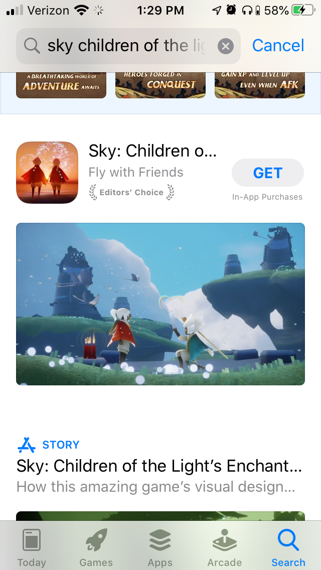
On the Apple App Store, Sky: Children of the Light features a video in landscape mode. When the app appears in search results, the App Store Video will be the only creative asset users see, so it must make a good impression.
The App Store Video for Sky shows several scenes from the game, such as characters flying or exploring different areas. This demonstrates the gameplay and graphics, as well as introduces the setting and characters. It’s accompanied by music intended to create a whimsical and inspiring mood to set the tone.

The video does not use any text or narration to describe the mobile game, relying instead on the visual elements to tell the story. This ensures it remains compliant with the App Store Guidelines, as the video shows only content available directly within the app.
It does not linger on any moment for long; no cut lasts more than five seconds, but occasionally the transitions switch between different scenes in the same location. This enables the video to show as many different aspects of the mobile game as it can in 30 seconds.
On Google Play, Sky: Children of the Light is available for pre-registration. The App Store Video is different than the iOS version, although it uses many of the same techniques. It also shows scenes from the game, such as characters in flight surrounded by lights, while lighthearted and inspiring music plays in the background. This video utilizes different scenes from the game, focusing primarily on the flight aspects more than anything else.

Like with the iOS version, each cut is short, lasting no more than four seconds at most. This helps keep the video moving from scene to scene in the time it uses.
While both videos feature similar designs, it’s always a good idea to test different versions of creative elements to see what converts best. If the App Store Video converts more users than the Google Play one, it might be a good idea to test the video on the other platform, and vice-versa. Testing variants is an important part of App Store Optimization.
When analyzing App Previews, it’s helpful to see what competing apps use for theirs.
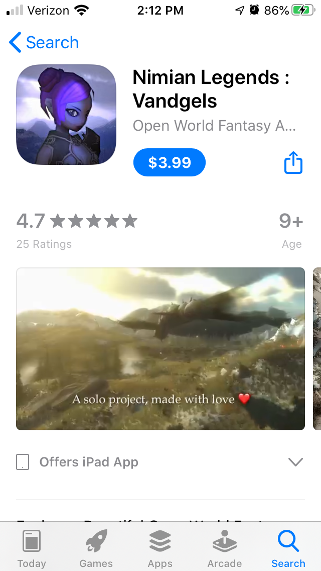
On the Apple App Store, we can see competitors using similar videos with a few differences. For instance, Nimian Legends also transitions between different scenes of the game to showcase flight, exploration and graphics. This video includes text at the bottom of the screen describing the game and calling out key features such as “a beautiful, immersive fantasy game” and includes a few action scenes.

On the Google Play Store, the competitor SHINE – Journey of Light also uses its video to show the graphics and game, focusing on the floating ball of light that players control and flying through obstacles. This video includes text that calls out values like “40 handcrafted stages.” The music is slow and quiet, different from Sky’s uplifting melody, which sets a different atmosphere.

Sky: Children of the Light uses its App Store Video and Play Store promo video to show its graphics and music, illustrating its artistic design. This can help convert users that are interested in the game.
Looking at competitors, we can see the different ways similar apps design their App Store Videos. Sky: Children of the Light might benefit from adding explanatory text that appears briefly to explain what the game is; that is an option it could consider testing to see if it improves conversion.
An App Store Video can be a deciding factor for many users, so it should be made with care and tested to determine what converts best. App developers should consider ASO best practices when creating videos for their apps.
Want more information regarding App Store Optimization? Contact Gummicube and we’ll help get your strategy started.

A deep dive into Pupford’s App Store listing, with tips to improve visibility, boost conversions, and turn more browsers into loyal users.

Discover how Orbit can boost visibility and conversions with smarter keywords, optimized creatives, and a stronger App Store presence.

Explore how Home Contents can improve its App Store listing with smarter ASO tactics, from stronger keywords to better screenshots and video strategy.