Star Wars App Store Spotlight
November 15th, 2018
 Tagged: App-Store-Spotlight
By Anh Nguyen
COO & Co-Founder at Gummicube, Inc
The official “Star Wars” app was not made a long time ago, nor in a galaxy far, far away, but it still captures the energy of the “Star Wars” franchise. The app offers augmented reality functions, video clips, photo stickers and even a virtual reality feature for Google Cardboard users. With all that the app has made available, is the Force with its App Store Optimization, or has it fallen to the dark side of the App Stores?
iOS
On the Apple App Store, the “Star Wars” app is the top-ranked app for several, but not all, “Star Wars” keywords. This includes “Star Wars 3D,” “Star Wars Disney” and “Star Wars Ringtones.” It’s the 8th highest app for “augmented reality,” and the 14th highest for “3d VR apps,” so the features it targets are earning it rankings in those relevant keywords, although it could potentially be higher in them if it emphasized them further. Its rankings fall lower for “light saber,” where it’s number 24, as well as “Jedi Knight,” where it comes in at the 23rd highest result. Creatives: The “Star Wars” app’s store listing begins with a video, showing several features the app has to offer, including the augmented reality features, sound board, and “This Day in Star Wars” section. While it is all in-app footage, as required by Apple’s guidelines, it does include text appearing over the footage to describe what each section provides. The following screenshots show various pages and features, such as “featured content” and the selfie editor. Each one features a different aspect of the app with callout text on the bottom describing what they do. However, it only uses five screenshots out of the ten allowed, while the app has many more features it could highlight by including screenshots.  For instance, the description boasts a virtual reality feature, but neither the video nor screenshots include it – a screenshot could show users what the virtual reality portion is like and encourage them to download the app to use with their VR headsets. Title & Subtitle: The app’s name is simply “Star Wars,” and there is no subtitle. This means that the title leaves 21 blank characters that it could use to include more keywords, while the lack of a subtitle leaves the app with another 30 unused characters. By including a subtitle, the “Star Wars” app could include more information about what the app has to offer at a glance. Just a quick 30-character summary still provides important information and adds more keywords, which would help it show up in more searches. Description: The description for the “Star Wars” app starts off formatted properly for iOS, with a few short lines that are easy to read. After the features list, it organically works in some “Star Wars” quotes and references as part of its call to action. Additionally, the description itself integrates important keywords, like “3D Star Wars,” “virtual reality” and “lightsaber,” which is helpful for Apple Search Ads. However, the feature list is a single, lengthy list that fills the screen. While bullet lists are good, the app’s description could improve its readability by dividing it into smaller sections, each focused on a different key feature of the app. If it were to have separate feature sections for “VR and AR,” “Star Wars Games,” “Customization,” and so on, it would be easier for viewers to understand all that the app has to offer at a glance. Although the "Star Wars" name is well-known, the description does not delve into the details of the universe. It assumes the user already knows about "Star Wars," but rather than appeal to them with all the elements of the beloved space opera, it rests on the laurels of the name alone. With 4000 characters to use, it has the space to establish more about the brand and what the app provides.
Google Play
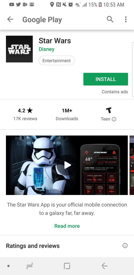
On the Google Play Store, “Star Wars” is the top-ranked app for “starwarsapp” searches, but that’s all. Even for “Star Wars” it comes in at #5, and while it is in the top 10 for keywords like “star wars free,” “han solo” and “star wars force,” it doesn’t rank high for many keywords outside of “Star Wars” related searches. For instance, although it features AR features, it’s the 233rd search result for “augmented reality,” and in spite of its virtual reality function, it doesn’t rank at all for terms including “Virtual reality” or “VR.” Creatives: The app features a very different video on Google Play, but it is a well-made one. The video transitions between clips from the “Star Wars” movies and features of the app, connecting them thematically while playing the iconic opening theme over it. While it only gives snippets of the features in this way, it still plays on the user’s love for the “Star Wars” franchise and indicates what they’ll be able to find within the app.  The screenshots are identical to the ones on the iOS version, and while they are good screenshots, it still has room for more. Like on iOS, it could include more screenshots that show off more features of the app to give users a better idea of what to expect and appeal to them more. Metadata & Description: The app’s description on Google Play is identical to that on the Apple App Store. This means that the same issues remain, in addition to not being formatted for Google Play’s algorithm. When Google Play indexes an app for keywords, it does so by crawling the description. Starting off a line or sentence with a keyword helps the algorithm find it, while incorporating the keyword in the middle of a sentence makes it less likely to index for it. As such, the “Star Wars” app could benefit by rewording its features lists to start off with the relevant keyword, such as “augmented reality” or “watch star wars” – the latter of which it does not currently rank for. Similarly, if it were to split the long list of features into multiple, smaller feature lists, it could incorporate important keywords as the headers for each of those feature sets. In doing so it would not only improve its relevance for those keywords, but it would catch the eye of users searching for apps with those features as well.
Overall
The “Star Wars” app is a great app for fans of the franchise, and while its visual elements are great, its metadata usage, creatives and descriptions can be improved. Doing so could help improve its rankings in searches for not only “Star Wars” terms, but also terms related to the features it has to offer. Additionally, turning the long list of features into several smaller feature sets would better appeal to users by letting them see what the app has to offer at a glance. With all that the app has to offer, it needs to make sure users are fully aware of everything the app can provide to them. It can do this by adding more screenshots to show off more of its functions and reformatting the description to be easier to read. Until then, the app is on the iOS and Android Council, but not granted the rank of ASO master.
More blog-posts like this:

Timeleft: Finding Friends, But Is It Finding App Store Visibility?
A/B testing alternative subtitle structures, and experimenting with screenshot designs could set Timeleft apart from its competition. Read more!

Checking In on Booking.com's ASO Strategy
Success in the App Store is driven by a combination of discoverability and conversion. Apps that excel in both areas consistently outperform the competition.

Mark Your Calendar: Howbout's ASO Audit
By introducing dynamic design elements & leveraging ASO tools such as App Store video and A/B testing, Howbout can significantly enhance its App Store listing.
