Unleashing Success: ASO Breakdown of Pupford's Puppy Training App
Posted on April 24th, 2025
A deep dive into Pupford’s App Store listing, with tips to improve visibility, boost conversions, and turn more browsers into loyal users.

An App Store Video, whether it’s an App Preview Video on the Apple App Store or a Promo Video on Google Play, can be a powerful tool for user conversion. A good video can increase conversions by up to 25%, although a poorly-made one can have an equally detrimental effect. For apps available on both the App Store and Google Play Store, it may be necessary to create more than one video. For an example of this, we look at the mobile game Starbeard and its App Store Videos.
On the Apple App Store, Starbeard’s App Preview Video is viewed in portrait-mode. It gives a quick rundown of the story through in-app footage, then shows off gameplay. This includes functionality like character choices, different levels and power-ups.
App Preview Videos are required to use in-app footage with minimal transitions and text, and can be 15 to 30 seconds. Starbeard uses this time to showcase several different aspects of the game, with no shot taking more than four seconds. This conveys as much information as possible in the limited time it has while still showcasing each feature properly.

The App Store Video on Google Play is a little different. While Google Play Promo Videos do allow footage from outside the app, Starbeard’s video continues to use only in-app footage. It is 15 seconds longer than the iOS version and uses landscape formatting.
In order to accommodate a game played in portrait mode on a landscape video, Starbeard’s Promo Video adds borders with characters from the game calling out aspects like features and gameplay while the game footage plays in a smaller box beside them. The footage is similar to that used in the Apple App Store Preview Video, but it adds in some other scenes to transition between elements of the game.

By looking at what other apps in Starbeard’s space are doing, we can see recurring elements used in App Store Video design.
Dungeon Faster, another roguelike game, features a Google Play Video that also uses a landscape screen to show footage of a game played in portrait mode. This video also includes characters from the game placed on the side of the screen, but the video itself spends more time on a single aspect of the gameplay.

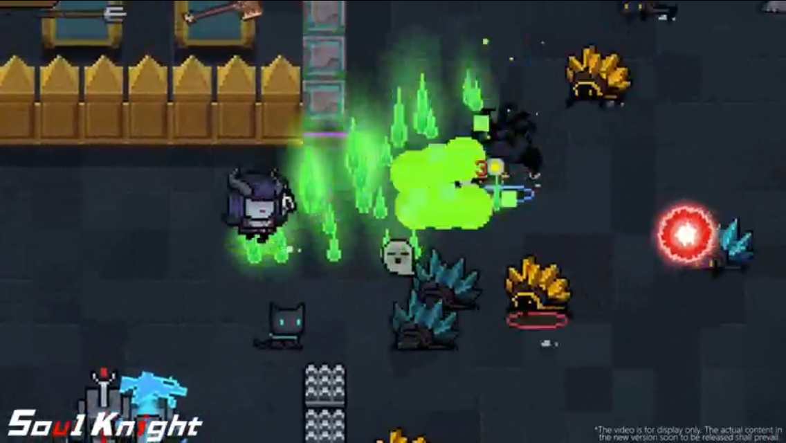
Soul Knight, a competing game on the Apple App Store, features a landscape-style video that shows the game in action. It very briefly includes an image of a cutscene that mentions the storyline, but the text is lengthy and the scene changes before users have enough time to read it.

Void Tyrant uses a similar style for its App Store Preview Video. It rotates through different aspects of the game, including the combat and customization options, while spending only a few seconds on each shot.

App Store Video optimization requires videos that entertain users while demonstrating its features. While each store has different rules and guidelines, it’s important that the video is visually engaging and informative. For mobile games like Starbeard, showing different aspects of the gameplay in quick snippets can be a useful way to showcase the game’s features. These videos can play a big role in whether or not users download the game and should not be overlooked.
Want more information regarding App Store Optimization? Contact Gummicube and we’ll help get your strategy started.

A deep dive into Pupford’s App Store listing, with tips to improve visibility, boost conversions, and turn more browsers into loyal users.

Discover how Orbit can boost visibility and conversions with smarter keywords, optimized creatives, and a stronger App Store presence.

Explore how Home Contents can improve its App Store listing with smarter ASO tactics, from stronger keywords to better screenshots and video strategy.