Finding the Right Rhythm in ASO with Musixmatch
Posted on March 27th, 2025
This week, we explore how Musixmatch can update its ASO strategy to improve App Store search rankings, enhance visuals, and drive more downloads.

It feels like I've written this review before…
That Level Again is a devastatingly simple, delightfully repetitive and thoroughly enjoyable mobile platformer. This free game features gritty visuals, challenging puzzles, and a minimalist design that makes That Level Again a must play for platformer fans.
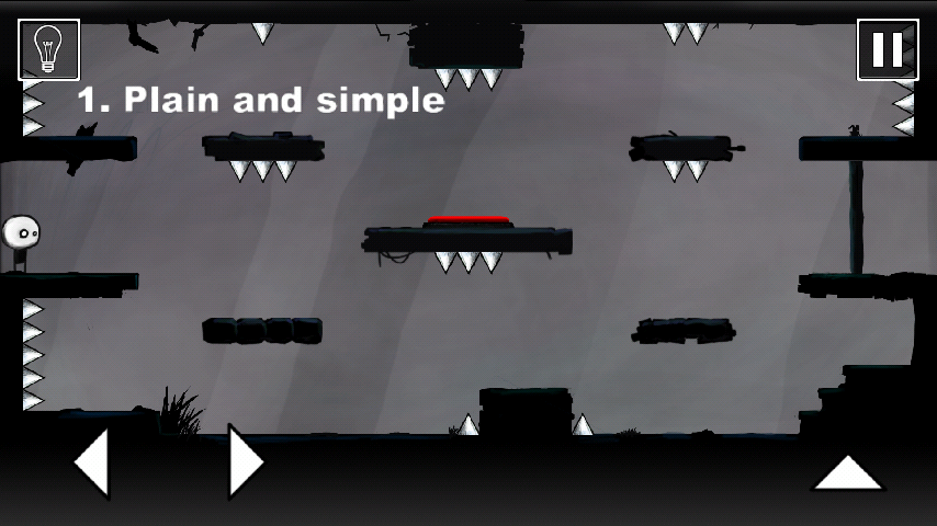
You control an immortal stick man living out a Groundhog's Day hell and you must escape 96 identical levels. That's right, nearly 100 spawns into the same room with the same obstacles. How on earth could it be fun if the level never changes? Why, because the in-world physics don't adhere to the common standards of predictability, of course!
Each level has a unique solution that can be discovered by finding out what has changed. Reversal of gravity, backwards controls, and literally doing nothing are just a few examples of the clever design of this fun game. If you are wondering why you haven't heard of this game yet, then read on to see how it ranks, and where it misses, in the world of app store optimization.
While minimalism is this game's bread and butter, they could really benefit from a healthy dose of maximalism in the Google Play Store description. That Level Again has a description that matches its tone: irreverent and simple. While this is great for human readers, it leaves Google Play Store with very little information for indexing. Currently That Level Again is utilizing only 284 characters of a 4,000 character limit in the description field where Google crawls for keywords.
Keeping a short and simple description for such a game is understandable, but detrimental for bringing in new users. With proper keyword implementation and a clear and compelling description, That Level Again could blow past its already respectable ten million plus downloads. Maybe they could even incorporate some white-on-white text? (Spoilers)
Ok, so the description is exactly the same in the iOS App Store, so same critique there, right? Not exactly. An awesome feature of the iOS App Store is the back-end keyword bank. While Google Play Store has to rely on the description to parse keywords, Apple allows for a unique field that is rife with choice keywords. Despite this keyword bank, the description would still benefit from a rewrite focusing more on highlighting the uniqueness of That Level Again for prospective players.
That Level Again ranks high on keywords are formed around the words "platform" and "level", which are used frequently in the description. Due to the challenging nature of the game, it would be nice to see how they would rank for words like "logic", "challenge", and "puzzle" which would add some welcome zest to the description as well.
The creative elements for both app stores really reflect the feeling of That Level Again. The icon features the protagonist in all its gritty glory, deadpan staring as if begging to not go in that room again. The screenshots give you a good idea of the absurdity of this game, showing you a few different levels with no real discernible differences.


However, they could benefit from incorporating some text call-outs to give a peek into why so many people love to rage quit That Level Again, before immediately booting it back up...again.
The Google Play Store features a short video which gives even more of a cavalier air to the game, although it does lack real game play footage. Overall the visual design is good, but including one or two additional screenshots of different levels for further juxtaposition, and tacking on some high volume keywords would make it more appealing.
Altogether, That Level Again is a fun game with an established fan base, but they could open the door to so many new devotees by spiffing up their descriptions with some great keywords. Ironically, considering this game's penchant for repetition, it could also benefit from eliminating some of the repetitive keywords found in the short description to focus more on unique keywords.
The intention of whimsy and coolness in the lacking descriptions is understandable, however it is stifling this app's growth more than anything. That Level Again is a superb example of an excellent app with a cult following that is really missing out on the exposure that proper app store optimization would provide.
Want to learn more about App Store Optimization? Contact Gummicube, and we’ll help get your strategy started.

This week, we explore how Musixmatch can update its ASO strategy to improve App Store search rankings, enhance visuals, and drive more downloads.

Discover how 23andMe can enhance its App Store presence with strategic ASO tweaks, and learn key ASO tips to boost visibility and conversion rates.

This App Store Spotlight on theScore explores title, subtitle, and screenshot optimizations to boost visibility and conversions during March Madness and beyond.