Finding the Right Rhythm in ASO with Musixmatch
Posted on March 27th, 2025
This week, we explore how Musixmatch can update its ASO strategy to improve App Store search rankings, enhance visuals, and drive more downloads.

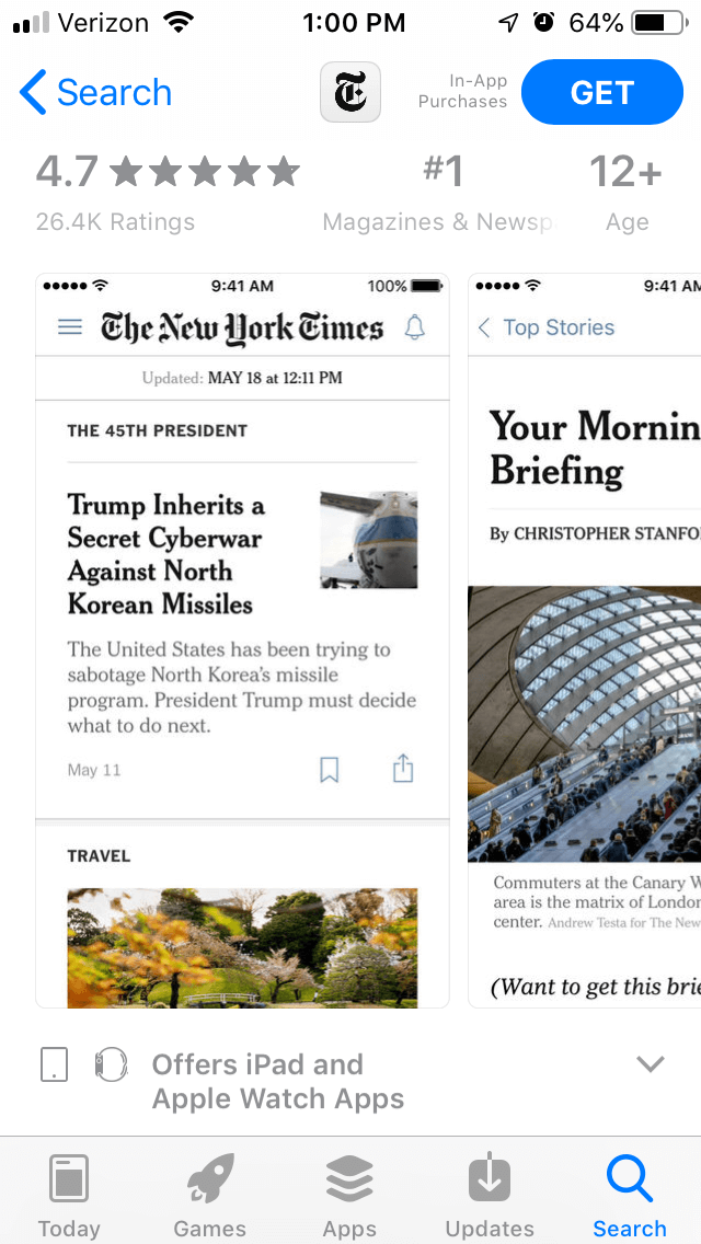
The New York Times is a major newspaper, covering topics vital to the nation and the world. As users begin moving from print media to digital, newspapers like The New York Times have had to adapt with their own mobile apps. For this week’s App Store Spotlight, we take a look at The New York Times app and its App Store Optimization to see if its news is reaching the audience it needs.
On the Apple App Store, The New York Times is the #1 app in the “Magazines & Newspapers” category. It’s the top app in searches for its name and variants thereof, as well as “newspaper,” “nyt now” and “the daily.” It also ranks as the second-highest app in searches for “international news,” third-highest for “daily world news” and “national news,” and seventh for “journalism.” Its ratings get lower for other competing news sources, such as “CNN news app” (#22) and “apple news app” (#18) as well as terms like “breaking news” (#19) and “smart news” (#20).
Creatives: The New York times utilizes five screenshots, each one focusing on different sections of the newspaper. This includes breaking political news, the “Morning Briefing” section, and “The Daily 360” videos. None of them are accompanied by callout text or framed in any way outside of existing as a screenshot.

The app page could expand on these screenshots by showing more than just the fact that it is a newspaper. It could use them to showcase the navigation, podcasts, alerts, favorite sections and so on, demonstrating the full range of features the app has to provide. These sections could also be expanded with callout text, providing clear information as to the benefits of each section.
Title & Subtitle: The app’s title, “The New York Times,” takes 18 of the 30 characters Apple provides. While this is key to the app’s branding, it could potentially expand it with terms like “news app” to add more keywords.
The subtitle, “Breaking National & World News” is a good example of an app subtitle. This utilizes all 30 characters, and each one is an important keyword for the app. It helps the app index for searches for terms like “breaking news” and “national news” while providing clear information about what the app is and what it provides.
Description: The description for The New York Times begins with a short and direct introduction. It’s two sentences long and states what the app is. While the short length is good, it could expand with another short line or two to provide more information and utilize more keywords. For instance, telling users they can “Catch up on world news” or get “breaking news alerts” would help it build relevancy for Search Ads campaigns and provide more information for users.
The feature set is one list talking about the features it has to offer. While it is good to use a bullet list, it could split it into multiple, smaller feature sets to elaborate on everything the app has to offer.
For instance, “The Daily 360” gets one line talking about how it offers a new video each day. This could be expanded into a feature set talking about “The Daily 360,” elaborating on the video content and news it provides. Doing so would help entice users with a unique feature of the app, rather than burying it with the other functions.
On Google Play, The New York Times app is called “NYTimes – Latest News.” It’s ranked #13 in the News & Magazines category. It ranks #1 in searches for its name and all variants, #5 for “New York news” and #5 for “news for New York.” Its rankings for other news terms is a bit lower, as it comes in at #22 for “news,” #24 for “news apps” and #36 for “daily news mobile.”
Creatives: The New York Times uses a very different set of creatives for “NYTimes – Latest News” than it does for the iOS app. This one opens with a video showing off its augmented reality feature, which doesn’t give a full overview of the app but still demonstrates a unique feature it has to offer.
The screenshots alternate between shots from the newspaper and the AR features, but they also include sections such as podcasts, the menu, and other aspects of the app. While they could still benefit from callout text describing what benefits the features provide, the wider range of screenshots provide more information about the multiple features available.
Description & Metadata: The Google Play description features a lengthy introduction that talks about the app and its AR features. While introducing the main points upfront is good, it also uses the first paragraph to provide links to specific AR features; these could be moved to their own section in the feature set to keep the introduction cleaner.
The section discussing the breaking news works as a good lead-in, as it provides important information about the app. The section that follows it is about the pricing, which would be better placed closer to the end of the description rather than before the feature sets.
As with iOS, it just has one list covering all the features. This could be split into smaller feature sets that focus on specific parts of the app. Doing so not only provides more information in a way that’s easy to get at a glance, but it also provides more information for utilizing keywords. If the description were to include sections for “breaking news,” (#52) “local news” (#206) and so on, it could potentially improve its indexation and ranking for those terms.
The New York Times provides valuable news, but proper App Store Optimization could help it get that news to even more users. While it is successful on both the iOS App Store and Google Play, it could potentially increase its conversions as well as keyword rankings and indexation by deploying an ASO strategy.
It could convince more users to install the app by reworking its creative sets to focus on the various features it has to offer and highlighting them with callout text. This would provide it with ways to differentiate itself from other news apps by showing off what makes it unique.
The descriptions can also be reworked to emphasize the various features and their values. This is especially important on Google Play, where keyword placement helps determine indexation.
With proper App Store Optimization, the next breaking news for The New York Times could be how big of a difference ASO makes.
Want more information regarding App Store Optimization? Contact Gummicube and we’ll help get your strategy started.

This week, we explore how Musixmatch can update its ASO strategy to improve App Store search rankings, enhance visuals, and drive more downloads.

Discover how 23andMe can enhance its App Store presence with strategic ASO tweaks, and learn key ASO tips to boost visibility and conversion rates.

This App Store Spotlight on theScore explores title, subtitle, and screenshot optimizations to boost visibility and conversions during March Madness and beyond.