
Finding the Right Rhythm in ASO with Musixmatch
Posted on March 27th, 2025
This week, we explore how Musixmatch can update its ASO strategy to improve App Store search rankings, enhance visuals, and drive more downloads.
This week’s App Store Spotlight focuses on There Is No Game and potential ideas for testing its App Store Screenshot design.
Designing screenshots for the iOS App Store and the Google Play Store is not quite as simple as just uploading in-app screenshots from the app’s current build. Screenshots, alongside the App Store icon, are the primary creatives that drive user conversion. In order to make the most of this space, there are a few best practices that should be considered.
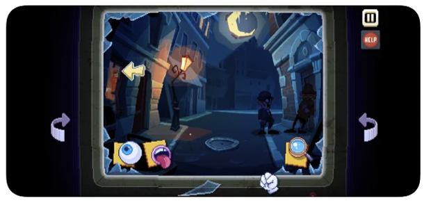
This week we are going to take a look at “There Is No Game”, which Apple is currently featuring in the “Essential Indie Games” spot. “There Is No Game” is a fun point-and-click comedy adventure that takes users on a tongue-in-cheek journey through video game universes.
While “There Is No Game” has high-quality screenshots that are accurate to gameplay, there are some creative treatments that could be applied to optimize this listing. Furthermore, the metadata is missing a few tried and true practices for increasing visibility. This game would benefit from the knowledge and guidance that a skilled ASO agency can provide.
App Store screenshots are the primary drivers of user conversion. This handful of images can convince users to download more effectively that paid campaigns in some cases. Furthermore, due to the fact that many users download directly from the search results, screenshots can be one of the only factors in an app’s listing that influences a user’s decision to convert.
Mobile app industry research has revealed a few ASO best practices that can increase user conversion when applied to app store screenshots. Many of these practices are intuitive, like making sure the images are high resolution, while others may be new to some developers. While not every treatment need be applied, or else the risk of over edited screenshots is very real, choosing the most applicable treatments for a creative set can be an invaluable advantage.

First, it is very important that screenshots are high quality. Today’s mobile devices are capable of displaying extremely high-definition images; by uploading a lower resolution for screenshots, potential users may count the pixels and decide to move on. Even in situations like “There Is No Game” where the in-app graphics are 16-bit and pixelated, it is clear that the images they utilize for screenshots are still high-quality. This gives the app a polished and well-made appearance.
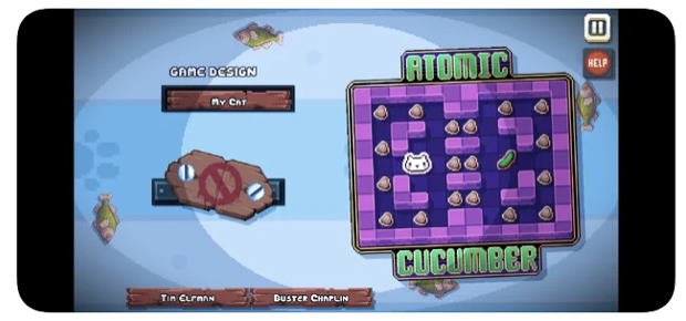
In addition to having the screenshots be high-quality, they also need to be accurate to the app’s gameplay or features. This is not only a good practice for App Store Optimization, it is also a requirement per Apple and Google screenshot guidelines. Accuracy is doubly important for day one retention, as users will likely uninstall an app or game that they feel they have been misled by, and are likely to leave a negative review as well.
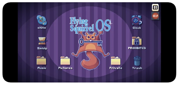
Showcasing an app’s UI can influence users by subtly placing them in the mindset of how they will interact with the app once installed. There are numerous ways to incorporate the UI, and simply displaying as it appears inside the app is a basic and effective way to do so. For more flair, some developers pop out UI elements as if they were jumping out of the screen at the user. While this is applicable for some apps, it may not convert well for others, so it is best to analyze current category trends to guide this decision.
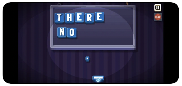
Another best practice for screenshots, and that which most readily stands out as missing in the creative set for “There Is No Game,” is the use of screenshot copy text. Text callouts are a straightforward way to highlight an app’s features, value propositions, and accolades. It is important to make sure the text is bold and readily visible, using a legible font and appropriate contrast. When including screenshot text, developers should consider emphasizing keywords in each screen in a larger font than supporting text. While this does not impact keyword indexation, users who download from search are likely to select an app that directly reflects their query, so this small step can reassure a user that this app is the one they are looking for.
Sometimes the best treatment for screenshots isn’t readily apparent by analyzing trends alone. Possibly there are many trends across the category, or perhaps conversion isn’t seeing the boost expected. This is why A/B testing on creatives is an important step in App Store Optimization.
On the Google Play Store, A/B testing is available within Store Listing Experiments where up to three variations can be tested against the control, or default image. Native A/B testing is coming to the Apple iOS App Store, hopefully by late 2021, but until then A/B testing can be achieved through third-party testing platforms, pre-post testing, or via Apple Search Ads creative set testing.
Regardless of the method used for A/B testing, it is important to limit the number of variables per test. For example, one test can be dedicated to experimenting with different background treatments across the set. Once a winner is confirmed from that test, the next could try out different screenshot text callouts. This process should be continued until all the desired experiments have been completed individually, before re-analyzing trends and planning the next round of testing.
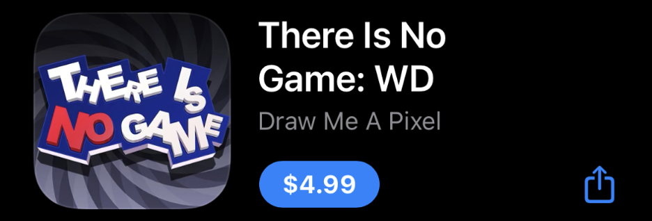
“There Is No Game” needs a bit of work on their creative assets in order to fully optimize their presence on the iOS App Store, and while putting in the extra work here will drive their conversion, visibility and keyword ranking come from another direction. Organic visibility on Apple’s iOS App Store is influenced by three main fields: the keyword bank, the title, and the subtitle.
What stands out at first glance is the lack of keyword inclusion in the subtitle field. With 30 characters worth a keyword real estate, using the subtitle “Wrong Dimension” may be missing out on some important terms. This current subtitle is using 15 of the 30 characters, and despite being accurate to the game’s setting, and serving as the title tag in effect, it lacks keywords that contribute to phrase building.
The developer, “Draw Me A Pixel”, could look into either revisiting the subtitle from scratch and relying on “WD” as the title tag in the title field, or simply including a few relevant, high-volume keywords following the current subtitle. Regardless of which option they pursue, as it stands they have 10 characters of free space in the title and 15 characters in the subtitle that can be put to good use. The right ASO tools can help developers discover which keywords will be most beneficial for inclusion.
App Store Optimization is an in-depth process that looks at the holistic picture of creative and metadata, and how they might best represent an app. For “There Is No Game” one of the missing pieces that immediately jumps out is the lack of callout text in the screenshots. App Store screenshot design should incorporate some tried and tested treatments that have been proven to drive user conversion. By revisiting their screenshots as well as their title and subtitle fields, the developer “Draw Me A Pixel” could get “There Is No Game” in front of more users with intent, and boost their visibility and conversion with a solid App Store Optimization Strategy.
Want to learn more about App Store Optimization? Contact Gummicube and we’ll help get your strategy started.

This week, we explore how Musixmatch can update its ASO strategy to improve App Store search rankings, enhance visuals, and drive more downloads.
Discover how 23andMe can enhance its App Store presence with strategic ASO tweaks, and learn key ASO tips to boost visibility and conversion rates.

This App Store Spotlight on theScore explores title, subtitle, and screenshot optimizations to boost visibility and conversions during March Madness and beyond.