CBS Sports: Analyzing its ASO Bracket
Posted on March 13th, 2026
Apps that evolve alongside their audience can maintain visibility in its app category through regular A/B testing, and iterations based on real user behavior.
Whenever anyone talks about apps that were massively successful from the launch, or apps that brought augmented reality into the mainstream, it’s safe to assume that Pokémon GO will be mentioned. Niantic’s killer app was an immediate success, bringing Pokémon into the real world with augmented reality, but even though the app is a household name, is it properly optimized for the app stores? Apple App Store One thing that Pokémon GO did well was update its creatives with screenshots showing off all the new features that users were demanding. A recent update added trading and a friends list feature, so two of the first three screenshots include those features. The screenshot before those properly demonstrates the app’s features by showing a rare Pokémon in augmented reality with the pokeball (an item used to capture Pokémon) ready to be thrown. 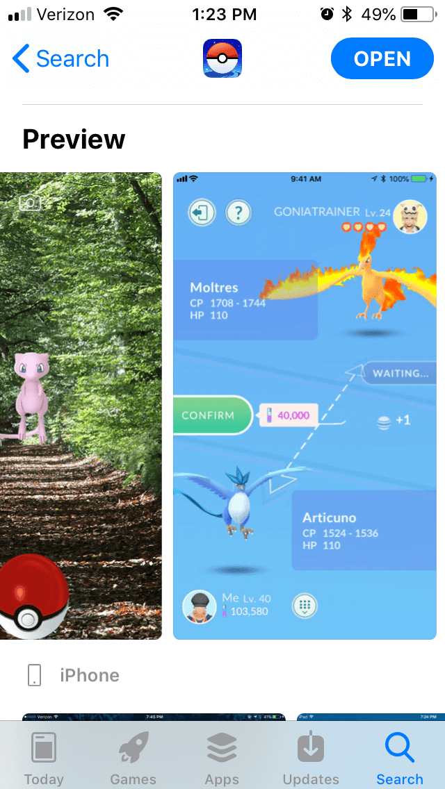 Each screenshot shows off a different feature of the game, including gym battles, sending gifts and completing research tasks. There are even small touches to several of them, like the inclusion of rare Pokémon or scenic poke stops, that further demonstrate its value. However, with all of those features, it doesn’t include the overworld or trainer customization features, in spite of having space for two more screenshots. The screenshots could benefit from callout text. These would explain the gameplay and features to the users in a quick, concise manner, while integrating important keywords and explaining the game’s value. Without them, the features such as gyms or trading are not immediately clear to people who don’t already play. Additionally, many of the creatives seem focused on players who are already familiar with Pokémon. While the screenshots feature rare Pokémon such as Mew or a golden Magikarp, that means little to people unfamiliar with the franchise. While those do appeal to longtime fans, they make it harder to bring in new users, especially without a call to action explaining why they should care about those. While the creatives are quite good, save for the lack of callout text, the description is very bulky on iOS. While it does properly call out each feature, include important keywords and mention the awards it earned, each section forms a large block of text. Even the headers take up a few lines, and without bullet points underneath them, they seem like another part of the paragraph.
 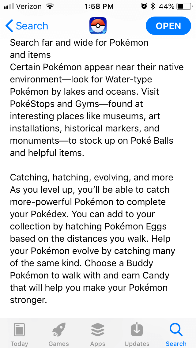 Google Play Store On the Google Play Store, Pokémon GO uses very similar descriptions and creatives. However, it does include more screenshots there, including the overworld map. It also includes an outdated screenshot from before the in-game gyms were revamped, which could be replaced with one showing a more recent feature. These screenshots could also benefit from callout text to better demonstrate the game’s features and value, because as with iOS, the images only stand on their own to players already familiar with the game, or at least with Pokémon.
 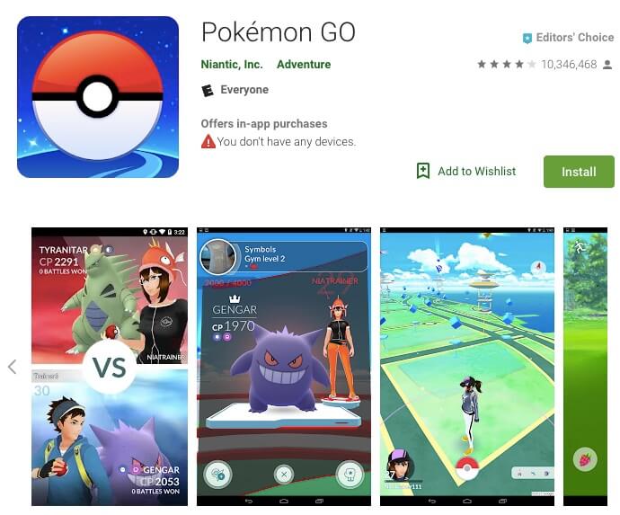 The creatives no longer feature a video, but considering the number of updates the game has gone through since its promotional videos were filmed, that is for the best, as it avoids presenting outdated information. Additionally, its previous video was part of its featured graphic, which Google Play is experimenting with not using on many devices. The description is written and formatted the same as the one for Apple, but it works much better on the Google Play Store. Here, larger paragraphs are acceptable, and the headers are more evident. With that said, the description could benefit from placing its keywords closer to the start of each line, so that Google’s algorithms can better identify them. As it is now, the algorithm would read it as targeting “join one of three teams” and “succeed in defeating it in battle” as key phrases before “catch Pokémon” in some sections.
While no one can doubt the huge success that is Pokémon GO, it still serves as a good demonstration of why the same description does not work on both app stores. Its description is the right length for Google Play but features a usage of keywords better suited for the Apple App Store, and without being properly optimized for each store individually, it won’t reach its full potential for either. With that said, the latest updates to its creatives do a great job at demonstrating each of its new features as well as details that would appeal to fans of the Pokémon franchise. While there are still some areas it could stand to improve, it’s still an example of great creatives overall. No app is beyond criticism and there is always room to improve. For as popular an app as Pokémon GO is, a solid ASO strategy could help it even further.

Apps that evolve alongside their audience can maintain visibility in its app category through regular A/B testing, and iterations based on real user behavior.

By evaluating SeedTime's app title, subtitle, icon, screenshots, we can identify what the app is doing well & where ASO opportunities exist. Read more!

Even apps supported by healthcare providers must compete in search. The App Store is is an evolving marketplace shaped by user behavior, seasons, & algorithmic shifts.